Visualization of different data types with python
Contents
Visualization of different data types with python
Here, will learn some of the most basic plotting functionalities with Python, to give you the tools you need to assess basic distributions and relationships within you dataset. We will focus on the Seaborn library, which is designed to make nice looking plots quickly and (mostly) intuitively.
import os
import pandas
import numpy as np
import matplotlib.pyplot as plt
import seaborn as sns

%matplotlib inline
Let’s first gather our dataset. We’ll use participant related information from the OpenNeuro dataset ds000228 “MRI data of 3-12 year old children and adults during viewing of a short animated film” .
%%bash
curl https://openneuro.org/crn/datasets/ds000228/snapshots/1.0.0/files/participants.tsv  -o /data/participants.tsv
  % Total    % Received % Xferd  Average Speed   Time    Time     Time  Current
                                 Dload  Upload   Total   Spent    Left  Speed

  0     0    0     0    0     0      0      0 --:--:-- --:--:-- --:--:--     0
100 16041    0 16041    0     0  66769      0 --:--:-- --:--:-- --:--:-- 66837
pheno_file = ('/data/participants.tsv')

pheno = pandas.read_csv(pheno_file,sep='\t')

pheno.head()
| participant_id | Age | AgeGroup | Child_Adult | Gender | Handedness | ToM Booklet-Matched | ToM Booklet-Matched-NOFB | FB_Composite | FB_Group | WPPSI BD raw | WPPSI BD scaled | KBIT_raw | KBIT_standard | DCCS Summary | Scanlog: Scanner | Scanlog: Coil | Scanlog: Voxel slize | Scanlog: Slice Gap | |
|---|---|---|---|---|---|---|---|---|---|---|---|---|---|---|---|---|---|---|---|
| 0 | sub-pixar001 | 4.774812 | 4yo | child | M | R | 0.80 | 0.736842 | 6.0 | pass | 22.0 | 13.0 | NaN | NaN | 3.0 | 3T1 | 7-8yo 32ch | 3mm iso | 0.1 |
| 1 | sub-pixar002 | 4.856947 | 4yo | child | F | R | 0.72 | 0.736842 | 4.0 | inc | 18.0 | 9.0 | NaN | NaN | 2.0 | 3T1 | 7-8yo 32ch | 3mm iso | 0.1 |
| 2 | sub-pixar003 | 4.153320 | 4yo | child | F | R | 0.44 | 0.421053 | 3.0 | inc | 15.0 | 9.0 | NaN | NaN | 3.0 | 3T1 | 7-8yo 32ch | 3mm iso | 0.1 |
| 3 | sub-pixar004 | 4.473648 | 4yo | child | F | R | 0.64 | 0.736842 | 2.0 | fail | 17.0 | 10.0 | NaN | NaN | 3.0 | 3T1 | 7-8yo 32ch | 3mm iso | 0.2 |
| 4 | sub-pixar005 | 4.837782 | 4yo | child | F | R | 0.60 | 0.578947 | 4.0 | inc | 13.0 | 5.0 | NaN | NaN | 2.0 | 3T1 | 7-8yo 32ch | 3mm iso | 0.2 |
What are our different variables?
pheno.columns
Index(['participant_id', 'Age', 'AgeGroup', 'Child_Adult', 'Gender',
       'Handedness', 'ToM Booklet-Matched', 'ToM Booklet-Matched-NOFB',
       'FB_Composite', 'FB_Group', 'WPPSI BD raw', 'WPPSI BD scaled',
       'KBIT_raw', 'KBIT_standard', 'DCCS Summary', 'Scanlog: Scanner',
       'Scanlog: Coil', 'Scanlog: Voxel slize', 'Scanlog: Slice Gap'],
      dtype='object')
Univariate visualization
Let’s start by having a quick look at the summary statistics and distribution of Age:
print(pheno['Age'].describe())
count    155.000000
mean      10.555189
std        8.071957
min        3.518138
25%        5.300000
50%        7.680000
75%       10.975000
max       39.000000
Name: Age, dtype: float64
# simple histogram with seaborn
sns.displot(pheno['Age'],
            #bins=30,          # increase "resolution"
            #color='red',    # change color
            #kde=False,        # get rid of KDE (y axis=N)
            #rug=True,         # add "rug"
            )
<seaborn.axisgrid.FacetGrid at 0x7f0fd2627450>
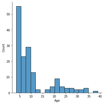
What kind of distribution do we have here?
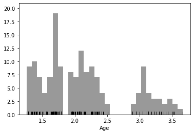
Let’s try log normalization as a solution. Here’s one way to do that:
import numpy as np

log_age = np.log(pheno['Age'])
sns.distplot(log_age,
            bins=30,
            color='black',
            kde=False,
            rug=True,
            )
/opt/miniconda-latest/envs/neuro/lib/python3.7/site-packages/seaborn/distributions.py:2551: FutureWarning: `distplot` is a deprecated function and will be removed in a future version. Please adapt your code to use either `displot` (a figure-level function with similar flexibility) or `histplot` (an axes-level function for histograms).
  warnings.warn(msg, FutureWarning)
/opt/miniconda-latest/envs/neuro/lib/python3.7/site-packages/seaborn/distributions.py:2055: FutureWarning: The `axis` variable is no longer used and will be removed. Instead, assign variables directly to `x` or `y`.
  warnings.warn(msg, FutureWarning)
<AxesSubplot:xlabel='Age'>
There is another approach for log-transforming that is perhaps better practice, and generalizable to nearly any type of transformation. With sklearn, you can great a custom transformation object, which can be applied to different datasets.
Advantages :
Can be easily reversed at any time
Perfect for basing transformation off one dataset and applying it to a different dataset
Distadvantages :
Expects 2D data (but that’s okay)
More lines of code :(
from sklearn.preprocessing import FunctionTransformer

log_transformer = FunctionTransformer(np.log, validate=True)

age2d = pheno['Age'].values.reshape(-1,1)
log_transformer.fit(age2d)

sk_log_Age = log_transformer.transform(age2d)
Are two log transformed datasets are equal?
all(sk_log_Age[:,0] == log_age)
True
And we can easily reverse this normalization to return to the original values for age.
reverted_age = log_transformer.inverse_transform(age2d)
The inverse transform should be the same as our original values:
all(reverted_age == age2d)
True
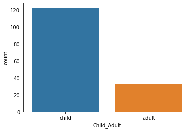
Another strategy would be categorization. Two type of categorization have already been done for us in this dataset. We can visualize this with pandas value_counts() or with seaborn countplot():
# Value counts of AgeGroup
pheno['AgeGroup'].value_counts()
5yo       34
8-12yo    34
Adult     33
7yo       23
3yo       17
4yo       14
Name: AgeGroup, dtype: int64
# Countplot of Child_Adult

sns.countplot(pheno['Child_Adult'])
/opt/miniconda-latest/envs/neuro/lib/python3.7/site-packages/seaborn/_decorators.py:43: FutureWarning: Pass the following variable as a keyword arg: x. From version 0.12, the only valid positional argument will be `data`, and passing other arguments without an explicit keyword will result in an error or misinterpretation.
  FutureWarning
<AxesSubplot:xlabel='Child_Adult', ylabel='count'>
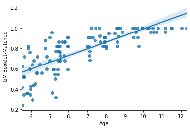
Bivariate visualization: Linear x Linear
Cool! Now let’s play around a bit with bivariate visualization.
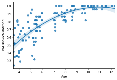
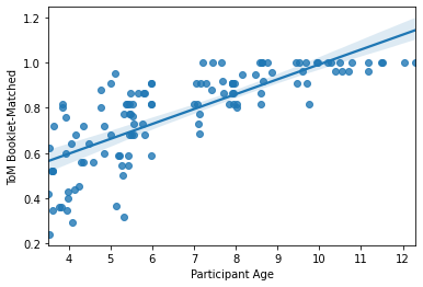
For example, we could look at the association between age and a cognitive phenotype like Theory of Mind or "intelligence". We can start with a scatterplot. A quick and easy scatterplot can be built with regplot():
sns.regplot(x=pheno['Age'], y=pheno['ToM Booklet-Matched'])
<AxesSubplot:xlabel='Age', ylabel='ToM Booklet-Matched'>
regplot() will automatically drop missing values (pairwise). There are also a number of handy and very quick arguments to change the nature of the plot:
## Try uncommenting these lines (one at a time) to see how
## the plot changes.

sns.regplot(x=pheno['Age'], y=pheno['ToM Booklet-Matched'],
           order=2,        # fit a quadratic curve
           #lowess=True,    # fit a lowess curve
           #fit_reg = False # no regression line
           #marker = ''     # no points
           #marker = 'x',   # xs instead of points
           )
<AxesSubplot:xlabel='Age', ylabel='ToM Booklet-Matched'>
Take a minute to try plotting another set of variables. Don’t forget – you may have to change the data type!
#sns.regplot(x=, y=)
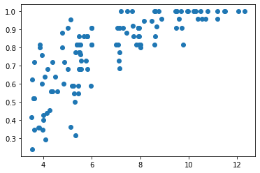
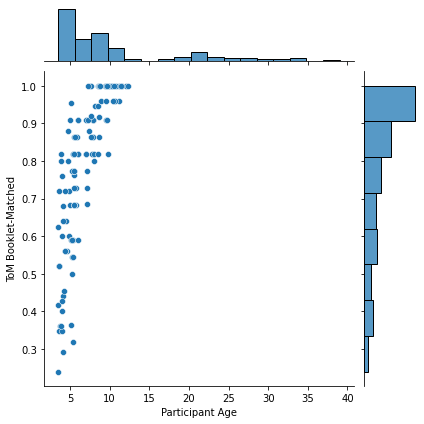
This would be as good a time as any to remind you that seaborn is built on top of matplotlib. Any seaborn object could be built from scratch from a matplotlib object. For example, regplot() is built on top of plt.scatter:
plt.scatter(x=pheno['Age'], y=pheno['ToM Booklet-Matched'])
<matplotlib.collections.PathCollection at 0x7f0fd2262a90>
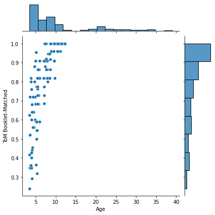
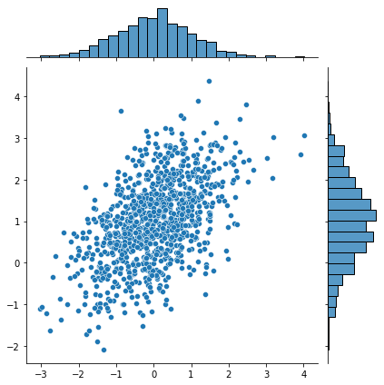
If you want to get really funky/fancy, you can play around with jointplot() and change the "kind" argument.
However, note that jointplot is a different type of object and therefore follows different rules when it comes to editing. More on this later …
for kind in ['scatter','hex']: #kde
    sns.jointplot(x=pheno['Age'], y=pheno['ToM Booklet-Matched'],
                  kind=kind)

    plt.show()
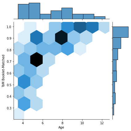
That last one was a bit weird, eh? These hexplots are really built for larger sample sizes. Just to showcase this, let’s plot a hexplot 1000 samples of some random data. Observe how the hexplot deals with density in a way that the scatterplot cannot.
mean, cov = [0, 1], [(1, .5), (.5, 1)]
x, y = np.random.multivariate_normal(mean, cov, 1000).T
sns.jointplot(x=x, y=y, kind="scatter")
sns.jointplot(x=x, y=y, kind="hex")
<seaborn.axisgrid.JointGrid at 0x7f0fd1e89d50>
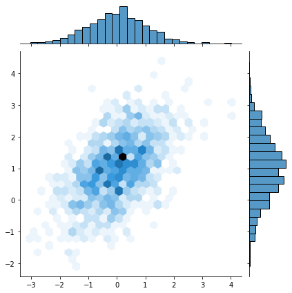
More on dealing with “overplotting” here: https://python-graph-gallery.com/134-how-to-avoid-overplotting-with-python/.
However, note that jointplot is a different type of object and therefore follows different rules when it comes to editing. This is perhaps one of the biggest drawbacks of seaborn.
For example, look at how the same change requires different syntax between regplot and jointplot:
sns.regplot(x=pheno['Age'], y=pheno['ToM Booklet-Matched'])
plt.xlabel('Participant Age')
Text(0.5, 0, 'Participant Age')
g = sns.jointplot(x=pheno['Age'], y=pheno['ToM Booklet-Matched'],
                  kind='scatter')
g.ax_joint.set_xlabel('Participant Age')
Text(0.5, 32.99999999999995, 'Participant Age')
Finally, lmplot() is another nice scatterplot option for observing multivariate interactions.
However, lmplot() cannot simply take two arrays as input. Rather (much like R), you must pass lmplot some data (in the form of a pandas DataFrame for example) and variable names. Luckily for us, we already have our data in a pandas DataFrame, so this should be easy.
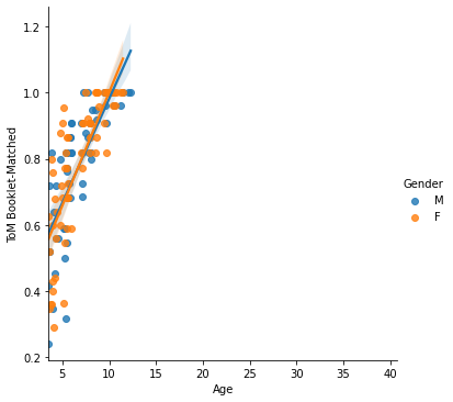
Let’s look at how the relationship between Age and Theory of Mind varies by Gender. We can do this using the "hue", "col" or "row" arguments:
sns.lmplot(x='Age', y = 'ToM Booklet-Matched',
           data = pheno, hue='Gender')
<seaborn.axisgrid.FacetGrid at 0x7f0fd1c7b210>
Unfortunately, these plots can be a bit sub-optimal at times. The regplot is perhaps more flexible. You can read more about this type of plotting here: https://seaborn.pydata.org/tutorial/distributions.html.
Bivariate visualization: Linear x Categorical
Let’s take a quick look at how to look at bivariate relationships when one variable is categorical and the other is scalar.
For consistency can continue to look at the same relationship, but look at "AgeGroup" instead of age.
There are many ways to visualize such relationships. While there are some advantages and disadvantes of each type of plot, much of the choice will come down to personal preference.
sns.
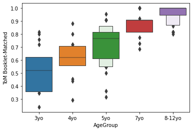
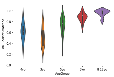
Here are several ways of visualizing the same relationship. Note that adults to not have cognitive tests, so we won’t include adults in any of these plots. Note also that we explicitly pass the order of x:
order = sorted(pheno.AgeGroup.unique())[:-1]
order
['3yo', '4yo', '5yo', '7yo', '8-12yo']
order = sorted(pheno.AgeGroup.unique())[:-1]
sns.barplot(x='AgeGroup',
y = 'ToM Booklet-Matched',
data = pheno[pheno.AgeGroup!='Adult'])
plt.show()
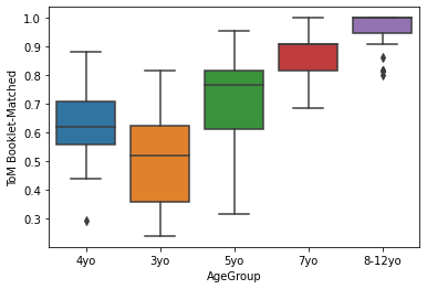
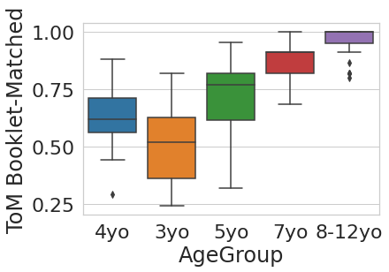
sns.boxplot(x='AgeGroup',
y = 'ToM Booklet-Matched',
data = pheno[pheno.AgeGroup!='Adult'])
plt.show()
sns.boxenplot(x='AgeGroup',
y = 'ToM Booklet-Matched',
data = pheno[pheno.AgeGroup!='Adult'],
order = order)
plt.show()
sns.violinplot(x='AgeGroup',
y = 'ToM Booklet-Matched',
data = pheno[pheno.AgeGroup!='Adult'])
plt.show()
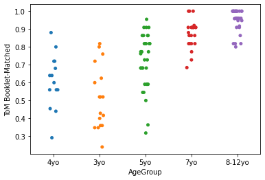
sns.stripplot(x='AgeGroup', jitter=True,
y = 'ToM Booklet-Matched',
data = pheno[pheno.AgeGroup!='Adult'])
plt.show()
sns.pointplot(x='AgeGroup',
y = 'ToM Booklet-Matched',
data = pheno[pheno.AgeGroup!='Adult'])
plt.show()
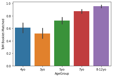

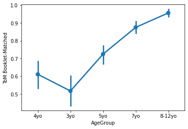
Generally, lineplots and barplots are frowned upon because they do not show the actual data, and therefore can mask troublesome distributions and outliers.
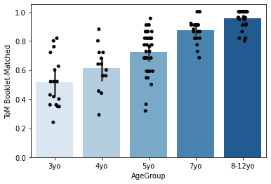
But perhaps you’re really into barplots? No problem! One nice thing about many seaborn plots is that they can be overlaid very easily. Just call two plots at once before doing plt.show() (or in this case, before running the cell). Just overlay a stripplot on top!
sns.barplot(x='AgeGroup',
            y = 'ToM Booklet-Matched',
            data = pheno[pheno.AgeGroup!='Adult'],
            order = order, palette='Blues')

sns.stripplot(x='AgeGroup',
            y = 'ToM Booklet-Matched',
            data = pheno[pheno.AgeGroup!='Adult'],
            jitter=True,
            order = order, color = 'black')
<AxesSubplot:xlabel='AgeGroup', ylabel='ToM Booklet-Matched'>
You can find more info on these types of plots here: https://seaborn.pydata.org/tutorial/categorical.html.
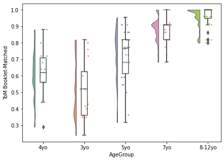
Having trouble deciding which type of plot you want to use? Checkout the raincloud plot, which combines multiple types of plots to achieve a highly empirical visualization.
Read more about it here: https://wellcomeopenresearch.org/articles/4-63/v1?src=rss.
%%bash
pip install ptitprince
Collecting ptitprince
  Downloading ptitprince-0.2.5.tar.gz (9.2 kB)
Requirement already satisfied: seaborn>=0.10 in /opt/miniconda-latest/envs/neuro/lib/python3.7/site-packages (from ptitprince) (0.11.0)
Requirement already satisfied: matplotlib in /opt/miniconda-latest/envs/neuro/lib/python3.7/site-packages (from ptitprince) (3.3.2)
Requirement already satisfied: numpy>=1.13 in /opt/miniconda-latest/envs/neuro/lib/python3.7/site-packages (from ptitprince) (1.18.5)
Requirement already satisfied: scipy in /opt/miniconda-latest/envs/neuro/lib/python3.7/site-packages (from ptitprince) (1.4.1)
Collecting PyHamcrest>=1.9.0
  Downloading PyHamcrest-2.0.2-py3-none-any.whl (52 kB)
Requirement already satisfied: cython in /opt/miniconda-latest/envs/neuro/lib/python3.7/site-packages (from ptitprince) (0.29.21)
Requirement already satisfied: pandas>=0.23 in /opt/miniconda-latest/envs/neuro/lib/python3.7/site-packages (from seaborn>=0.10->ptitprince) (1.1.4)
Requirement already satisfied: cycler>=0.10 in /opt/miniconda-latest/envs/neuro/lib/python3.7/site-packages (from matplotlib->ptitprince) (0.10.0)
Requirement already satisfied: pyparsing!=2.0.4,!=2.1.2,!=2.1.6,>=2.0.3 in /opt/miniconda-latest/envs/neuro/lib/python3.7/site-packages (from matplotlib->ptitprince) (2.4.7)
Requirement already satisfied: kiwisolver>=1.0.1 in /opt/miniconda-latest/envs/neuro/lib/python3.7/site-packages (from matplotlib->ptitprince) (1.3.1)
Requirement already satisfied: certifi>=2020.06.20 in /opt/miniconda-latest/envs/neuro/lib/python3.7/site-packages (from matplotlib->ptitprince) (2020.6.20)
Requirement already satisfied: python-dateutil>=2.1 in /opt/miniconda-latest/envs/neuro/lib/python3.7/site-packages (from matplotlib->ptitprince) (2.8.1)
Requirement already satisfied: pillow>=6.2.0 in /opt/miniconda-latest/envs/neuro/lib/python3.7/site-packages (from matplotlib->ptitprince) (8.0.1)
Requirement already satisfied: pytz>=2017.2 in /opt/miniconda-latest/envs/neuro/lib/python3.7/site-packages (from pandas>=0.23->seaborn>=0.10->ptitprince) (2020.4)
Requirement already satisfied: six in /opt/miniconda-latest/envs/neuro/lib/python3.7/site-packages (from cycler>=0.10->matplotlib->ptitprince) (1.15.0)
Building wheels for collected packages: ptitprince
  Building wheel for ptitprince (setup.py): started
  Building wheel for ptitprince (setup.py): finished with status 'done'
  Created wheel for ptitprince: filename=ptitprince-0.2.5-py3-none-any.whl size=8428 sha256=b233423b170924d0614d65d9166e74f70961972a4506ae798d248d5ed0897163
  Stored in directory: /home/neuro/.cache/pip/wheels/58/a5/f2/55920bbc5d0e6fb74b2370e1e52e07c236ba7b621236ea5a81
Successfully built ptitprince
Installing collected packages: PyHamcrest, ptitprince
Successfully installed PyHamcrest-2.0.2 ptitprince-0.2.5
import ptitprince as pt

dx = "AgeGroup"; dy = "ToM Booklet-Matched"; ort = "v"; pal = "Set2"; sigma = .2
f, ax = plt.subplots(figsize=(7, 5))

pt.RainCloud(x = dx, y = dy, data = pheno[pheno.AgeGroup!='Adult'], palette = pal, bw = sigma,
                 width_viol = .6, ax = ax, orient = ort)
<AxesSubplot:xlabel='AgeGroup', ylabel='ToM Booklet-Matched'>
Bivariate visualization: Categorical x Categorical
What if we want to observe the relationship between two categorical variables? Since we are usually just looking at counts or percentages, a simple barplot is fine in this case.
Let’s look at AgeGroup x Gender. Pandas.crosstab helps sort the data in an intuitive way.
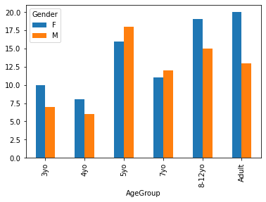
pandas.crosstab(index=pheno['AgeGroup'],
                columns=pheno['Gender'],)
| Gender | F | M |
|---|---|---|
| AgeGroup | ||
| 3yo | 10 | 7 |
| 4yo | 8 | 6 |
| 5yo | 16 | 18 |
| 7yo | 11 | 12 |
| 8-12yo | 19 | 15 |
| Adult | 20 | 13 |
We can actually plot this directly from pandas.
pandas.crosstab(index=pheno['AgeGroup'],
                columns=pheno['Gender'],).plot.bar()
<AxesSubplot:xlabel='AgeGroup'>
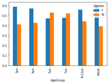
The above plot gives us absolute counts. Perhaps we’d rather visualize differences in proportion across age groups. Unfortunately we must do this manually.
crosstab = pandas.crosstab(index=pheno['AgeGroup'],
                columns=pheno['Gender'],)

crosstab.apply(lambda r: r/r.sum(), axis=1).plot.bar()
<AxesSubplot:xlabel='AgeGroup'>
Style points
You will be surprised to find out exactly how customizable your python plots are. Its not so important when you’re first exploring your data, but aesthetic value can add a lot to visualizations you are communicating in the form of manuscripts, posters and talks.
Once you know the relationships you want to plot, spend time adjusting the colors, layout, and fine details of your plot to maximize interpretability, transparency, and if you can spare it, beauty!
You can easily edit colors using many matplotlib and python arguments, often listed as col, color, or palette.
## try uncommenting one of these lines at a time to see how the
## graph changes

sns.boxplot(x='AgeGroup',
            y = 'ToM Booklet-Matched',
            data = pheno[pheno.AgeGroup!='Adult'],
            #palette = 'Greens_d'
            #palette = 'spectral',
            #color = 'black'
           )
<AxesSubplot:xlabel='AgeGroup', ylabel='ToM Booklet-Matched'>
You can find more about your palette choices here: https://matplotlib.org/3.1.0/tutorials/colors/colormaps.html.
More about your color choices here: https://matplotlib.org/3.1.0/gallery/color/named_colors.html.
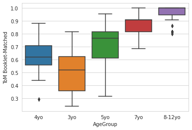
You can also easily change the style of the plots by setting "style" or "context":
sns.set_style('whitegrid')
sns.boxplot(x='AgeGroup',
            y = 'ToM Booklet-Matched',
            data = pheno[pheno.AgeGroup!='Adult'],
           )
<AxesSubplot:xlabel='AgeGroup', ylabel='ToM Booklet-Matched'>
sns.set_context('notebook',font_scale=2)
sns.boxplot(x='AgeGroup',
            y = 'ToM Booklet-Matched',
            data = pheno[pheno.AgeGroup!='Adult'],
           )
<AxesSubplot:xlabel='AgeGroup', ylabel='ToM Booklet-Matched'>
Notice these changes do not reset after the plot is shown. To learn more about controlling figure aesthetics, as well as how to produce temporary style changes, visit here: https://seaborn.pydata.org/tutorial/aesthetics.html.
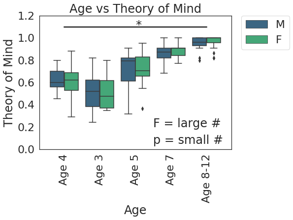
Finally, remember that these plots are extremely customizable. Literally every aspect can be changed. Once you know the relationship you want to plot, don’t be afraid to spend a good chunk of time tweaking your plot to perfection:
# set style
sns.set_style('white')
sns.set_context('notebook',font_scale=2)

# set figure size
plt.subplots(figsize=(7,5))

g = sns.boxplot(x='AgeGroup',
            y = 'ToM Booklet-Matched',
            hue = 'Gender',
            data = pheno[pheno.AgeGroup!='Adult'],
           palette = 'viridis')

# Change X axis
new_xtics = ['Age 4','Age 3','Age 5', 'Age 7', 'Age 8-12']
g.set_xticklabels(new_xtics, rotation=90)
g.set_xlabel('Age')

# Change Y axis
g.set_ylabel('Theory of Mind')
g.set_yticks([0,.2,.4,.6,.8,1,1.2])
g.set_ylim(0,1.2)

# Title
g.set_title('Age vs Theory of Mind')

# Add some text
g.text(2.5,0.2,'F = large #')
g.text(2.5,0.05,'p = small #')

# Add significance bars and asterisks
plt.plot([0,0, 4, 4],
         [1.1, 1.1, 1.1, 1.1],
         linewidth=2, color='k')
plt.text(2,1.08,'*')

# Move figure legend outside of plot

plt.legend(bbox_to_anchor=(1.05, 1), loc=2, borderaxespad=0.)
<matplotlib.legend.Legend at 0x7f0fd1f03c10>
That’s all for now. There’s so much more to visualization, but this should at least get you started.
Recommended reading:
multidimensional plotting with seaborn: https://jovianlin.io/data-visualization-seaborn-part-3/
Great resource for complicated plots, creative ideas, and data!: https://python-graph-gallery.com/
A few don’ts of plotting: https://www.data-to-viz.com/caveats.html