Supervised or unsupervised & model types
Contents
Supervised or unsupervised & model types
Aim(s) of this section 🎯
learn about the distinction between supervised & unsupervised machine learning
get to know the variety of potential models within each
Outline for this section 📝
supervised vs. unsupervised learning
supervised learning examples
unsupervised learning examples
A brief recap & first overview

Machine learning (ML) is the study of computer algorithms that can improve automatically through experience and by the use of data. It is seen as a part of artificial intelligence. Machine learning algorithms build a model based on sample data, known as “training data”, in order to make predictions or decisions without being explicitly programmed to do so. A subset of machine learning is closely related to computational statistics, which focuses on making predictions using computers; but not all machine learning is statistical learning. The study of mathematical optimization delivers methods, theory and application domains to the field of machine learning. Data mining is a related field of study, focusing on exploratory data analysis through unsupervised learning. Some implementations of machine learning use data and neural networks in a way that mimics the working of a biological brain.
https://en.wikipedia.org/wiki/Machine_learning
Let’s bring back our simplified graphical description that we introduced in the previous section:

So far we talked about how a model (M) can be utilized to obtain information (output) from a certain input.
The information requested can be manifold but roughly be situated on two broad levels:
specific task type - predicting clinical measures, behavior, demographics, other properties - segmentation - discover hidden structures - etc.
Lucky for us, the scikit-learn docs entail an amazing graphic outlining different model types that can be of tremendous help when deciding on a given analysis pipeline:

https://scikit-learn.org/stable/_static/ml_map.png
Here, we are going to add a bit more content to further stress the distinctions made above. First, the learning problem:

https://scikit-learn.org/stable/_static/ml_map.png
And second, the task type:

Learning problems - supervised vs. unsupervised
Based on these aspects we can and need to further specify our graphical description:

If we now also include task type we can basically describe things via a 2 x 2 design (leaving our graphical description for a moment):

Some primers using the example dataset
Now that we’ve gone through a huge set of definitions and road maps, let’s go away from this rather abstract discussions to the “real deal”.
Specifically, how these models behave in the wild. For this we’re going to sing the song “hello example dataset my old friend, I came to apply machine learning to you again.”. Just to be sure: we will use the example dataset we briefly explored in the previous section again to showcase how these models can be put into action, how they change/affect the questions one’s asking, and how to interpret the results.
At first, we’re going to load our input data, i.e., X again:
import numpy as np
data = np.load('MAIN2019_BASC064_subsamp_features.npz')['a']
data.shape
(155, 2016)
Just as a reminder: what we have in X here is a vectorized connectivity matrix containing 2016 features, which constitutes the correlation between brain region-specific time courses for each of 155 samples (participants).
As before, we can visualize our X to inspect it and maybe get a first idea if there might be something going on (please click on the + to see the code):
import plotly.express as px
from IPython.core.display import display, HTML
from plotly.offline import init_notebook_mode, plot
fig = px.imshow(data, labels=dict(x="features", y="participants"), height=800, aspect='None')
fig.update(layout_coloraxis_showscale=False)
init_notebook_mode(connected=True)
#fig.show()
plot(fig, filename = '../../../static/input_data.html')
display(HTML('../../../static/input_data.html'))
At this point we already need to decide on our learning problem:
do we want to use the information we already have (
labels) and thus conduct asupervised learninganalysis to predictY?do we want to find information we do not have (yet) and thus conduct an
unsupervised learninganalysis to e.g., findclustersin thedata?
Note
Please note: we only do this for the sake of this course! Please never do this type of “Hm, maybe we do this or this, let’s see how it goes.” approach in your research. Always make sure you have a precise analyses plan that is informed by prior research and guided by the possibilities of your data. Otherwise you’ll just add to the ongoing reproducibility and credibility crisis, not accelerating but hindering scientific progress.
However, there is always room for exploratory analyses, just be honest about it and don’t acting as if they are confirmatory.
That being said: we’re going to basically test of all them (talking about “to not practise what one preaches”, eh?), again, solely for teaching purposes.
Within a given learning problem, we will go through a couple of the most heavily used estimators/algorithms and give a little bit of information about each
- supervised learning: SVM, regression, nearest neighbor, tree-ensembles
- unsupervised learning: PCA, kmeans, hierarchical clustering
We’re going to start with supervised learning, thus using the information we already have.
Supervised learning
Independent of the precise task type we want to run, we initially need to load the information, i.e. labels, available to us:
import pandas as pd
information = pd.read_csv('participants.csv')
information.head(n=5)
| participant_id | Age | AgeGroup | Child_Adult | Gender | Handedness | |
|---|---|---|---|---|---|---|
| 0 | sub-pixar123 | 27.06 | Adult | adult | F | R |
| 1 | sub-pixar124 | 33.44 | Adult | adult | M | R |
| 2 | sub-pixar125 | 31.00 | Adult | adult | M | R |
| 3 | sub-pixar126 | 19.00 | Adult | adult | F | R |
| 4 | sub-pixar127 | 23.00 | Adult | adult | F | R |
As you can see, we have multiple variables, this is where we get the labels from, that allow us to describe our participants (i.e., samples).
Almost each of these variables can be used to address a supervised learning problem (e.g., Child_Adult variable).
What’s the goal here again? Let’s bring back our graphical description:
Overall, goal 🎯 is to learn parameters (or weights) of a model (M) that maps X to y.
Based on the information available to us, we see a few things:
Some are variables are
categoricaland thus could be employed within aclassificationanalysis (e.g.,childrenvs.adults).Some are
continuousand thus would fit within aregressionanalysis (e.g.,Age).
We’re going to explore both!
Supervised learning - classification
goal: Learn parameters (or weights) of a model (
M) that mapsXtoy
In order to run a classification analysis, we need to obtain the correct categorical labels defining them as our Y
Y_cat = information['Child_Adult']
Y_cat.describe()
count 155
unique 2
top child
freq 122
Name: Child_Adult, dtype: object
We can see that we have two unique expressions, but let’s plot the distribution just to be sure and maybe see something important/interesting (please click on the + to see the code):
fig = px.histogram(Y_cat, marginal='box', template='plotly_white')
fig.update_layout(showlegend=False, width=800, height=800)
init_notebook_mode(connected=True)
#fig.show()
plot(fig, filename = '../../../static/labels.html')
display(HTML('../../../static/labels.html'))
That looked about right and we can continue with our analysis.
To keep things easy, we will use the same pipeline we employed in the previous section, that is we will scale our input data, train a Support Vector Machine and test its predictive performance. At first, we import the necessary python modules:
from sklearn.preprocessing import StandardScaler
from sklearn.svm import SVC
from sklearn.pipeline import make_pipeline
from sklearn.model_selection import train_test_split
from sklearn.metrics import accuracy_score
And then setup the pipeline, defining preprocessing and the estimator:
# set up pipeline (sequence of steps)
pipe = make_pipeline(
# Step 1: z-score (z = (x - u) / s)
# the features (i.e., predictors)
StandardScaler(),
# Step 2: run classification using a
# Support Vector Classifier
SVC()
)
However, before we actually run things, we should start talking about the estimator(s) we’re using in more detail.
A bit of information on Support Vector Machines:
Support vector machines or SVMs for short comprise a set of non-probabilistic binary supervised learning methods which means that they predict discrete labels for each sample for one of two classes.
However, one can also tackle so called “multi-class problems” within which labels for more than two classes will/can be predicted. In these cases, SVMs classically implement either one-vs-one or one-vs-rest strategies and thus either run pair-wise problems for all possible pairs of labels and then aggregate the result into one overarching performance or formulate learning problems in which one label is put against an aggregated version of all other labels and the respective outcomes again being combined to obtain one overarching performance.
In short, SVMs utilize hyperplane(s) as decision boundaries. A hyperplane (in terms of geometry) is a subspace that has one dimension less than the space it operates in, ie the ambient space. Applied to artificial intelligence, here machine learning and specifically SVMs, the ambient space is defined by the number of features and the hyperplane aims to separate the data into different classes and is defined by n_feature dimensions - 1. Thus, it acts as a decision boundary as mentioned before.
The data points that are very close to the decision boundary are crucial to the SVM and its optimization/performance. They are thus called the support vectors. In order to find the best hyperplane, the distance should to the support vectors should be maximized. This distance is referred to as margin and are described via terms like e.g. small and large.

So far it might appear that SVMs are only applicable for classification problems where data is linearly separable. However, that’s not the case at all: while routinely used for such applications, SVMs can also perform regression (support vector regression or SVR) and non-linear classification via the so-called kernel trick, employing a non-linear kernel. We will see what this means in a bit. For now, lets check an example.
General example
Using an example dataset from scikit-learn, we will showcase and explain important aspects of SVMs further (please click on the + to see the code).
import numpy as np
import matplotlib.pyplot as plt
from sklearn import svm
from sklearn.datasets import make_blobs
# *** just for demostrastion purposes ***
# we create 40 separable points
X, y = make_blobs(n_samples=40, centers=2, random_state=6)
# fit the model, don't regularize for illustration purposes
clf = svm.SVC(kernel='linear', C=1000)
clf.fit(X, y)
# get feature limits
xlim = (X[:, 0].min(), X[:, 0].max())
ylim = (X[:, 1].min(), X[:, 1].max())
# create grid to evaluate model
xx = np.linspace(xlim[0], xlim[1], 30)
yy = np.linspace(ylim[0], ylim[1], 30)
YY, XX = np.meshgrid(yy, xx)
xy = np.vstack([XX.ravel(), YY.ravel()]).T
Z = clf.decision_function(xy).reshape(XX.shape)
# generate plotly figure
import plotly.graph_objects as go
from plotly.offline import plot
from IPython.core.display import display, HTML
colorscale = [[0, 'gray'], [0.5, 'black'], [1, 'gray']]
fig = go.Figure()
fig.add_trace(
go.Contour(
z=Z.T,
x=np.linspace(X[:, 0].min(), X[:, 0].max(), 30),
y=np.linspace(X[:, 1].min(), X[:, 1].max(), 30),
colorscale=colorscale,
contours_coloring='lines',
contours=dict(start=-1, end=1, size=1),
line=dict(dash='dash',width=2),
name='Desicion Function',
showscale=False
)
)
# add elements
fig.add_trace(go.Scatter(x=X[y==0, 0], y=X[y==0, 1],
mode='markers',
marker=dict(color='crimson', size=10),
name='1'))
fig.add_trace(go.Scatter(x=X[y==1, 0], y=X[y==1, 1],
mode='markers',
marker=dict(color='darkblue', size=10),
name='2'))
fig.add_trace(go.Scatter(x=clf.support_vectors_[:, 0],
y=clf.support_vectors_[:, 1],
marker=dict(color='white', size=7),
mode='markers', name=''))
fig.add_annotation(xref="x domain", yref="y", x=0.1, y=-5.2,
text="optimal <br> (hyperplane)",
showarrow=True, arrowhead=2, arrowsize=2,
axref="x domain", ayref="y", ax=0.2, ay=-1)
fig.add_annotation(xref="x domain", yref="y", x=0.1, y=-6.25,
text="maximal <br> (margin)",
showarrow=True, arrowhead=2, arrowsize=2,
axref="x domain", ayref="y", ax=0.1, ay=-10)
fig.add_annotation(xref="x domain", yref="y", x=0.58, y=-7.6,
text="support vectors",
showarrow=True, arrowhead=2, arrowsize=2,
axref="x domain", ayref="y", ax=0.75, ay=-9)
fig.add_annotation(xref="x domain", yref="y", x=0.5, y=-4.8,
text="support vectors",
showarrow=True, arrowhead=2, arrowsize=2,
axref="x domain", ayref="y",
ax=0.75, ay=-9)
# set figure size and margins
fig.update_layout(
autosize=False,
width=800, height=500,
margin=dict(l=50, r=200, b=100, t=100, pad=10),
title="Decision Function",
xaxis_title="Feature 1",
yaxis_title="Feature 2",
legend_title="Classes",
font=dict(size=18, color="Black"),
template='plotly_white'
)
# fig.show()
# display figure
plot(fig, filename = '../../../static/SVC.html')
display(HTML('../../../static/SVC.html'))
What does the SVM tell us about the data? (Hint: we have two features (stored in X) with 40 samples).
print('predictor side: %s and target side: %s' %(str(X.shape), str(y.shape)) )
preditor side: (40, 2) and target side: (40,)
# look at the coeficients of the model
print('coefs: %s and intercept: %s' %(clf.coef_, clf.intercept_))
coefs: [[-0.2539717 -0.83806387]] and intercept: [-3.21132826]
Recall that in linear SVM, the result is a hyperplane that separates the classes as best as possible. The weights represent this hyperplane, by giving you the coordinates of a vector which is orthogonal to the hyperplane (these are the coefficients given by clf.coef_).
So, what can we do with this vector? It’s direction gives us the predicted class, if you take the dot product of any point with the vector, you can tell on which side it is: if the dot product is positive, it belongs to the positive class, if it is negative it belongs to the negative class.
# print coeffients and true classes
for i in range(X.shape[0]):
print('Feat 1: ' + "{0:0.2f}".format(X[i, 0]) +
' Feat 2 : ' + "{0:0.2f}".format(X[i, 1]) +
' Coef: ' + "{0:0.2f}".format(float(np.dot(X[i ], clf.coef_.T) + clf.intercept_)) +
' Class: ' + str(y[i]))
Feat 1: 6.38 Feat 2 : -10.62 Coef: 4.07 Class: 1
Feat 1: 6.50 Feat 2 : -3.82 Coef: -1.66 Class: 0
Feat 1: 4.29 Feat 2 : -8.99 Coef: 3.23 Class: 1
Feat 1: 7.39 Feat 2 : -3.13 Coef: -2.47 Class: 0
Feat 1: 7.64 Feat 2 : -10.02 Coef: 3.25 Class: 1
Feat 1: 8.68 Feat 2 : -4.54 Coef: -1.61 Class: 0
Feat 1: 5.37 Feat 2 : -2.45 Coef: -2.52 Class: 0
Feat 1: 9.24 Feat 2 : -3.88 Coef: -2.31 Class: 0
Feat 1: 5.73 Feat 2 : -4.19 Coef: -1.15 Class: 0
Feat 1: 7.97 Feat 2 : -3.23 Coef: -2.53 Class: 0
Feat 1: 7.38 Feat 2 : -8.72 Coef: 2.23 Class: 1
Feat 1: 6.95 Feat 2 : -8.23 Coef: 1.92 Class: 1
Feat 1: 8.21 Feat 2 : -1.55 Coef: -4.00 Class: 0
Feat 1: 6.85 Feat 2 : -9.92 Coef: 3.37 Class: 1
Feat 1: 5.64 Feat 2 : -8.21 Coef: 2.24 Class: 1
Feat 1: 10.49 Feat 2 : -2.76 Coef: -3.56 Class: 0
Feat 1: 7.27 Feat 2 : -4.84 Coef: -1.00 Class: 0
Feat 1: 6.30 Feat 2 : -10.53 Coef: 4.02 Class: 1
Feat 1: 9.42 Feat 2 : -2.65 Coef: -3.39 Class: 0
Feat 1: 8.98 Feat 2 : -4.87 Coef: -1.41 Class: 0
Feat 1: 6.60 Feat 2 : -8.07 Coef: 1.88 Class: 1
Feat 1: 5.95 Feat 2 : -6.83 Coef: 1.00 Class: 1
Feat 1: 6.87 Feat 2 : -10.18 Coef: 3.58 Class: 1
Feat 1: 6.26 Feat 2 : -8.44 Coef: 2.27 Class: 1
Feat 1: 7.97 Feat 2 : -3.38 Coef: -2.40 Class: 0
Feat 1: 7.68 Feat 2 : -2.83 Coef: -2.79 Class: 0
Feat 1: 7.93 Feat 2 : -9.76 Coef: 2.96 Class: 1
Feat 1: 5.86 Feat 2 : -10.20 Coef: 3.85 Class: 1
Feat 1: 8.08 Feat 2 : -4.26 Coef: -1.69 Class: 0
Feat 1: 6.78 Feat 2 : -8.09 Coef: 1.85 Class: 1
Feat 1: 7.89 Feat 2 : -7.42 Coef: 1.00 Class: 1
Feat 1: 6.05 Feat 2 : -8.77 Coef: 2.60 Class: 1
Feat 1: 6.78 Feat 2 : -9.81 Coef: 3.29 Class: 1
Feat 1: 8.71 Feat 2 : -2.42 Coef: -3.40 Class: 0
Feat 1: 8.49 Feat 2 : -2.55 Coef: -3.23 Class: 0
Feat 1: 9.50 Feat 2 : -3.79 Coef: -2.45 Class: 0
Feat 1: 7.52 Feat 2 : -2.12 Coef: -3.34 Class: 0
Feat 1: 6.39 Feat 2 : -9.26 Coef: 2.92 Class: 1
Feat 1: 7.93 Feat 2 : -3.52 Coef: -2.28 Class: 0
Feat 1: 6.87 Feat 2 : -10.02 Coef: 3.44 Class: 1
Pros
effective in high dimensional spaces
Still effective in cases where number of dimensions is greater than the number of samples.
uses a subset of training points in the decision function (called support vectors), so it is also memory efficient.
versatile: different Kernel functions (ways to approximate decition function)
Cons
if number of features is much greater than the number of samples: danger of over-fitting
make sure to check kernel and regularization (see next section)
SVMs do not directly provide probability estimates
SVM on the example dataset
After getting a first idea re SVMs, we will apply them to our example dataset. First, we need to divide our input data X into training and test sets:
X_train, X_test, y_train, y_test = train_test_split(data, Y_cat, random_state=0)
Then we are ready to fit our analysis pipeline:
pipe.fit(X_train, y_train)
Pipeline(steps=[('standardscaler', StandardScaler()), ('svc', SVC())])
and testing the model’s predictive performance. Here, we use the predict method (as in pipe.predict()) because it runs the classification for us on the basis of the computed coefficients (important: we are now predicting on the test dataset).
acc = accuracy_score(pipe.predict(X_test), y_test)
print('accuracy is %s with chance level being %s'
% ("{0:0.3f}".format(acc), 1/len(pd.unique(Y_cat)))
)
accuracy is 0.795 with chance level being 0.5
(spoiler alert: can this be right?)
Supervised learning - regression
After seeing that we can obtain a super high accuracy using a classification approach, we’re hooked and want to check if we can get an even better performance via addressing our learning problem through a regression approach.
For this to work, we need to change our labels, i.e., Y from a categorical to a continuous variable, e.g., we could try to predict Age instead of age class (see Child_Adult variable).
information.head(n=5)
| participant_id | Age | AgeGroup | Child_Adult | Gender | Handedness | |
|---|---|---|---|---|---|---|
| 0 | sub-pixar123 | 27.06 | Adult | adult | F | R |
| 1 | sub-pixar124 | 33.44 | Adult | adult | M | R |
| 2 | sub-pixar125 | 31.00 | Adult | adult | M | R |
| 3 | sub-pixar126 | 19.00 | Adult | adult | F | R |
| 4 | sub-pixar127 | 23.00 | Adult | adult | F | R |
Thus, the Age variable looks promising and set as target:
Y_con = information['Age']
Y_con.describe()
count 155.000000
mean 10.555189
std 8.071957
min 3.518138
25% 5.300000
50% 7.680000
75% 10.975000
max 39.000000
Name: Age, dtype: float64
Note
Reminder: always check (best: know) your data: we are of course going to plot the Age distribution again.
fig = px.histogram(Y_con, marginal='box', template='plotly_white')
fig.update_layout(showlegend=False, width=800, height=600)
init_notebook_mode(connected=True)
#fig.show()
plot(fig, filename = '../../../static/labels.html')
display(HTML('../../../static/labels.html'))
Next we need to change our previous analysis pipeline from a classification to a regression task and choose the corresponding estimator:
from sklearn.linear_model import LinearRegression
# same procedure as before: set up the pipeline
pipe = make_pipeline(
# z score predictors
StandardScaler(),
# use Linear Regression (e.g., least-squares)
# to find best fit
LinearRegression()
)
A bit of information about regression
In general, it describes the relationship between a scalar (i.e., continuous scale) target and one or more predictor variables.

General example
Using an example dataset from scikit-learn, we will showcase and explain important aspects of regressions further (please click on the + to see the code).
import matplotlib.pyplot as plt
import numpy as np
from sklearn import datasets, linear_model
from sklearn.metrics import mean_squared_error, r2_score
# load the diabetes dataset
diabetes_X, diabetes_y = datasets.load_diabetes(return_X_y=True)
# use only one feature
diabetes_X = diabetes_X[:, np.newaxis, 2]
# split the data and targets into training/testing sets
diabetes_X_train = diabetes_X[:-20]
diabetes_X_test = diabetes_X[-20:]
# split the targets into training/testing sets
diabetes_y_train = diabetes_y[:-20]
diabetes_y_test = diabetes_y[-20:]
# create linear regression object
regr = linear_model.LinearRegression()
# fit the model (fist with training set for demostration)
regr.fit(diabetes_X_train, diabetes_y_train)
# make predictions
diabetes_y_pred = regr.predict(diabetes_X_train)
# generate plotly figure
import plotly.graph_objects as go
from plotly.offline import plot
from IPython.core.display import display, HTML
colorscale = [[0, 'gray'], [0.5, 'black'], [1, 'gray']]
fig = go.Figure()
# add elements
fig.add_trace(go.Scatter(x=np.squeeze(diabetes_X_train),
y=np.squeeze(diabetes_y_train),
mode='markers',
name= 'Observations'))
fig.add_trace(go.Scatter(x=np.squeeze(diabetes_X_train),
y=diabetes_y_pred,
mode='lines',
name='linear fit'))
# set figure size and margins
fig.update_layout(
autosize=False,
width=800, height=500,
margin=dict(l=50, r=200, b=100, t=100, pad=10),
title="Linear regression",
xaxis_title="Feature (predictor, X)",
yaxis_title="Target (Y)",
legend_title="",
font=dict(size=18, color="Black"),
template='plotly_white'
)
# fig.show()
# display figure
plot(fig, filename = '../../../static/linreg.html')
display(HTML('../../../static/linreg.html'))
What does the linear regression tell us about the data? Remember, we have one feature (stored in X).
print('preditor side: %s and target side: %s'
% (str(diabetes_X_train.shape), str(diabetes_y_train.shape))
)
preditor side: (422, 1) and target side: (422,)
We can also look at the coefficients of the model.
print('coef: %s and intercept: %s'
% (regr.coef_, regr.intercept_)
)
coef: [938.23786125] and intercept: 152.91886182616167
Recall that in linear regression, the result is a line. It represents the best estimate (in terms of least-squares approximation) for the relationship between two variables
So, what can we do with these values?
they allow us to
predictthe increase (or decrease) in thetargetfor a given increase (or decrease) in a certainfeaturee.g., if you take the
productof anypointwith theweights, you can find the expectedvaluesof thetarget.
How about we print X and predicted Y?
for i in range(20):
print('X: '
+ "{0:0.2f}".format((np.squeeze(diabetes_X_train)[i])) +
' Predicted Y: '
+ "{0:0.2f}".format(float(regr.intercept_ + (np.squeeze(diabetes_X_train)[i] * regr.coef_)))
)
X: 0.06 Predicted Y: 210.80
X: -0.05 Predicted Y: 104.62
X: 0.04 Predicted Y: 194.62
X: -0.01 Predicted Y: 142.04
X: -0.04 Predicted Y: 118.78
X: -0.04 Predicted Y: 114.74
X: -0.05 Predicted Y: 108.67
X: -0.00 Predicted Y: 151.14
X: 0.06 Predicted Y: 210.80
X: 0.04 Predicted Y: 189.57
X: -0.08 Predicted Y: 74.29
X: 0.02 Predicted Y: 169.34
X: -0.03 Predicted Y: 125.86
X: -0.00 Predicted Y: 151.14
X: -0.03 Predicted Y: 128.89
X: -0.02 Predicted Y: 135.97
X: 0.04 Predicted Y: 192.60
X: 0.01 Predicted Y: 164.29
X: -0.01 Predicted Y: 143.05
X: -0.02 Predicted Y: 135.97
Pros
simple implementation, efficient & fast
good performance in linear separable datasets
can address overfitting via regularization
Cons
prone to underfitting
outlier sensitivity
assumption of independence
Regression on the example dataset
The rest of the workflow is almost identical to the classification approach. After splitting the data into train and test sets:
X_train, X_test, y_train, y_test = train_test_split(data, Y_con, random_state=0)
and fit the pipeline:
pipe.fit(X_train, y_train)
Pipeline(steps=[('standardscaler', StandardScaler()),
('linearregression', LinearRegression())])
Obviously, we now have more than one coefficient:
print('N features: %s' % pipe.named_steps.linearregression.coef_.shape)
N features: 2016
Let’s evaluate the predictive performance of the model. The predict method (as in pipe.predict()) runs the classification for us on the basis of the computed coefficients (important: we are now predicting on the test dataset).
from sklearn.metrics import mean_absolute_error
# compute
predictions = pipe.predict(X_test)
# mean difference between observed and predicted values
mae = mean_absolute_error(predictions, y_test)
print('mean absolute error in years: %s against a data distribution from %s to %s years'
% ("{0:0.2f}".format(mae),
"{0:0.2f}".format(Y_con.min()), Y_con.max())
)
mean absolute error in years: 4.88 against a data distribution from 3.52 to 39.0 years
Question: Is this good or bad?
Having spent a look at classification and regression via respectively common models we will devote some time to two other prominent models that can be applied within both tasks. (For the sake of completeness, please note that SVMs can also be utilized within regression tasks, changing from a support vector classifier to a support vector regression.)
Supervised learning - nearest neighbors
Goal: find a predefined number of training samples closest in distance to a new point, and predict the label from these.
the output is a class membership. An object is classified by a plurality vote of its neighbors (measured as the distance between them).
can be used for supervided learning problems by means of
classificationfor data with discrete labels andregressionfor data with continuous labels
non-parametric method
i.e., distribution-free (or specific distribution)
k-nearest neighbors
sensitive to local structure of data as object is assigned to the class most common among its
k nearest neighbors

General example
Using an example dataset from scikit-learn, we will showcase and explain important aspects of regressions further (please click on the + to see the code).
import numpy as np
import matplotlib.pyplot as plt
import seaborn as sns
from matplotlib.colors import ListedColormap
from sklearn import neighbors, datasets
# import some data to play with
iris = datasets.load_iris()
# we only take the first two features. We could avoid this ugly
# slicing by using a two-dim dataset
X = iris.data[:, :2]
y = iris.target
# nuumber of neighbours
n_neighbors = 10
weights='distance'
clf = neighbors.KNeighborsClassifier(n_neighbors, weights=weights)
clf.fit(X, y)
# Estimate the decision boundary for a certain
# range of values [x_min, x_max] x [y_min, y_max]
h = .02 # step size in the mesh
x_min, x_max = X[:, 0].min() - 1, X[:, 0].max() + 1
y_min, y_max = X[:, 1].min() - 1, X[:, 1].max() + 1
xx, yy = np.meshgrid(np.arange(x_min, x_max, h),
np.arange(y_min, y_max, h))
Z = clf.predict(np.c_[xx.ravel(), yy.ravel()])
Z = Z.reshape(xx.shape)
# generate plotly figure
import plotly.graph_objects as go
from plotly.offline import plot
from IPython.core.display import display, HTML
colorscale = [[0, 'LightPink'], [0.5, 'white'], [1, 'PaleTurquoise']]
fig = go.Figure()
fig.add_trace(
go.Contour(
z=Z,
x=xx[0],
y=yy[:, 0],
colorscale=colorscale,
# contours_coloring='lines',
contours=dict(start=0, end=1, size=1),
line=dict(dash='solid',width=2),
name='Class',
showscale=False
)
)
# add elements
fig.add_trace(go.Scatter(x=np.squeeze(X[y==0, 0]),
y=np.squeeze(X[y==0, 1]),
mode='markers',
marker=dict(color='red', size=6),
name= iris.target_names[1]))
fig.add_trace(go.Scatter(x=np.squeeze(X[y==1, 0]),
y=np.squeeze(X[y==1, 1]),
mode='markers',
marker=dict(color='gray', size=6),
name= iris.target_names[2]))
fig.add_trace(go.Scatter(x=np.squeeze(X[y==2, 0]),
y=np.squeeze(X[y==2, 1]),
mode='markers',
marker=dict(color='blue', size=6),
name= iris.target_names[1]))
# set figure size and margins
fig.update_layout(
autosize=False,
width=800, height=500,
margin=dict(l=50, r=200, b=100, t=100, pad=10),
title="K-nearest neighbors classification",
xaxis_title="Feature 1 (sepal lenght)",
yaxis_title="Feature 2 (sepal width)",
legend_title="True class",
font=dict(size=18, color="Black"),
template='plotly_white'
)
# fig.show()
# display figure
plot(fig, filename = '../../../static/knn_clf.html')
display(HTML('../../../static/knn_clf.html'))
What does the KNN model tell us about the data?
Similar to SVM and regression models, we can use the model to predict the class for any new combination of values of feature 1 and feature 2.
combinations = [[[8, 2]], [[6, 2]], [[4, 2]]]
for comb in combinations:
print('Feat. 1 & Feat. 2:' + str(np.squeeze(comb)) +
' Class: ' + str(iris.target_names[clf.predict(np.array(comb))])
)
Feat. 1 & Feat. 2:[8 2] Class: ['virginica']
Feat. 1 & Feat. 2:[6 2] Class: ['versicolor']
Feat. 1 & Feat. 2:[4 2] Class: ['setosa']
Pros
intuitive and simple
no assumptions
one hyperparameter (k)
variety of distance parameters
Cons
slow and sensitive to outliers
curse of dimensionality
requires homogeneous features and works best with balanced classes
how to determine k?
KNN on the example dataset
As before, changing our pipeline to use k-nearest neighbor or knn as the estimator will do the trick.
from sklearn.neighbors import KNeighborsClassifier
pipe = make_pipeline(
# standardise
StandardScaler(),
# set estimator
KNeighborsClassifier()
)
Given we can tackle both, classification and regression tasks, we will actually do both and compare the outcomes to the results we got before using different estimators.
Let’s start with classification for which we need our categorical labels:
Y_cat = information['Child_Adult']
Y_cat.describe()
count 155
unique 2
top child
freq 122
Name: Child_Adult, dtype: object
By now you know the rest, we divide into train and test set, followed by fitting our analysis pipeline and then testing its predictive performance.
To ease up the comparison with the SVM, we will pack things into a small for-loop, iterating over the two different pipelines.
X_train, X_test, y_train, y_test = train_test_split(data, Y_cat, random_state=0)
# set up the SVC pipeline
pipe_svc = make_pipeline(
StandardScaler(),
SVC())
# set up the KNN pipeline
pipe_knn = make_pipeline(
StandardScaler(),
KNeighborsClassifier(n_neighbors=10))
# check accuracy
for pipeline, name in zip([pipe_svc, pipe_knn], ['SVC', 'kNN']):
pipeline.fit(X_train, y_train)
print('accuracy for %s is %s with chance level being %s'
%(name, "{0:0.2f}".format(accuracy_score(pipeline.predict(X_test), y_test)), 1/len(pd.unique(Y_cat))))
accuracy for SVC is 0.79 with chance level being 0.5
accuracy for kNN is 0.87 with chance level being 0.5
How about the regression task?
from sklearn.neighbors import KNeighborsRegressor
X_train, X_test, y_train, y_test = train_test_split(data, Y_con, random_state=0)
pipe_reg = make_pipeline(
StandardScaler(),
LinearRegression())
pipe_knn = make_pipeline(
StandardScaler(),
KNeighborsRegressor(n_neighbors=10))
for pipeline, name in zip([pipe_reg, pipe_knn], ['Reg', 'kNN']):
pipeline.fit(X_train, y_train)
print('mean absolute error for %s in years: %s against a data distribution from %s to %s years'
% (name,
"{0:0.2f}".format(mean_absolute_error(pipeline.predict(X_test), y_test)),
"{0:0.2f}".format(Y_con.min()), Y_con.max())
)
mean absolute error for Reg in years: 4.88 against a data distribution from 3.52 to 39.0 years
mean absolute error for kNN in years: 5.19 against a data distribution from 3.52 to 39.0 years
Question for both tasks: which estimator do you choose and why?

https://c.tenor.com/yGhUqB860GgAAAAC/worriedface.gif
Last but not least, another very popular model: tree-ensembles
Supervised learning - tree-ensembles
This e.g. entails random forest models:
construction of multiple decision trees
goal: what
featuresallow me to split thedatasetin a way thatgroups/classesare as different from each other as possible, andobservationswithinclassesassimilaras possiblecan be used for
classificationandregressionuse of entire
datasetorsubsetsofdata(e.g.,bagging/aggregation,bootstrapping)e.g., fit a number of
decision treeclassifierson varioussub-samplesof thedatasetandaverageto improve thepredictiveaccuracyand controlover-fitting(operate as anensemble: the wisdom of crowds)

Pros
reduces overfitting in decision trees
tends to improve accuracy
addresses missing values
scaling of input not required
Cons
expansive regarding computational resources and training time
reduced interpretability
small changes in data can lead to drastic changes in tress
now that we’ve heard about it, we’re going to put it to work
comparable to the
nearest neighborsmodel, we’ll check out for bothclassificationandregressiontaskswe will also compare it to the other
models
from sklearn.ensemble import RandomForestClassifier, RandomForestRegressor
at first, within a
classification task:
X_train, X_test, y_train, y_test = train_test_split(data, Y_cat, random_state=0)
# SVM pipeline
pipe_svc = make_pipeline(
StandardScaler(),
SVC())
# KNN pipeline
pipe_knn = make_pipeline(
StandardScaler(),
KNeighborsClassifier(n_neighbors=10))
# Random forest (RFC) pipeline
pipe_rfc = make_pipeline(
StandardScaler(),
RandomForestClassifier(random_state=0))
for pipeline, name in zip([pipe_svc, pipe_knn, pipe_rfc], ['SVM', 'kNN', 'RFC']):
pipeline.fit(X_train, y_train)
print('accuracy for %s is %s with chance level being %s'
%(name, "{0:0.2f}".format(accuracy_score(pipeline.predict(X_test), y_test)), 1/len(pd.unique(Y_cat))))
accuracy for SVM is 0.79 with chance level being 0.5
accuracy for kNN is 0.87 with chance level being 0.5
accuracy for RFC is 0.85 with chance level being 0.5
Oooooh damn, yet another great result: we nearly got a perfect accuracy score. I can already see our Nature publication being accepted…

https://c.tenor.com/wyaFBOMEuskAAAAC/curious-monkey.gif
Maybe it does comparably well within the regression task? Only one way to find out…
X_train, X_test, y_train, y_test = train_test_split(data, Y_con, random_state=0)
# regression
pipe_reg = make_pipeline(
StandardScaler(),
LinearRegression())
# KNN
pipe_knn = make_pipeline(
StandardScaler(),
KNeighborsRegressor(n_neighbors=10))
# RFC
pipe_rfc = make_pipeline(
StandardScaler(),
RandomForestRegressor(random_state=0))
for pipeline, name in zip([pipe_reg, pipe_knn, pipe_rfc], ['Reg', 'kNN', 'RFC']):
pipeline.fit(X_train, y_train)
print('mean absolute error for %s in years: %s against a data distribution from %s to %s years'
%(name,
"{0:0.2f}".format(mean_absolute_error(pipeline.predict(X_test), y_test)),
"{0:0.2f}".format(Y_con.min()), Y_con.max()))
mean absolute error for Reg in years: 4.88 against a data distribution from 3.52 to 39.0 years
mean absolute error for kNN in years: 5.19 against a data distribution from 3.52 to 39.0 years
mean absolute error for RFC in years: 5.43 against a data distribution from 3.52 to 39.0 years
Won’t you look at that? However, what do you think about it?
Pros
reduces overfitting in decision trees
tends to improve accuracy
addresses missing values
scaling of input not required
Cons
expansive regarding computational resources and training time
reduced interpretability
small changes in data can lead to drastic changes in tress
Now that we’ve spent a fair amount of time to evaluate how we can use the information we already have (labels) to predict a given outcome (Y), we will have a look on the things we can learn from the data (X) without using labels.
Unsupervised learning
Decomposition & dimensionality reduction
goal: extract information about
Xideally, this will allow us to reduce the dimensionality of
X, i.e., focus on importan featues, reduce redundancyfind hinden structures or clusters of data in
X

As mentioned before, within unsupervised learning problems, we have two task types
- decomposition & dimension reduction: PCA, ICA
- clustering: kmeans, hierarchical clustering
Comparable to the supervised learning section, we will try each and check what hidden treasures we might discover in our dataset (X).
Principal component analysis - PCA
goal: find out wheather the current variable layout (coordinate system) is the ideal way to represent the information in my data?
compute principle components of data to change its representational basis
eigenvectors of covariance matrix obtained via SVD
achieves lower dimensional representation of data
variance preservation
directions on orthonormal basis
data dimensions linearly uncorrelated


Excited about the PCAs of our X? We too!
In general the analysis pipeline and setup doesn’t differ that much between supervised and supervised learning. At first we need to import the class(es) we need:
from sklearn.decomposition import PCA
Next, we need to set up our
estimator, thePCA, defining how manycomponentswe want to compute/obtain. For the sake of simplicity, we will use2.
pipe_pca = make_pipeline(
# standardise features
StandardScaler(),
# set up estimator
PCA(n_components=2))
With that, we can already fit it to our X, saving the output to a new variable, which will be a decomposed/dimensionality reduced version of our input X:
data_pca = pipe_pca.fit_transform(data)
We can now evaluate the components:
# first look at the "transforded" data
data_pca.shape
(155, 2)
Question: What does this represent, i.e. can you explain what the different dimensions are?
We can also plot our components and factor in our labels again to check if, for example, the two components we obtained distinguish age-related variables we tried to predict in the supervised learning examples:
information.head(n=5)
| participant_id | Age | AgeGroup | Child_Adult | Gender | Handedness | |
|---|---|---|---|---|---|---|
| 0 | sub-pixar123 | 27.06 | Adult | adult | F | R |
| 1 | sub-pixar124 | 33.44 | Adult | adult | M | R |
| 2 | sub-pixar125 | 31.00 | Adult | adult | M | R |
| 3 | sub-pixar126 | 19.00 | Adult | adult | F | R |
| 4 | sub-pixar127 | 23.00 | Adult | adult | F | R |
How about the categorical variable Child_Adult?
Lets look at the data on component space
first component one:
# generate plotly figure
import plotly.graph_objects as go
from plotly.offline import plot
from IPython.core.display import display, HTML
fig = go.Figure()
# add elements
fig.add_trace(go.Scatter(x=data_pca[information['Child_Adult'] == 'child', 0],
y=information[information['Child_Adult'] == 'child']['Age'],
mode='markers',
marker=dict(color='red', size=6),
name='Children'))
fig.add_trace(go.Scatter(x=data_pca[information['Child_Adult'] == 'adult', 0],
y=information[information['Child_Adult'] == 'adult']['Age'],
mode='markers',
marker=dict(color='blue', size=6),
name='Adults'))
# set figure size and margins
fig.update_layout(
autosize=False,
width=800, height=500,
margin=dict(l=50, r=200, b=100, t=100, pad=10),
title="PCA (PC 1)",
xaxis_title="PC 1",
yaxis_title="Age (years)",
legend_title="Classes",
font=dict(size=18, color="Black"),
template='plotly_white'
)
# fig.show()
# display figure
plot(fig, filename = '../../../static/pca_proj_1.html')
display(HTML('../../../static/pca_proj_1.html'))
and now component two:
# generate plotly figure
import plotly.graph_objects as go
from plotly.offline import plot
from IPython.core.display import display, HTML
fig = go.Figure()
# add elements
fig.add_trace(go.Scatter(x=data_pca[information['Child_Adult'] == 'child', 1],
y=information[information['Child_Adult'] == 'child']['Age'],
mode='markers',
marker=dict(color='red', size=6),
name='Children'))
fig.add_trace(go.Scatter(x=data_pca[information['Child_Adult'] == 'adult', 1],
y=information[information['Child_Adult'] == 'adult']['Age'],
mode='markers',
marker=dict(color='blue', size=6),
name='Adults'))
# set figure size and margins
fig.update_layout(
autosize=False,
width=800, height=500,
margin=dict(l=50, r=200, b=100, t=100, pad=10),
title="PCA (PC 2)",
xaxis_title="PC 2",
yaxis_title="Age (years)",
legend_title="Classes",
font=dict(size=18, color="Black"),
template='plotly_white'
)
# fig.show()
# display figure
plot(fig, filename = '../../../static/pca_proj_2.html')
display(HTML('../../../static/pca_proj_2.html'))
Not a “perfect” fit, but definitely looks like the PCA was able to compute components of our data that nicely separate our groups.
Pros
remove correlated
features(reduces data into important components)improve performance (less data, less computational resources needed for analysis)
reduce overfitting (e.g., redundancy)
Cons
components are less interpretable (component or source space)
scaling required (bring variables onto same referential system)
some information lost (through component rejection)
We could now work further with our components, e.g., keeping it in the realm of dimensionality reduction and thus using them as X within a supervised learning approach or further evaluating them and test if they also separate more fine-grained classes in our dataset like the AgeGroup or even Age.
However, given our unfortunate time constraints, we will continue with the next decomposition/dimensionality reduction approach: ICA.
Independent component analysis - ICA
goal: Transform data to represent underlying independent source signals
well, what do the new variables represent?
recall, in PCA, the components represent variance (varimax principle, cf. rotation methods)
ICA components represent independence / non-gaussianity, i.e., separate out the independent variables that underlie the observed data
special case of blind source separation
problems: underdetermination, set of possible solutions
sometimes preprocessing needed


Alrighty, let’s see how it performs on our dataset!
You guessed right, we need to import it first:
from sklearn.decomposition import FastICA
The rest works as with the PCA:
we define our
analysis pipeline
pipe_ica = make_pipeline(
StandardScaler(),
FastICA(n_components=2))
and use it to transform our
dataset:
data_ica = pipe_ica.fit_transform(data)
coolio! As with
PCA, we obtaintwo components:
data_ica.shape
(155, 2)
However, this time being additive instead of orthogonal.
Any guesses on how things might look like? We can easily check that out.
Lets look at the data on (ICA) component space
first component one:
# generate plotly figure
import plotly.graph_objects as go
from plotly.offline import plot
from IPython.core.display import display, HTML
fig = go.Figure()
# add elements
fig.add_trace(go.Scatter(x=data_ica[information['Child_Adult'] == 'child', 0],
y=information[information['Child_Adult'] == 'child']['Age'],
mode='markers',
marker=dict(color='red', size=6),
name='Children'))
fig.add_trace(go.Scatter(x=data_ica[information['Child_Adult'] == 'adult', 0],
y=information[information['Child_Adult'] == 'adult']['Age'],
mode='markers',
marker=dict(color='blue', size=6),
name='Adults'))
# set figure size and margins
fig.update_layout(
autosize=False,
width=800, height=500,
margin=dict(l=50, r=200, b=100, t=100, pad=10),
title="ICA (IC 1)",
xaxis_title="IC 1",
yaxis_title="Age (years)",
legend_title="Classes",
font=dict(size=18, color="Black"),
template='plotly_white'
)
# fig.show()
# display figure
plot(fig, filename = '../../../static/ica_proj_1.html')
display(HTML('../../../static/ica_proj_1.html'))
and now component two
# generate plotly figure
import plotly.graph_objects as go
from plotly.offline import plot
from IPython.core.display import display, HTML
fig = go.Figure()
# add elements
fig.add_trace(go.Scatter(x=data_ica[information['Child_Adult'] == 'child', 1],
y=information[information['Child_Adult'] == 'child']['Age'],
mode='markers',
marker=dict(color='red', size=6),
name='Children'))
fig.add_trace(go.Scatter(x=data_ica[information['Child_Adult'] == 'adult', 1],
y=information[information['Child_Adult'] == 'adult']['Age'],
mode='markers',
marker=dict(color='blue', size=6),
name='Adults'))
# set figure size and margins
fig.update_layout(
autosize=False,
width=800, height=500,
margin=dict(l=50, r=200, b=100, t=100, pad=10),
title="ICA (IC 2)",
xaxis_title="ICA 2",
yaxis_title="Age (years)",
legend_title="Classes",
font=dict(size=18, color="Black"),
template='plotly_white'
)
# fig.show()
# display figure
plot(fig, filename = '../../../static/ica_proj_2.html')
display(HTML('../../../static/ica_proj_2.html'))
Pros
removes correlations and higher order dependence
all components are equally important (are sources)
vectors are not orthogonal
Cons
components are less interpretable (component or source space)
does not necessarily lead to dimensionality reduction
number of sources to be estimated need to be carefully informed
Question: When would you apply
PCAand whenICA?
Decomposition & dimensionality reduction is quite fun, isn’t it? Do you think the second set of unsupervised learning tasks, i.e., clustering can beat that? Only one way to find out …
Clustering
goal: extract information about
X
We saw that we can use decomposition and dimensionality reduction approaches to unravel important dimensions of our data X. But can we also discover a certain structure in an unsupervised learning approach? That is, would it be possible to divide our dataset X into groups or clusters?
In the last section, ee will quickly go over to ways to tackle this kind of questions: kmeans and hierarchical clustering
kmeans
finds clusters in the data by trying to separate samples in n groups of equal variance, minimizing a criterion known as the inertia or within-cluster sum-of-squares (cf. regression), the latter can also be seen as distance between the points within a cluster (e.g., Squared Euclidean Distance)
cluster based on nearest mean or center/centroid
partitioning of the data space into Voronoi cells

Pros
easy way to find groups of features (i.e., variables) with shared variance
allows us to stay on the oroginal referential space
keeps (uses) relationship amoung observations, features, etc.
Cons
requieres one to determine the number of clusters to be found (i.e.,
k)does not necessarily lead to dimensionality reduction
what strategy should be followed after finding the clusters (e.g., average over features)
Now it’s time to test it on our dataset. After importing the class:
from sklearn.cluster import KMeans
we add it to our pipeline and apply it:
# cretae pipeline
pipe_kmeans = make_pipeline(
StandardScaler(),
KMeans(n_clusters=2))
# separate data into clusters
data_kmeans = pipe_kmeans.fit_transform(data)
Now lets look at the computer clusters:
look at the cluster centers
# dimension space
pipe_kmeans.named_steps.kmeans.cluster_centers_.shape
(2, 2016)
# values
pipe_kmeans.named_steps.kmeans.cluster_centers_
array([[-0.51853079, -0.08199504, 0.17334763, ..., 0.86265613,
-0.13956567, 0.08426431],
[ 0.29331035, 0.04638103, -0.09805522, ..., -0.48796711,
0.07894624, -0.04766466]])
# look at the first 20 eintries in `data_kmeans` they show
# the distance from each point to the cluster center
data_kmeans[:20, :]
array([[63.35229552, 55.09647975],
[52.98891372, 46.64053623],
[41.23228314, 37.26977631],
[47.74982478, 41.4825318 ],
[43.69480574, 46.90737974],
[53.84220051, 43.12376372],
[48.16294054, 40.92113328],
[45.99053751, 40.62676617],
[53.94521041, 43.91543493],
[39.76636374, 36.89485541],
[38.47857156, 37.44457135],
[51.07568855, 41.29413243],
[42.86741133, 38.77513285],
[40.25101153, 34.66757567],
[37.37408381, 36.19430215],
[43.88758179, 35.47542446],
[41.71331261, 40.01894002],
[48.70125624, 43.69443637],
[61.7358614 , 52.61108361],
[52.40094342, 48.18281045]])
right, but how do we know if this is the correct number of clusters
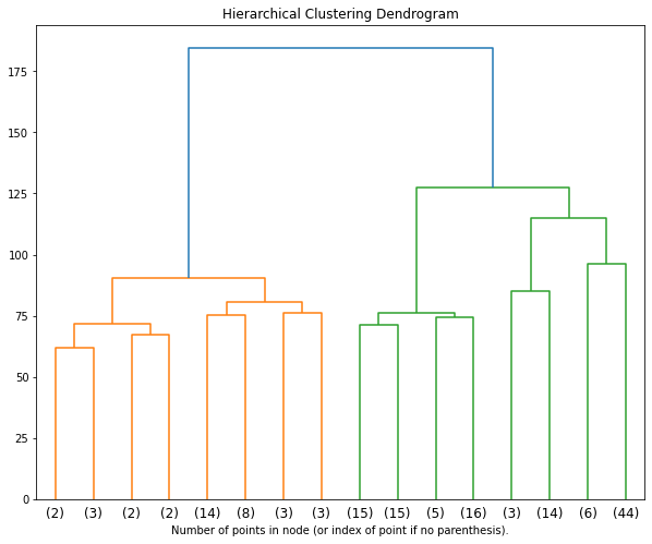
Hierarchical clustering
goal: Build nested clusters by merging or splitting them successively. This hierarchy of clusters is represented as a tree (or dendrogram). The root of the tree is the unique cluster that gathers all the samples, the leaves being the clusters with only one sample.
agglomerative/bottom up
divisive/top-dow
-
single linkage: minimizes the distance between the closest observations of pairs of clusters.
complete-linkage: minimizes the maximum distance between observations of pairs of clusters.

Pros
outputs a varity of number of clusters at different resolution levels
Cons
you still need to decide how many cluster is the best representation of the data
Well well well, how will hierarchical clustering perform in our dataset X?
from sklearn.cluster import AgglomerativeClustering
# set up the pipeline
pipe_clust = make_pipeline(
StandardScaler(),
# use an agglomerative clustering algorithm
AgglomerativeClustering(distance_threshold=0, n_clusters=None))
# run hierarchical clustering
data_hclust = pipe_clust.fit(data)
Now, let’s plot the hierarchical clustering results and decide how many clusters best represent the data
from scipy.cluster.hierarchy import dendrogram
# helper function for plot
def plot_dendrogram(model, **kwargs):
# create linkage matrix and then plot the dendrogram
# create the counts of samples under each node
counts = np.zeros(model.children_.shape[0])
n_samples = len(model.labels_)
for i, merge in enumerate(model.children_):
current_count = 0
for child_idx in merge:
if child_idx < n_samples:
current_count += 1 # leaf node
else:
current_count += counts[child_idx - n_samples]
counts[i] = current_count
linkage_matrix = np.column_stack([model.children_, model.distances_,
counts]).astype(float)
# plot the corresponding dendrogram
dendrogram(linkage_matrix, **kwargs)
# plot the top three levels of the dendrogram
fig = plt.figure(figsize=(10, 8))
plt.title('Hierarchical Clustering Dendrogram')
plot_dendrogram(data_hclust.named_steps.agglomerativeclustering,
truncate_mode='level',
p=3)
plt.xlabel("Number of points in node (or index of point if no parenthesis).")
plt.show()