Functional MRI
Contents
Functional MRI
Objectives
Functional magnetic resonance imaging
is an imaging modality that indirectly measures brain activity. fMRI acquires images of the brain in action in relation to different experimental conditions, having been designed to isolate specific cognitive processes. fMRI therefore makes it possible to map the functional organization of the brain, in different cognitive contexts.
The specific objectives of this part of the course are:
Understand the physical and physiological principles of the
fMRI signal.Understand the
modelof the haemodynamic response, invariant over time, which makes it possible toestimatethe level ofactivationinresponseto variousexperimental paradigms.Know the main stages of pre-processing of
fMRI data, namely registration, spatial smoothing and filtering of factors of non-interest. These steps are necessary in order to reducenoisein thefMRI signal, which does not reflectneuronal activity.Know the principle of generating an activation map, which, using
statistical models, makes it possible to test hypotheses on thefunctional organizationof thebrain.
Physical and physiological principles
3D images + time
|
|
|
|---|---|---|
|
Anatomy, structures and properties of tissues |
functional organization |
|
1 volume - 3D |
multiple |
|
multiple minutes |
seconds |
fMRI images are like a movie of the brain in action. They are composed of a series of 3D volumes which follow one another at a given frequency, rather than a single volume as was the case in structural MRI. We then speak of 4D or 3D+t images since the spatial dimensions (x, y, z) are extended by the dimension of time t. We could, for example, acquire 1 brain volume every 2 seconds, for 6 minutes, which would result in an fMRI dataset consisting of 180 3D brain volumes.
# Import required libraries
import pandas as pd
import nilearn
import numpy as np
from nilearn import datasets
from mpl_toolkits.mplot3d import Axes3D
from nilearn.input_data import NiftiLabelsMasker, NiftiMasker
from mpl_toolkits.mplot3d import Axes3D
import matplotlib.pyplot as plt

# Get a functional MRI from one participant
haxby_dataset = datasets.fetch_haxby()
haxby_func_filename = haxby_dataset.func[0]

# Initialize the masker
brain_masker = NiftiMasker(
    smoothing_fwhm=6,
    detrend=True, standardize=True,
    low_pass=0.1, high_pass=0.01, t_r=2,
    memory='nilearn_cache', memory_level=1, verbose=0)

# Apply the masker
brain_time_series = brain_masker.fit_transform(haxby_func_filename,
                                               confounds=None)
# Functions for the visualization of 3D voxels
def expand_coordinates(indices):
    x, y, z = indices
    x[1::2, :, :] += 1
    y[:, 1::2, :] += 1
    z[:, :, 1::2] += 1
    return x, y, z

def explode(data):
    shape_arr = np.array(data.shape)
    size = shape_arr[:3]*2 - 1
    exploded = np.zeros(np.concatenate([size, shape_arr[3:]]), dtype=data.dtype)
    exploded[::2, ::2, ::2] = data
    return exploded

# Initialization of the figure
fig = plt.figure(figsize=(15,7))

# Visualize a voxel
ax1 = fig.add_subplot(1, 2, 1, projection='3d')
ax1.set_xlabel("x")
ax1.set_ylabel("y")
ax1.set_zlabel("z")
ax1.grid(False)
colors = np.array([[['#1f77b430']*1]*1]*1)
colors = explode(colors)
filled = explode(np.ones((1, 1, 1)))
x, y, z = expand_coordinates(np.indices(np.array(filled.shape) + 1))

x[1::2, :, :] += 1
y[:, 1::2, :] += 1
z[:, :, 1::2] += 1

ax1.voxels(x, y, z, filled, facecolors=colors, edgecolors='white', shade=False)
plt.title("Voxel (3D)")

# add time series
# random voxels
voxel = 1
ax = fig.add_subplot(1, 2, 2)
ax.plot(brain_time_series[:, voxel])
ax.set_title("Time course of a voxel")

plt.xlabel("Time (s)", fontsize = 10)
plt.ylabel("BOLD signal", fontsize= 10)

from myst_nb import glue
glue("voxel-timeseries-fig", fig, display=False)
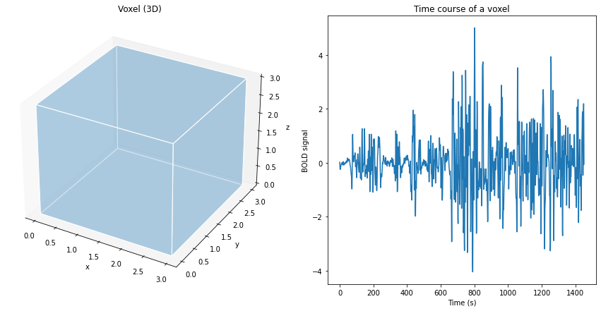
Fig. 60 Illustration of a volume element (voxel), of size 3 mm x 3 mm x 3 mm, and the associated fMRI time course.
The volume of the brain (3D) is formed by several thousand voxels, which are small volume units (3D) having a coordinate in space x, y, z. In fMRI, for each voxel in the brain, we have several measurement points of activity over time, which forms what is called a time series or time course. Typically, a few tens to hundreds of measurement points describe the time series. These measurement points are separated by a time interval, which can vary from milliseconds to seconds. These characteristics represent a good compromise between spatial and temporal resolution. As we will see later, the time series indirectly reflects changes in neural activity over time. Much of the work in functional MRI consists of analyzing these time series.
Trade-off between spatial vs temporal resolution in fMRI
When choosing an fMRI sequence, we are often led to favor temporal vs. spatial resolution. For example, we can take images of the whole brain in 700 ms with a spatial resolution of 3 x 3 x 3 mm\(^3\), or acquire the same image with a spatial resolution of 2 x 2 x 2 mm\(^3\) , but this time in 1500 ms. There is no one choice of parameter that is better than another, but the researcher must decide whether spatial or temporal resolution is more important for their research questions.
Neurovascular coupling
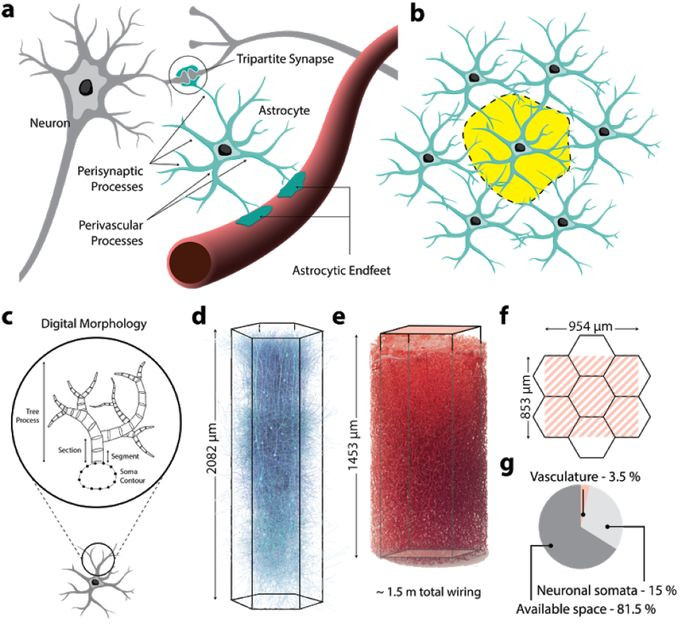
Fig. 61 Summary of neuro-glial-vascular architecture. (a) Astrocytes wrap around synapses, and have projections to the surface of microcapillaries. (b) Astrocytes establish exclusive anatomical domains, which minimally overlap with those of their astrocyte neighbors. (c) Diagram representing the morphology of a glial cell, with a body connected to a tree structure. (d) Neural micro-circuit. (e) cerebral microvasculature. (f) illustration of neural microcircuit size and vasculature. (g) percentage of volume occupancy in circuit space. Figure taken from the article by [Zisis et al., 2021], licensed under CC-BY-NC-ND.
The link between neuronal activity and fMRI signal is based on the phenomenon of neurovascular coupling, and more specifically the coupling between the post-synaptic activity of neurons and blood micro-capillaries. The production of neurotransmitters in the synaptic cleft triggers a series of chemical reactions in the surrounding glia cells. When neuronal activity increases, the accompanying chemical reactions lead to a metabolic demand for nutrients and ultimately the extraction of oxygen in the micro-capillaries locally. The following events then occur:
increased
volumeofcapillaries;increased
blood flow;increase the delivery of
oxygen(oxyhaemoglobin) topopulationsofactive neurons.
The increase in oxygen extraction therefore paradoxically leads to a local increase in the concentration of oxyhemoglobin (oxygenated blood) compared to the concentration of deoxyhemoglobin (deoxygenated blood) locally, which can be detected using fMRI. The first quantitative model of neurovascular coupling (known as the “balloon model”) was proposed by [Buxton et al., 1998].
Below you’ll find a cool video of a talk from Claudine Gautheir that nicely explains neurovascular coupling in a precise manner with great graphics!
BOLD signal
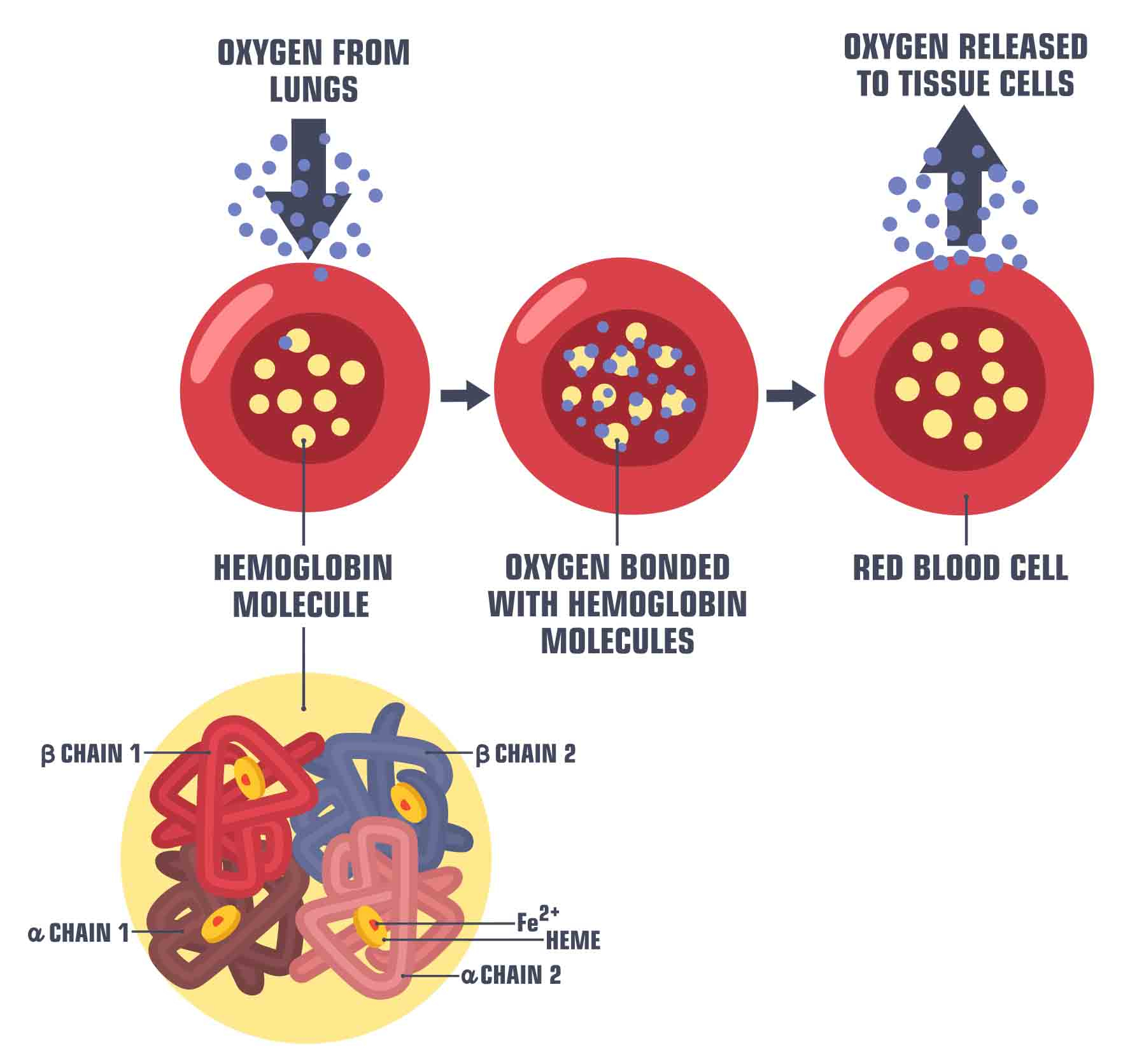
Fig. 62 Illustration of the transport of oxygen by hemoglobin in the blood. Image by ShadeDesign available at shutterstock ID 1472480087, used under standard shutterstock license.
What is the origin of the BOLD signal? Hemoglobin exists in two states, oxygenated (oxygen carrier) and deoxygenated (non-oxygen carrier). The presence of oxygen modifies the electromagnetic properties of this molecule:
Oxyhemoglobin is diamagnetic
Deoxyhemoglobin is paramagnetic
What this means is that when subjected to electromagnetic pulses, these two molecules behave very differently. Deoxyhemoglobin will create inhomogeneities in the magnetic field, whereas oxyhemoglobin has no effect on this same field. \(T_2^*\) weighted MRI sequences are very sensitive to such inhomogeneities. The deoxyhemoglobin therefore distorts the magnetic field \(B_O\) induced by the magnet, which causes the relaxation time \(T_2^*\) to be faster. The images acquired by fMRI therefore use a \(T_2^*\) contrast, and this has the effect of amplifying the signal when the blood becomes more oxygenated in response to an increase in neuronal activity. For this reason, the signal used in fMRI is called BOLD signal, for Blood oxygenation level-dependent, or signal dependent on blood oxygenation.
|
|
|
|---|---|---|
|
|
|
Impact on the |
Reduces the |
Increases the |
\(T_2^*\) |
Decreasing more rapidly |
Decreasing more slowly |
Effect on |
Added inhomogeneities/distortions |
No inhomogeneities |
Attention!
The BOLD signal in fMRI is an indirect measurement of neuronal activity. Indeed, this modality does not directly measure the activity of neurons, but rather the vascular consequences of the metabolic demand associated with neuronal activity. This neurovascular coupling relationship is very complex, involving many different metabolites and mechanisms.
Hemodynamic response function
Short impulse response
# To get an impulse response, we simulate a single event
# occurring at time t=0, with duration 1s.
import numpy as np
frame_times = np.linspace(0, 30, 61)
onset, amplitude, duration = 0., 1., 1.
exp_condition = np.array((onset, duration, amplitude)).reshape(3, 1)
stim = np.zeros_like(frame_times)
stim[(frame_times > onset) * (frame_times <= onset + duration)] = amplitude

# Now we plot the hrf
from nilearn.glm.first_level import compute_regressor
import matplotlib.pyplot as plt
fig = plt.figure(figsize=(6, 4))

# obtain the signal of interest by convolution
signal, name = compute_regressor(
    exp_condition, 'glover', frame_times, con_id='main',
    oversampling=16)

# plot this
plt.fill(frame_times, stim, 'b', alpha=.5, label='stimulus')
plt.plot(frame_times, signal.T[0], 'r', label=name[0])

# Glue the figure
from myst_nb import glue
glue("hrf-fig", fig, display=False)
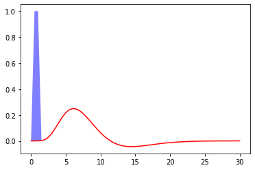
Fig. 63 Hemodynamic response to a unit pulse of 1 second duration, following the model proposed by Glover et al. (1999) []. The code to generate this figure is adapted from a Nilearn tutorial, and the figure is licensed under CC-BY.
The following figure shows the expected hemodynamic response following a finite activation pulse at time 0, and of duration 1 second. The response to this type of stimulus visualizes the most widely used hemodynamic response, describing the sustained relationship between neural activity (blue) and BOLD signal (red), as a function of time. The 'x' axis represents time, in seconds, and the 'y' axis the brain signal, expressed as percentage change from a baseline. Important features of the hemodynamic response function are:
temporal resolution: this is a
slow response, which lasts between 15 to 20 seconds depending on thestimulusthe time before reaching the maximum amplitude: from 4 to 6 seconds
Post-stimulation trough (Undershoot in English): decreases from the
maximum amplitudeuntil it is below thebaseline.Return to baseline: The
functionreturns to thelevelbefore thestimulationafter approximately 15 to 20secondsMaximum amplitude: The order of the
relative changeof theBOLD signalreaches around 5% forsensory stimulations, while it is more like **0.1 to 0.5% ** for othercognitive paradigms
Attention!
The above hemodynamic response model is very rigid and may prove to be an invalid assumption for some populations, especially if the neurovascular coupling is different from the original study by [Glover, 1999]. This is probably the case, for example, in the elderly or in individuals with cardiovascular diseases. The hemodynamic response function can also vary from one region of the brain to another. It is possible to use models of the hemodynamic response which are more flexible and allow, for example, to modify the time of the peak of the response.
The Brain (BOLD) as a System
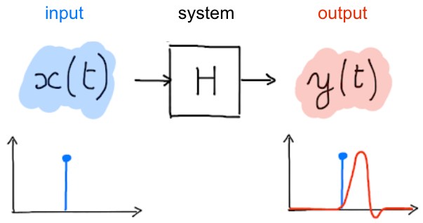
Fig. 64 A system takes an input time course and associates it with an output time course. Figure licensed under CC-BY.
The process that transforms neuronal activity into a BOLD signal can be formalized within the general framework of systems theory. More specifically, the hemodynamic response function of the Fig. 63 is generally approximated as a linear and time-invariant system. This approximation underlies the inferences we make about the functional organization of the brain: we use it to estimate the response to a given task or condition. The hemodynamic response function of the Fig. 63 relates to a simple experimental context: a short and isolated stimulation. In reality, experimental paradigms are much more complex: they repeatedly alternate between different experimental conditions/stimuli (in blocks, randomly or in a specific order). In addition, they often involve more than one stimulation close in time, or/and stimuli that extend over several milliseconds or seconds. What then happens to the hemodynamic response function? A key property of a linear system is to be additive, ie the response to a long stimulation can be decomposed like the superposition of responses to shorter stimulations. Another key assumption is time invariance, which tells us that the system response will not vary if we perform the same short stimulation at different times. When combining the linearity assumption with time invariance, it is possible to predict the response to any series of complex stimuli from the response to a single short stimulus, as shown in :refnum:`hrf-fig`. The study by Logothetis et al. (2001) {cite:p} Logothetis2001-lt was the first to demonstrate in monkeys that this assumption of linearity and invariance seems to be fairly well respected, at least in the visual cortex for simple visual stimuli (context of the study).
Additivity
A system is said to be additive if the response to several impulses corresponds to the sum of the responses to these impulses taken independently. This `behavior is illustrated below.
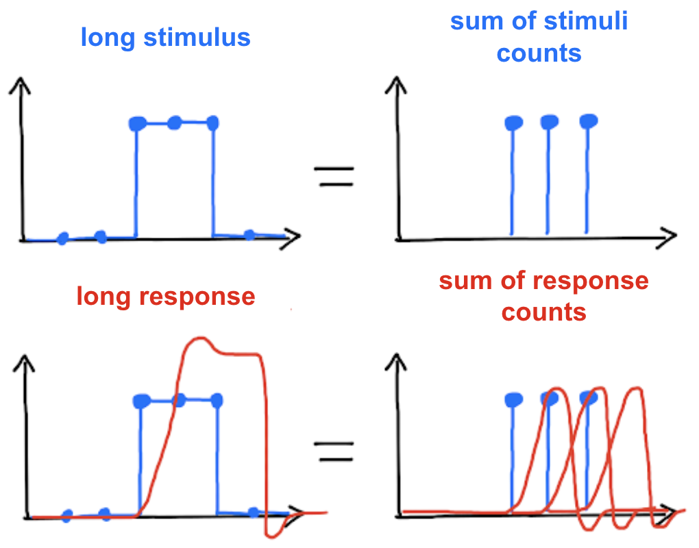
Fig. 65 Figure licensed under CC-BY.
fMRI data pre-processing
We have discussed in previous sections various aspects of modeling the hemodynamic response. Another important point in fMRI is the modeling of noise and sources of variations that may be present in time series. Different confounding factors and artifacts (from the MRI scanner or from the scanned participants themselves) can induce substantial fluctuations in the measured BOLD signal, and confound inferences made about the neural activity in response to tasks:
heart/pulse,artefactlinked to themovementof theparticipantduring theacquisition,fault in the
antenna,inhomogeneitiesin themagnetic field, in particular at theair-tissue intersections,differences between the
anatomyof theparticipants.
Different modeling strategies can be employed to reduce the influence of confounding factors and artifacts. In this section, we present an overview of three major fMRI preprocessing steps, which typically are applied sequentially. We speak of processing chain, or even pipeline or worflow.
Realignment/registration
The registration consists in aligning an image to a reference image. It is a pre-processing step completed before individual statistical and group statistical analyses, as these presuppose that there is a match between the voxels of images within a participant and between participants. We have already discussed the registration-tip>registration in the morphometry section. We will see that three types of registration are used in functional MRI.
Movement registration
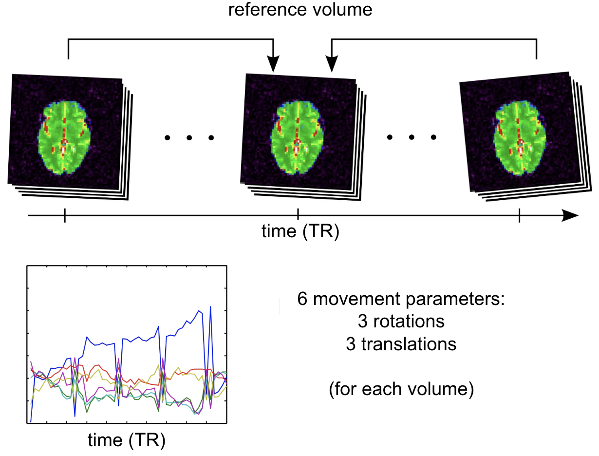
Fig. 66 Illustration of the motion registration process during an fMRI scan. Figure licensed under CC-BY.
Often, the participant does not maintain exactly the same position of the head in the scanner throughout the acquisitions, which can sometimes last more than an hour and/or require stops. (e.g. yawning, muscle fatigue, blinking, etc.). These movements have non-negligible impacts on the BOLD signal. They can cause distortions in the signal intensity of the picture. They imply that, from one image to another, the same voxel does not necessarily correspond to the same cerebral structure. As the brain of the same individual does not change shape or size through the acquisitions, this step uses a special case of affine transformation, called rigid transformation, comprising only three translations (according to x, y and z) and three rotations (according to x, y and z). A reference volume is used as the target for the registration, for example the first volume of the series, the last, or else the average of all the volumes. Different movement parameters are estimated for each volume, and can be represented over time as on the graph above.
Excessive movements
The level of movement varies depending on the population studied. Children and older people tend to move more than young adults. Some researchers choose to exclude participants who moved beyond a certain threshold.
BOLD registration with \(T_1\)
It is common to align the BOLD image with the \(T_1\) anatomical image of the participant. Why? The functional image has a lower spatial resolution than the structural image \(T_1\): we have shorter acquisition times to acquire the same volume. The contrast between anatomical structures is also much better in \(T_1\). It is therefore useful to superimpose the two images to locate the BOLD activations. This transformation is estimated rigidly, like motion. Note that there are also non-rigid distortions caused by field non-uniformities, which can be additionally corrected.
Registration in stereotactic space
Fig. 67 Illustration of the registration process of a T1 MRI on a stereotactic space (here in the macaque). We start with an affine transformation (to correct the position of the head and its size), then non-linear (to adjust the position of the furrows and subcortical structures). Figure under CC-BY 4.0 license contributed by Dan J Gale.
For inter-individual comparisons or group statistical analyses, there must be a match between the voxels of images from different individuals. However, brains and anatomical structures can have different sizes and shapes from individual to individual. Registration in stereotactic space, also sometimes called spatial normalization, consists in registering the \(T_1\) image in a target standard space defined by the chosen atlas, template, or so on, thus making the brains of different individuals comparable. This technique is identical to what is done for morphometry studies. The MNI152 template (Montreal Neurological Institute) is widely used as a standard space in the community. The respective transformation combines affine transformation and non-linear transformation.
Spatial smoothing
# Import necessary modules
import matplotlib.pyplot as plt
import numpy as np
from myst_nb import glue
import seaborn as sns

import warnings
warnings.filterwarnings("ignore")

# Download a functional scan
from nilearn import datasets
haxby_dataset = datasets.fetch_haxby()

# Calculate mean image
from nilearn.image.image import mean_img
func_filename = haxby_dataset.func[0]
mean_haxby = mean_img(func_filename)

from nilearn.plotting import plot_epi, show

# Initialize the figure
fig = plt.figure(figsize=(15, 15))

from nilearn.plotting import plot_anat
from nilearn.image import math_img
from nilearn.input_data import NiftiMasker
from nilearn.image import smooth_img

list_fwhm = (0, 5, 8, 10)
n_fwhm = len(list_fwhm)
coords = [-5, 5, -25]

for num, fwhm in enumerate(list_fwhm):
    ax_plot = plt.subplot2grid((n_fwhm, 1), (num, 0), colspan=1)
    vol = smooth_img(mean_haxby, fwhm)
    plot_epi(vol,
              cut_coords=coords,
              axes=ax_plot,
              black_bg=True,
              title=f'FWHM={fwhm}',
              vmax=1500)

from myst_nb import glue
glue("smoothing-fmri-fig", fig, display=False)
Fig. 68 Illustration of the impact of smoothing on a BOLD volume.
As the ``FWHM parameter increases, the measure in a voxel represents the average in a larger and larger spatial neighborhood.
This figure is generated by python code using the nilearn library and the haxby dataset (click on + to see the code). The figure is licensed under CC-BY.
We return here to a preprocessing step that we have already covered during the VBM section: spatial smoothing. The smoothing process is similar for functional MRI, but the purpose of this step is a little different. Random thermal noise plays a greater role in the BOLD signal, and can have a detrimental effect on statistical analyses. Spatial smoothing reduces this random noise. Apart from improving the signal-to-noise ratio, smoothing also makes it possible to attenuate registration imperfections between participants, by diffusing the activity in space. More operationally, smoothing consists in taking the voxels of the image and replacing them with a new value considering the values of neighboring voxels. Each neighboring voxel is assigned a weight that quantifies its contribution to the new value assigned to a target voxel. The original value of the target voxel is the one that will have the greatest weighting, and the values of neighboring voxels will be weighted according to the proximity maintained with the target voxel. So smoothing replaces the value associated with each voxel with a weighted average of its neighbors. As it is a weighted average, the original value of the voxel is the one that will have the greatest weight, but the values of the voxels located directly around it will also affect it greatly. The FWHM parameter (full width at half maximum) controls the scale of this smoothing (larger or smaller). It determines the spread of neighboring voxels that will participate in the new value of a target voxel. From a mathematical point of view, the FWHM parameter represents half the width of the Gaussian curve, which describes randomly distributed noise. A larger FWHM value underlies a more spread participation of neighboring voxels to the new value of a target voxel in the image. Several studies choose 6 mm as the value for the FWHM parameter.
Filtering out factors of no interest
# Import necessary libraries
import matplotlib.pyplot as plt
import numpy as np
from myst_nb import glue
import seaborn as sns

import warnings
warnings.filterwarnings("ignore")

# Import a functional dataset
from nilearn import datasets
dataset = datasets.fetch_development_fmri(n_subjects=1)
func_filename = dataset.func[0]

# Import an atlas
atlas = datasets.fetch_atlas_harvard_oxford('cort-maxprob-thr25-2mm')

# Initialize the figure
fig = plt.figure(figsize=(15, 15))

# Generate a time series
masker = NiftiLabelsMasker(atlas.maps,
                           labels=atlas.labels,
                           standardize=True)
masker.fit(func_filename)
signals = masker.transform(func_filename)

# Plot the atlas
from nilearn.plotting import plot_roi
ax = plt.subplot2grid((2, 2), (0, 0), colspan=2)
plot_roi(atlas.maps,
    axes=ax,
    title="Atlas Harvard-Oxford",
    cut_coords=(8, -4, 9),
    colorbar=True,
    cmap='Paired')

# Plot the time series
import matplotlib.pyplot as plt
ax = plt.subplot2grid((2, 2), (1, 0), colspan=1)
for label_idx in range(3):
    ax.plot(signals[:, label_idx],
            linewidth=2,
            label=atlas.labels[label_idx + 1])  # 0 is background
ax.legend(loc=2)
ax.set_title("Before correction of slow drifts")

# Generates time series after correcting for slow drifts
masker = NiftiLabelsMasker(atlas.maps,
                           high_pass=0.01,
                           t_r=4,
                           labels=atlas.labels,
                           standardize=True)
masker.fit(func_filename)
signals = masker.transform(func_filename)

# Plot the time series
ax = plt.subplot2grid((2, 2), (1, 1), colspan=1)
for label_idx in range(3):
    ax.plot(signals[:, label_idx],
            linewidth=2,
            label=atlas.labels[label_idx + 1])  # 0 is background
ax.legend(loc=2)
ax.set_title("After correction of slow drifts")

from myst_nb import glue
glue("detrending-fmri-fig", fig, display=False)
Fig. 69 We extract the time series associated with the Harvard-Oxford atlas before (on the left) and after (on the right) regression of the slow drifts.
This figure is adapted from a tutorial from nilearn from a development_fmri dataset (click on + to see the code). The figure is licensed under CC-BY.
The last pre-processing step that will be addressed is that of filtering out factors of non-interest, or confounding factors. These confounding factors can have different sources, such as heart/pulse, breathing, or movement. They are characterized in particular by different frequencies of the spectrum, either slower or faster. Slow drifts are a common example of factors of no interest, and they are quite easily spotted in the signal. In this case, we can apply a high-pass filter, which only keeps frequencies higher than a certain threshold (e.g. 0.01 Hz). Many other types of confounders are commonly regressed in fMRI - for example motion parameters.
Statistical analyses
Statistical analyzes generally include individual analyses in which the time series are analyzed separately for each of the participants (we analyze the effect of the experimental manipulations), then group analyses (we analyze the effect at the group level), where this data is combined for multiple participants for analysis. In this section we will briefly discuss the generation of individual statistical maps. We will come back to the group analyzes and the statistical models used in the chapter on cerebral statistical maps.
fMRI - Task-Based Experiments
from nilearn.datasets import fetch_spm_auditory
from nilearn import image
from nilearn import masking
import numpy as np
import pandas as pd
import matplotlib.pyplot as plt

# load fMRI data
subject_data = fetch_spm_auditory()

fig = plt.figure(figsize=(10,5))

# load events
events = pd.read_table(subject_data['events'])
events['amplitude'] = 1
events = events[events['trial_type']=='active']
events = events.loc[:,['onset', 'duration', 'amplitude']].to_numpy().transpose()

frame_times = np.linspace(4*7, 100*7, 100-4+1)
from nilearn.glm.first_level import compute_regressor

block, name = compute_regressor(
        events, None, frame_times, con_id='main',
        oversampling=16)
block = block > 0

response, name = compute_regressor(
        events, 'glover', frame_times, con_id='main',
        oversampling=16)

plt.fill(frame_times, block, 'b', alpha=.5, label='stimulus')
plt.plot(frame_times, response, 'r', label=name)
plt.xlabel('time (s)')
plt.ylabel('BOLD signal (u.a.)')

# Glue the figure
from myst_nb import glue
glue("hrf-auditory-fig", fig, display=False)
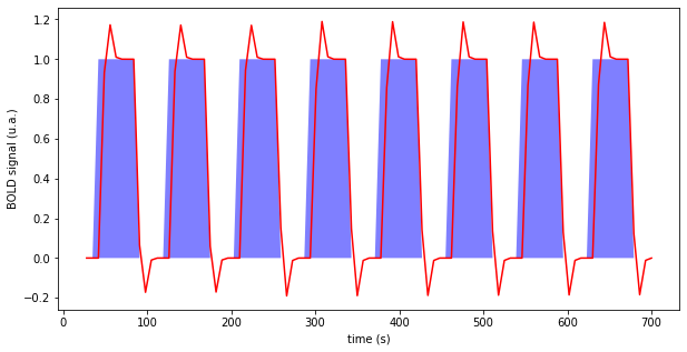
Fig. 70 Illustration of a block paradigm, here auditory perception. In blue: periods of audio stimulation. In red: predicted brain response with the time-invariant linear response model, and a unitary response following the model of Glover et al. (1999) []. The code to generate this figure is adapted from a Nilearn tutorial, and the figure is licensed under CC-BY.
To determine whether brain voxel activity changes in response to experimental manipulations, a standard experimental approach is to manipulate the task the participant is performing in the scanner, for example by alternating different block conditions (auditory stimulation, silence). We then use contrasts, also called subtraction analysis, which proceed by comparing the time series of one condition to another condition, or to a base threshold. In a simplified way, the analysis consists of computing the difference of average brain activity between the period of silence and the period of auditory stimulations. These contrasts are repeated for each of the voxels of the brain, and generate a cerebral statistical map.
Massive univariate regression
It is possible to generalize the subtraction analysis to account for 1) the shape of the hemodynamic response
2) the presence of several conditions in the same experiment. In practice, by making an assumption of a linear and time-invariant system, one generates a prediction of the shape of the response to an experimental condition, as in the Fig. 70. A linear regression model is then used to estimate the amplitude of this response, in order to adjust the model as closely as possible to the values measured in a voxel. This regression generates an amplitude parameter (and runs a significance test) for each voxel. We talk about univariate regression because each voxel in the brain is analyzed independently. And we talk about massive univariate regression, because we repeat this procedure for tens (or even hundreds) of thousands of voxels!(activation-section)=
fMRI - Activation Maps
# Import necessary libraries
from nilearn.datasets import fetch_spm_auditory
from nilearn import image
from nilearn import masking
import pandas as pd

# Initialize the figure
fig = plt.figure(figsize=(7,5))

# load fMRI data
subject_data = fetch_spm_auditory()
fmri_img = image.concat_imgs(subject_data.func)

# Make an average
mean_img = image.mean_img(fmri_img)
mask = masking.compute_epi_mask(mean_img)

# Clean and smooth data
fmri_img = image.clean_img(fmri_img, high_pass=0.01, t_r=7, standardize=False)
fmri_img = image.smooth_img(fmri_img, 5.)

# load events
events = pd.read_table(subject_data['events'])

# Fit model
from nilearn.glm.first_level import FirstLevelModel
fmri_glm = FirstLevelModel(t_r=7,
                           drift_model='cosine',
                           signal_scaling=False,
                           mask_img=mask,
                           minimize_memory=False)

fmri_glm = fmri_glm.fit(fmri_img, events)

# Extract activation clusters
from nilearn.reporting import get_clusters_table
from nilearn import input_data
z_map = fmri_glm.compute_contrast('active - rest')
table = get_clusters_table(z_map, stat_threshold=3.1,
                           cluster_threshold=20).set_index('Cluster ID', drop=True)

# get the 3 largest clusters' max x, y, and z coordinates
coords = table.loc[range(1, 4), ['X', 'Y', 'Z']].values

# extract time series from each coordinate
masker = input_data.NiftiSpheresMasker(coords)
real_timeseries = masker.fit_transform(fmri_img)
predicted_timeseries = masker.fit_transform(fmri_glm.predicted[0])

# Plot figure
# colors for each of the clusters
colors = ['blue', 'navy', 'purple', 'magenta', 'olive', 'teal']
# plot the time series and corresponding locations
from nilearn import plotting
fig1, axs1 = plt.subplots(2, 3)
for i in range(0, 3):
    # plotting time series
    axs1[0, i].set_title('Cluster peak {}\n'.format(coords[i]))
    axs1[0, i].plot(real_timeseries[:, i], c=colors[i], lw=2)
    axs1[0, i].plot(predicted_timeseries[:, i], c='r', ls='--', lw=2)
    axs1[0, i].set_xlabel('Time')
    axs1[0, i].set_ylabel('Signal intensity', labelpad=0)
    # plotting image below the time series
    roi_img = plotting.plot_stat_map(
        z_map, cut_coords=[coords[i][2]], threshold=3.1, figure=fig1,
        axes=axs1[1, i], display_mode='z', colorbar=False, bg_img=mean_img)
    roi_img.add_markers([coords[i]], colors[i], 300)

fig1.set_size_inches(24, 14)

# Glue the figure
from myst_nb import glue
glue("auditory-fig", fig1, display=False)
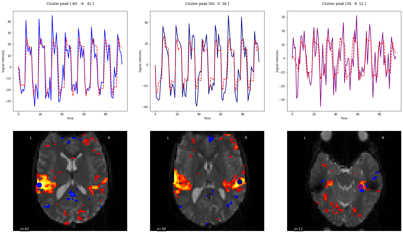
Fig. 71 Activation map for an auditory block paradigm. The three main activation peaks have been identified, and the signal is presented for each peak, superimposed with the activity predicted by the model based on the auditory stimuli. Note how the shape of the response is identical for the three selected voxels, but the amplitude of the pattern varies (estimated by the regression). The code to generate this figure is adapted from a Nilearn tutorial, and the figure is licensed under CC-BY.
Activation maps are often what are found in scientific papers in the results section. These are maps of the brain on which the statistics obtained are superimposed (e.g. level of activation, t-test, p-value). They are superimposed vis-à-vis the corresponding voxels or regions. They are often presented following the application of thresholds or masks, isolating the most active regions, with the average differences between the most important and/or the most statistically significant conditions. Via such maps, we can study the organization of systems of interest (visual, motor, auditory, working memory, etc.), but also compare groups or associate the level of activation with traits of interest such as age, training, etc. .
Conclusions
Performing an fMRI experiment requires thinking carefully about the conditions of interest and controls to isolate relevant cognitive processes, but it also requires thinking about the underlying assumptions:
neural hypotheses:
populationsofneuronswillactivateinresponseto ourconditions.neurovascular assumptions: We assume that the
neuronal responsewill becoupledto acharacteristic vascular responsethat can bemodeledwith ahemodynamic function, which islinearandtime-invariant.Statistical assumptions: We assume that our
regression modeladequately capturesbrain activity, and that we correctly account forconfounding factorsandartifacts.
For all these reasons, there are still important limitations to the interpretation that can be made based on fMRI results. But it is also the non-invasive whole-brain technique that has the best spatial resolution to date.
References
- 1
Richard B. Buxton, Eric C. Wong, and Lawrence R. Frank. Dynamics of blood flow and oxygenation changes during brain activation: The balloon model. Magnetic Resonance in Medicine, 39(6):855–864, 1998. _eprint: https://onlinelibrary.wiley.com/doi/pdf/10.1002/mrm.1910390602. URL: https://onlinelibrary.wiley.com/doi/abs/10.1002/mrm.1910390602 (visited on 2022-04-19), doi:10.1002/mrm.1910390602.
- 2
Gary H. Glover. Deconvolution of Impulse Response in Event-Related BOLD fMRI1. NeuroImage, 9(4):416–429, April 1999. URL: https://www.sciencedirect.com/science/article/pii/S1053811998904190 (visited on 2022-04-19), doi:10.1006/nimg.1998.0419.
- 3
Eleftherios Zisis, Daniel Keller, Lida Kanari, Alexis Arnaudon, Michael Gevaert, Thomas Delemontex, Benoît Coste, Alessandro Foni, Marwan Abdellah, Corrado Calì, Kathryn Hess, Pierre Julius Magistretti, Felix Schürmann, and Henry Markram. Architecture of the Neuro-Glia-Vascular System. Technical Report, bioRxiv, January 2021. Section: New Results Type: article. URL: https://www.biorxiv.org/content/10.1101/2021.01.19.427241v3 (visited on 2022-04-20), doi:10.1101/2021.01.19.427241.
Exercises
In the following we created a few exercises that aim to recap core aspects of this part of the course and thus should allow you to assess if you understood the main points.
Exercise 4.1
Choose the right answer. fMRI data are usually…
A picture of the
brain.A dozen
imagesof thebrain.Dozens of
brainimages.
Exercise 4.2
What is the BOLD signal? (right/wrong).
A very brave
signal.A
T2*-weightedsequence.A type of
MRIsequencethat measuresbrain activity.A type of
MRIsequencethat measuresblood oxygenation.
Exercise 4.3
Choose the right answer. The BOLD signal depends on…
Local blood flow.Local blood volume.The relative
deoxyhemoglobinconcentration.All of the above answers.
Exercise 4.4
(Right/wrong) The principle of additivity of the hemodynamic response is…
A
mathematical model.A basic property of
neurovascular coupling, always verified.A common
hypothesis, partly confirmed experimentally.
Exercise 4.5
What phenomena cause a change in the signal measured by the BOLD?
Exercise 4.6
In which portion of the vascular tree are the main changes related to local neuronal activity observed?
Exercise 4.7
Right/wrong?
The
hemodynamic responsestarts immediately afterneuronal excitation.The
hemodynamic responseis visibleone secondafterneuronal excitation.The
hemodynamic responseis maximal2 secondsafterneuronal excitation.The
hemodynamic responseis still visible7 secondsafterneuronal excitation.The
hemodynamic responseis still visible30 secondsafterneuronal excitation.
Exercise 4.8
True/False/Maybe? (explain why)
FunctionalandstructuralMRIdatamust berealignedto generate anactivation map.“Raw”fMRIdata(before pre-processing) cannot be used to generate anactivation map.Spatial smoothingis important even forindividual analysis.
Exercise 4.9
We compare activation for a memory task in the frontal cortex between two groups of participants: young participants and elderly participants (N=20 per group). Contrary to our hypotheses, no difference is found. Give three reasons that can explain this result. For each possible reason, suggest a modification to the protocol that would uncover a difference between the two groups.
Exercise 4.10
To answer the questions in this exercise, first read the article High-resolution functional MRI of the human amygdala at 7 T by Mensen et al. (published in 2013 in the journal European Journal of radiology, volume 82, pages 728 to 733). It is freely available at this address. The following questions require short-answer answers.
What type of
participantswere recruited in this study?What is the main
objectiveof the study?What are the
inclusionandexclusion criteria?What
neuroimagingtechnique is used? Is it astructuralorfunctionaltechnique?What type of
image acquisition sequenceis used? List theparameters.Which pre-processing steps were applied?
What
statistical modelswere applied?Which figure (or table) meets the main
objectiveof the study?What is the main result of the study?