Statistical maps
Contents
Statistical maps
# Import visualization libraries
# and prepare the layout of the figure
import numpy as np
import matplotlib.pyplot as plt

# ignore warnings
import warnings
warnings.filterwarnings("ignore")


# Download a motor activation contrast from NeuroVault
from nilearn import datasets
motor_images = datasets.fetch_neurovault_motor_task()
stat_img = motor_images.images[0]

# Visualization of the 3D brain volume
from nilearn.plotting import plot_stat_map, view_img
from myst_nb import glue


stat_map_fig = plt.figure(figsize=(12, 4));
plot_stat_map(stat_img,
              axes=stat_map_fig.gca(),
              cut_coords=(36, -27, 66),
              black_bg=False, cmap='coolwarm',
              title='Statistical map related to movements'
);

glue("stat_map_fig", stat_map_fig, display=False);


stat_map_fig_int = view_img(stat_img,
                   threshold=3,
                   title="Statistical map related to movements",
                   cut_coords=[36, -27, 66], cmap='RdBu_r'
                   );

glue("stat_map_fig_int", stat_map_fig_int, display=False);

plt.close();
Fig. 72 A regression model is applied to each voxel to generate a statistical brain map. Here, the statistical map corresponds to changes in fMRI activation during hand movements. The statistical map is visualized thanks to this nilearn tutorial and a motor activity map distributed via NeuroVault. Click on the + to see the code.
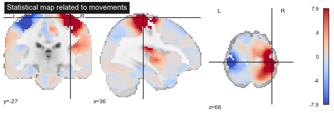
Fig. 73 A regression model is applied to each voxel to generate a statistical brain map. Here, the statistical map corresponds to changes in fMRI activation during hand movements. The statistical map is visualized thanks to this nilearn tutorial and a motor activity map distributed via NeuroVault. Click on the + to see the code.
Course Objectives
In this chapter, we will discuss the use of regression models to generate brain statistical maps at the individual and group level. Group statistics make it possible to combine the brain measurements of several individuals and thus e.g. also to contrast groups (e.g. a group of young people and a group of elderly people) or to test the association with a continuous variable (e.g. age ).
The specific objectives of the course relate to the following concepts:
linear regressionthe
general linear modelstatistical tests
Linear regression
The concepts presented in this chapter apply to most imaging modalities seen in this part of the course in more or less the same way. In order to make things a little more concrete, we are going to focus here on a morphometric analysis, i.e. VBM (structural MRI). This analysis uses the OASIS dataset (Marcus et al., 2010). Gray matter density maps for OASIS data are available via the nilearn library. For each voxel, we have a local measure of gray matter density which varies between 0 and 1. As all the images of the 100 OASIS participants used in this example were registered in the same stereotactic space, each voxel is associated with a series of 100 measurements.
Variables
# ignore warnings
import warnings
warnings.filterwarnings("ignore")

# Import libraries
import numpy as np
import matplotlib.pyplot as plt
from nilearn import datasets
from nilearn.input_data import NiftiMasker
from nilearn.image import get_data
import seaborn as sns

sns.set_theme(style="whitegrid")

# Load data
n_subjects = 100
oasis_dataset = datasets.fetch_oasis_vbm(n_subjects=n_subjects)
gray_matter_map_filenames = oasis_dataset.gray_matter_maps
age = oasis_dataset.ext_vars['age'].astype(float)
sex = oasis_dataset.ext_vars['mf'] == b'F'

# Converting data to pandas dataframe
# Two interesting voxels have been selected
import pandas as pd
coords = np.array([[ 29., 10., 4.], [-19., 8., -11.]])
colors = ['blue', 'olive']

from nilearn import input_data
masker = input_data.NiftiSpheresMasker(coords)
gm = masker.fit_transform(gray_matter_map_filenames)
subject_label = [f'sub-{num}' for num in range(n_subjects)]
df = pd.DataFrame({
    "subject_label": subject_label,
    "age": age,
    "gender": oasis_dataset.ext_vars['mf'],
    "GM1": gm[:, 0],
    "GM2": gm[:, 1]
    })

df["gender"] = df["gender"].replace([b'F', b'M'], value=['female', 'male'])

# We generate the Figure
from nilearn import plotting
fig_dist = plt. figure(figsize=(24, 14))

for i in range(0, 6):
    nx = np.floor_divide(i, 3)
    ny = np.remainder(i, 3)
    ax = plt.subplot2grid((2, 5), (nx, ny), colspan=1)
    king_img = plotting.plot_anat(
        gray_matter_map_filenames[i], cut_coords=[coords[nx][2]], figure=fig_dist,
        axes=ax, display_mode='z', colorbar=False)
    king_img.add_markers([coords[nx]], colors[nx], 1000)

ax = plt.subplot2grid((2, 5), (0, 3), colspan=2)
sns.histplot(
    df["GM1"], ax=ax, binwidth=0.05, binrange=[0, 1], stat='frequency')

ax = plt.subplot2grid((2, 5), (1, 3), colspan=2)
sns.histplot(
    df["GM2"], ax=ax, binwidth=0.05, binrange=[0, 1], stat='frequency')

from myst_nb import glue
glue("vbm_distribution_fig", fig_dist, display=False)

plt.close()
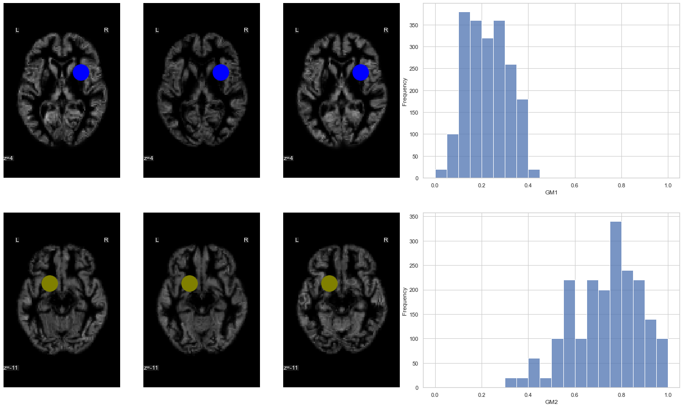
Fig. 74 The position of two voxels (shown using a blue circle (top) and an olive circle (bottom)) is here superimposed on gray matter density maps for different participants from the OASIS dataset ( Marcus et al., 2010). On the right, a histogram represents the distribution of gray matter density for the corresponding voxel, across a sample of 100 participants. This figure is adapted from a nilearn tutorial (click on + to see the code). This figure is distributed under license CC-BY 4.0.
This is our dependent variable. We will then seek to explain the variations of this measurement across the participants using other variables, called the predictors. For our example, we will start with the age of the participants which varies here from 20 years old to 90 years old.
Linear model
The concept supporting the regression model is an equation, or a kind of law, which will attempt to predict the dependent variable (here, gray matter density) from predictors (eg, age). But unlike a physical law that attempts to represent an exact dependency (to some degree), this law captures only a fraction of the variance of our measurement. The law will therefore incorporate some noise representing all the sources of variability that we cannot capture with our relationship. The mathematical relationship will take the following form:
gray_matter_density = b0 + b1 * age + e
Or
gray_matter_densityis thedensityofgray mattermeasured for avoxelageis theageof theparticipantb0is aconstantvalue, called “intercept” (the ordinate at the origin). This value is the same for allparticipants. In this case, it would represent thedensityofgray matterobserved at birth (age=0), averaged over thepopulation.b1is anotherconstantwhich in this example measures the reduction ingray matterper year of life (averaged over thepopulation).eis a measurementnoisethat captures all the variations ofdensity_gray_matterthat cannot be explained withage. Typically, we assume that themeanofein thepopulationis0and that thevarianceofeis the same for allparticipants, equal to \(\sigma^2\).
We obviously do not know the coefficients b0 and b1. It will be necessary to use a statistical procedure to estimate them, ie to guess (at best) their values from the data we have. For example, for the olive color region (right graph in regression_vbm_fig), we see that we lose about 25% of density between 20 years and 90 years (see {numref }regression_vbm_fig). We therefore lose about 0.35% of gray matter density per year, i.e. b1 ~ -0.0035. Using this value and noting that the gray matter density is roughly 0.85 at 20 years, we deduce that the density at birth should be b0=0.92. In practice, the statistical procedure will choose the values b0 and b1 to minimize the amplitude of the residuals of the regression:
residuals = gray_matter_density - b0 - b1 * age
Once the b0 and b1 coefficients have been estimated, a straight line can be drawn representing the gray matter density values predicted from the age of the participants (see regression_vbm_fig). If the model makes it possible to explain a large part of the variability of the dependent variable, the measured points will be close to the prediction line.
# We reorganize the DataFrame to work with seaborn
df2 = df.melt(id_vars=["age", "gender"], value_vars=["GM1", "GM2"], value_name="GM")
fig = sns.lmplot(x="age", y="GM", data=df2, col='variable',
            ci=None, scatter_kws={"s": 50, "alpha": 1})

# We paste the figure in the jupyter book
from myst_nb import glue
glue("regression_vbm_fig", fig.fig, display=False)

plt.close()
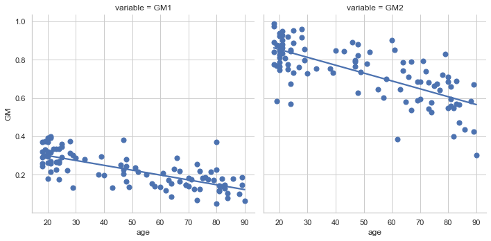
Fig. 75 Example of linear regression where the dependent variable is gray matter density for a voxel and the predictor is age. Gray matter density values are from 100 participants from the OASIS dataset (Marcus et al., 2010). The two voxels used here are the same ones shown in the Fig. 74 (blue voxel on the left, olive voxel on the right). Linear regression is performed using seaborn (click on + to see the code). This figure is distributed under license CC-BY 4.0.
Massively univariate analysis
from nilearn.glm.second_level import make_second_level_design_matrix
design_df = df[["subject_label", "age"]].replace(['female', 'male'], value=[0, 1])
design_matrix = make_second_level_design_matrix(
    subject_label,
    design_df
    )
from nilearn.glm.second_level import SecondLevelModel
second_level_model = SecondLevelModel(smoothing_fwhm=5.0)
second_level_model = second_level_model.fit(gray_matter_map_filenames,
                                            design_matrix=design_matrix)
beta0 = second_level_model.compute_contrast(second_level_contrast="intercept", output_type="effect_size")
beta1 = second_level_model.compute_contrast(second_level_contrast="age", output_type="effect_size")

# We generate the Figure
from nilearn import plotting
import seaborn as sns
fig = plt. figure(figsize=(24, 14))

ax = plt.subplot2grid((2, 4), (0, 0), colspan=3)
king_img = plotting.plot_stat_map(
    beta0, cut_coords=coords[1], figure=fig,
    axes=ax, display_mode='ortho', colorbar=True, title='intercept (b0)',
    black_bg=False)
king_img.add_markers([coords[1]], colors[1], 1000)

ax = plt.subplot2grid((2, 4), (1, 0), colspan=3)
king_img = plotting.plot_stat_map(
    beta1, cut_coords=coords[1], figure=fig,
    axes=ax, display_mode='ortho', colorbar=True, title='age effect (b1)',
    black_bg=False)
king_img.add_markers([coords[1]], colors[1], 1000)

#We paste the figure in the jupyter book
from myst_nb import glue
glue("b0-b1_fig", fig, display=False)

plt.close()
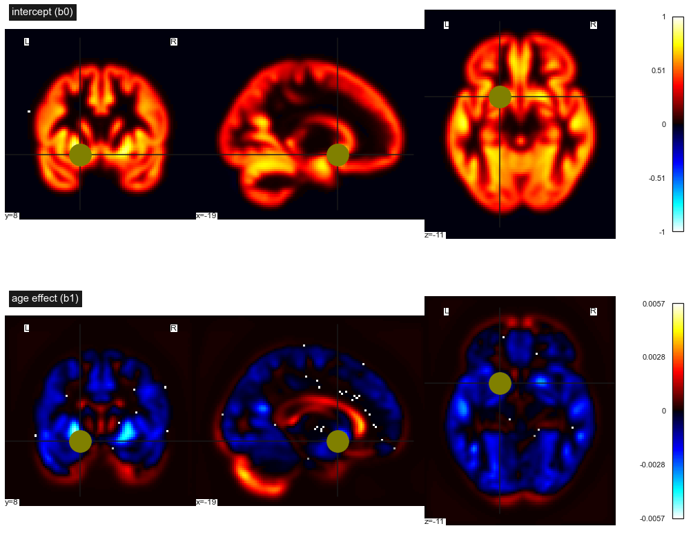
Fig. 76 Maps of statistical parameters in a massively univariate linear regression. First line: intercept b0, second line: linear effect of age b1. This figure is adapted from a nilearn tutorial (click on + to see the code). This figure is distributed under license CC-BY 4.0.
For now, we have used a regression model for two voxels only. But a VBM map can include hundreds of thousands of voxels. Neuroimaging software makes it possible to systematically perform linear regression for all of the voxels, simultaneously. In this case, we estimate two parameters for each voxel: b0 (the intercept) and b1 (the age effect). We will therefore generate two separate statistical maps (see b0_b1_fig). These two maps therefore summarize thousands of different regression models. As the regressions carried out at each voxel are independent of each other, we speak of a univariate model. The other option, the multivariate model, would rather seek to combine the values obtained at different voxels. Moreover, as we are doing a very large number of regressions at the same time, we speak of a massively univariate regression.
General linear model
Variables
sns.set_theme(style="ticks")

# Show the joint distribution using kernel density estimation
fig = sns.jointplot(
     data=df,
     x="age", y="GM1", hue="gender",
     kind="scatter",
)

# We paste the figure in the jupyter book
from myst_nb import glue
glue("age-gender-fig", fig.fig, display=False)

plt.close()
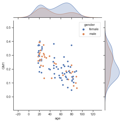
Fig. 77 Relationship between age, gender and gray matter density for a voxel (the blue colored voxel in vbm_distribution_fig). The graph is made using seaborn (click on + to see the code). This figure is distributed under license CC-BY 4.0.
The linear regression approach just seen is simple and powerful, but it is limited to two variables. In human neuroscience, we will not generally find ourselves in this situation. We will very often want to study multiple factors together. Even if the representation of the gender of the participants by a binary variable is very (very) simplistic - not to mention the diversity of gender identity - we might still try to incorporate gender into our analysis. The figure above shows the distributions of age and gray matter (for the blue voxel), separated by gender. This graph suggests that the distribution of gray matter may differ as a function of gender, but this difference could also be related to age. The general linear model allows us to incorporate all of these variables into a single analysis.
Multiple regression
from nilearn.plotting import plot_design_matrix
design_df = df[["subject_label", "age", "gender"]].replace(['female', 'male'], value=[0, 1])
design_matrix = make_second_level_design_matrix(
     subject_label,
     design_df
     )
fig, ax = plt.subplots(ncols=5, figsize=(6, 12), sharey=True)
Y = df["GM1"].to_numpy()
X = design_matrix.to_numpy()
ax[0].plot(np.expand_dims(Y, axis=1), range(len(Y)))
ax[1].plot(X[:,0], range(len(Y)))
ax[2].plot(X[:,1], range(len(Y)))
ax[3].plot(X[:,2], range(len(Y)))
ax[0].set_ylabel('#subject', fontsize=18)
ax[0].set_title('GM', fontsize=20)
ax[1].set_title('Age', fontsize=20)
ax[2].set_title('Gender', fontsize=20)
ax[3].set_title('Intercept', fontsize=20)
plot_design_matrix(design_matrix, ax=ax[4])
ax[4].set_title('Design Matrix', fontsize=12)
ax[4].set_ylabel('#participant')
plt.gca().invert_yaxis()
plt.tight_layout()

# We paste the figure in the jupyter book
from myst_nb import glue
glue("design_matrix_fig", fig, display=False)

plt.close()
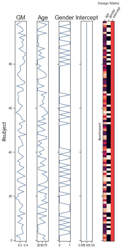
Fig. 78 Variables for multiple regression. The dependent variable is the gray matter density for a voxel (GM, the blue colored voxel in vbm_distribution_fig). The other columns represent variations in age, gender and intercept across participants (predictor variables). Predictor variables are usually represented in a more compact way, as an image where the color of each pixel represents the intensity of the regressor. The graph is adapted from a python code produced by the Dartbrains team, as well as a nilearn tutorial (click on + to see the code). This figure is distributed under license CC-BY 4.0.
From a mathematical point of view, the multiple regression model, sometimes called the general linear model, simply involves incorporating more variables into the “law” that attempts to predict the dependent variable from the regressors:
gray_matter_density = b0 + b1 * age + b2 * sex + e
The only new coefficient is b2, which in this case measures the difference between mean gray matter between gender, after an adjustment for the age of the participant. This type of encoding is used with categorical data and is called “dummy variable”. It makes it possible to integrate tests of mean difference between the groups in a regression model.
Statistical maps
from nilearn.datasets import fetch_icbm152_brain_gm_mask

gm_mask = fetch_icbm152_brain_gm_mask()

second_level_model = SecondLevelModel(smoothing_fwhm=5.0, mask_img=gm_mask)
second_level_model = second_level_model.fit(gray_matter_map_filenames,
                                            design_matrix=design_matrix)
beta0 = second_level_model.compute_contrast(second_level_contrast="intercept", output_type="effect_size")
beta1 = second_level_model.compute_contrast(second_level_contrast="age", output_type="effect_size")
beta2 = second_level_model.compute_contrast(second_level_contrast="gender", output_type="effect_size")

# We generate the Figure
from nilearn import plotting
import seaborn as sns
fig = plt.figure(figsize=(24, 14))

ax = plt.subplot2grid((2, 4), (0, 0), colspan=2)
king_img = plotting.plot_stat_map(
    beta0, cut_coords=coords[1], figure=fig, black_bg=False, cmap='coolwarm',
    axes=ax, display_mode='ortho', colorbar=True, title='intercept (b0)')
king_img.add_markers([coords[1]], colors[1], 100)

ax = plt.subplot2grid((2, 4), (0, 2), colspan=2)
king_img = plotting.plot_stat_map(
    beta1, cut_coords=coords[1], figure=fig, black_bg=False, cmap='coolwarm',
    axes=ax, display_mode='ortho', colorbar=True, title='age effect (b1)')
king_img.add_markers([coords[1]], colors[1], 100)

ax = plt.subplot2grid((2, 4), (1, 0), colspan=2)
king_img = plotting.plot_stat_map(
    beta2, cut_coords=coords[1], figure=fig, black_bg=False, cmap='coolwarm',
    axes=ax, display_mode='ortho', colorbar=True, title='gender effect (b2)')
king_img.add_markers([coords[1]], colors[1], 100)

# We paste the figure in the jupyter book
from myst_nb import glue
glue("multi_regression_fig", fig, display=False)

plt.close()
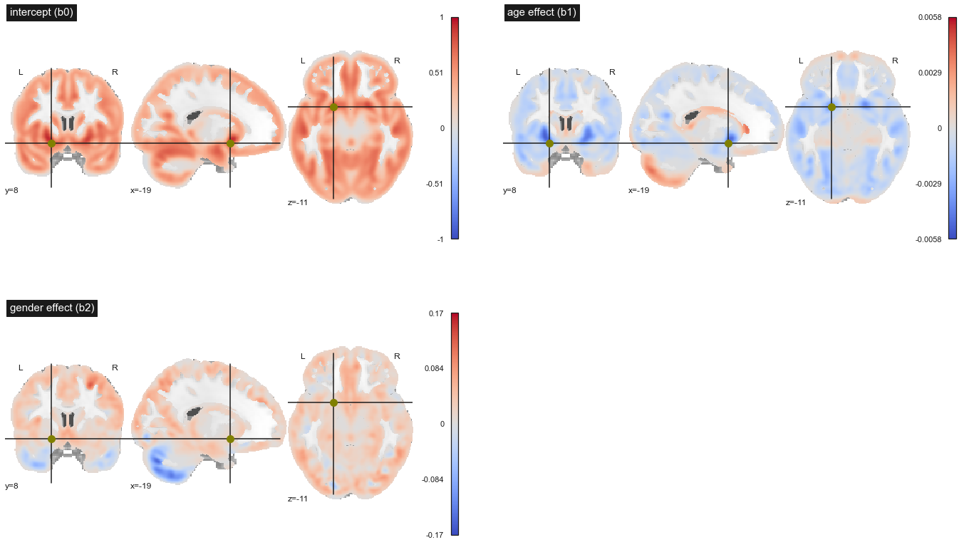
Fig. 79 Maps of statistical parameters in a massively univariate multiple linear regression. Top left: intercept b0, top right: linear effect of age b1, bottom left: linear effect of gender b2. This figure is adapted from a nilearn tutorial (click on + to see the code). This figure is distributed under license CC-BY 4.0.
One feature that may be slightly counter-intuitive with multiple regression is that the map showing the effect of age here is different from the one presented in the section on simple regression. Indeed, the effect of age is now evaluated after taking into account gender differences. Despite this, the regression result did not change strikingly: the cortex atrophies with age (in blue), while the cerebrospinal fluid expands (in red). What appears as gray matter expansion likely reflects partial volume effects and tissues misclassified as gray matter. The analysis on the gender variable shows that the gray matter density is higher (on average) in the cortex , while the trend is reversed in the cerebellum.
Statistical tests
T-tests and p-value
from nilearn.image import math_img
z_score = second_level_model.compute_contrast(second_level_contrast="age", output_type="z_score")
p_value = second_level_model.compute_contrast(second_level_contrast="age", output_type="p_value")
neg_log_pval = math_img("-np.log10(np.minimum(1, img))", img=p_value)

# We generate the Figure
from nilearn import plotting
import seaborn as sns
fig = plt. figure(figsize=(24, 6))

ax = plt.subplot2grid((1, 4), (0, 0), colspan=2)
king_img = plotting.plot_stat_map(
    z_score,  cut_coords=coords[1], figure=fig,
    axes=ax, display_mode='ortho', colorbar=True, title='t-test (age)', black_bg=False,
    cmap='viridis', dim=-1)
king_img.add_markers([coords[1]], colors[1], 1000)

ax = plt.subplot2grid((1, 4), (0, 2), colspan=2)
king_img = plotting.plot_stat_map(
    neg_log_pval, cut_coords=coords[1], figure=fig,
    axes=ax, display_mode='ortho', colorbar=False, black_bg=False,
    cmap='magma', title='significance (-log10(p))')
king_img.add_markers([coords[1]], colors[1], 1000)

# We paste the figure in the jupyter book
from myst_nb import glue
glue("tmap_pval_fig", fig, display=False)

plt.close()
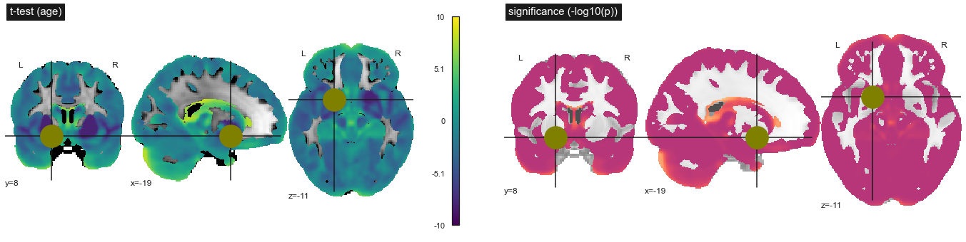
Fig. 80 Statistical tests on the significance of the association between gray matter density and age. Student's t test (top) and log10(p) (bottom). This figure is adapted from a nilearn tutorial (click on + to see the code). This figure is distributed under license CC-BY 4.0.
Once we have estimated the effect of certain explanatory variables (for example, age) on our dependent variable (for example, gray matter density), it is necessary to test the significance of this effect. To this end, we use the magnitude of the residuals to estimate the size of the effect that could be observed by chance, if only these residuals were present. We deduce a Student t test, which behaves like a normal distribution when the number of participants is large. For each voxel, we therefore have a different t statistic, and we can calculate the probability p of observing this statistic under the null hypothesis, where the effect of the explanatory variable is exactly zero.
Null Hypothesis
from numpy.random import seed
from numpy.random import shuffle

# seed random number generator
seed(1)
design_rand_df = df[["subject_label", "age"]].replace(['female', 'male'], value=[0, 1])
design_rand_matrix = make_second_level_design_matrix(
    subject_label,
    design_df
    )
shuffle(design_rand_matrix["age"].to_numpy())

second_level_model = SecondLevelModel(smoothing_fwhm=5.0, mask_img=gm_mask)
second_level_model_rand = second_level_model.fit(gray_matter_map_filenames,
                                            design_matrix=design_rand_matrix)

z_score_rand = second_level_model_rand.compute_contrast(second_level_contrast="age", output_type="z_score")
p_value_rand = second_level_model_rand.compute_contrast(second_level_contrast="age", output_type="p_value")
neg_log_pval_rand = math_img("-np.log10(np.minimum(1, img))", img=p_value_rand)

# We generate the Figure
from nilearn import plotting
import seaborn as sns
fig = plt. figure(figsize=(24, 6))

ax = plt.subplot2grid((1, 4), (0, 0), colspan=2)
king_img = plotting.plot_stat_map(
    z_score_rand, cut_coords=coords[1], figure=fig,
    axes=ax, display_mode='ortho', colorbar=True, title='t-test (H0)', cmap='viridis',
    black_bg=False)
king_img.add_markers([coords[1]], colors[1], 100)

ax = plt.subplot2grid((1, 4), (0, 2), colspan=2)
king_img = plotting.plot_stat_map(
    neg_log_pval_rand, cut_coords=coords[1], figure=fig,
    axes=ax, display_mode='ortho', colorbar=False, title='significance H0 (-log10(p))', cmap='magma',
    black_bg=False)
king_img.add_markers([coords[1]], colors[1], 100)

# We paste the figure in the jupyter book
from myst_nb import glue
glue("null_fig", fig, display=False)

plt.close()
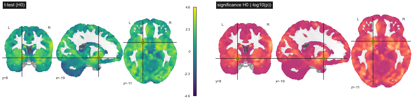
Fig. 81 Statistical tests on the significance of the association between gray matter density and age, under the null hypothesis that there is no association. Age data was randomly swapped between participants. Student's t test (top) and log10(p) (bottom). This figure is adapted from a nilearn tutorial (click on + to see the code). This figure is distributed under license CC-BY 4.0.
At the heart of the interpretation of the p value is what is called the null hypothesis. To try to understand what this means, let’s do an experiment. We are going to repeat the whole procedure for estimating the effect of age on gray matter density. But this time, instead of using the real age of the participants, we will randomly mix these values (we talk about permutations). The distribution of t tests and p values is shown in Fig. 81. Strikingly, the t values are much smaller with the random age values than when we did the analysis with the true values, but some values remain high. We performed an experiment under the null hypothesis, where there is no association with age. The p value tells us the frequency with which we will find higher age effect values under the null hypothesis than in the original sample. To estimate this directly, we would have to repeat the experiment we just did with thousands of permutations! But there are also faster approximate methods.
Multiple comparisons
from nilearn.glm import threshold_stats_img
from scipy.stats import norm
p_val = 0.001
p001_uncorrected = norm.isf(p_val)
p_val = 0.05
p05_uncorrected = norm.isf(p_val)

# We generate the Figure
from nilearn import plotting
import seaborn as sns
fig = plt.figure(figsize=(24, 18))

ax = plt.subplot2grid((3, 4), (0, 2), colspan=2)
roi_img = plotting.plot_stat_map(
    z_score, threshold=p05_uncorrected, cut_coords=coords[1], figure=fig,
    axes=ax, display_mode='ortho', colorbar=True, title='t-test, p<0.05')
roi_img.add_markers([coords[1]], colors[1], 100)

ax = plt.subplot2grid((3, 4), (1, 2), colspan=2)
roi_img = plotting.plot_stat_map(
    z_score, threshold=p001_uncorrected, cut_coords=coords[1], figure=fig,
    axes=ax, display_mode='ortho', colorbar=True, title='t-test, p<0.001')
roi_img.add_markers([coords[1]], colors[1], 100)

ax = plt.subplot2grid((3, 4), (2, 2), colspan=2)
thresholded_map, threshold = threshold_stats_img(
    z_score, alpha=.05, height_control='bonferroni')
roi_img = plotting.plot_stat_map(
    z_score, threshold=threshold, cut_coords=coords[1], figure=fig,
    axes=ax, display_mode='ortho', colorbar=True, title='t-test, p<0.05 corrected')
roi_img.add_markers([coords[1]], colors[1], 100)

ax = plt.subplot2grid((3, 4), (0, 0), colspan=2)
roi_img = plotting.plot_stat_map(
    z_score_rand, threshold=p05_uncorrected, cut_coords=coords[1], figure=fig,
    axes=ax, display_mode='ortho', colorbar=True, title='t-test (H0), p<0.05')
roi_img.add_markers([coords[1]], colors[1], 100)

ax = plt.subplot2grid((3, 4), (1, 0), colspan=2)
roi_img = plotting.plot_stat_map(
    z_score_rand, threshold=p001_uncorrected, cut_coords=coords[1], figure=fig,
    axes=ax, display_mode='ortho', colorbar=True, title='t-test (H0), p<0.001')
roi_img.add_markers([coords[1]], colors[1], 100)

ax = plt.subplot2grid((3, 4), (2, 0), colspan=2)
thresholded_map_rand, threshold_rand = threshold_stats_img(
    z_score_rand, alpha=.05, height_control='bonferroni')
roi_img = plotting.plot_stat_map(
    z_score_rand, threshold=threshold_rand, cut_coords=coords[1], figure=fig,
    axes=ax, display_mode='ortho', colorbar=True, title='t-test (H0), p<0.05 corrected')
roi_img.add_markers([coords[1]], colors[1], 100)

# We paste the figure in the jupyter book
from myst_nb import glue
glue("threshold_fig", fig, display=False)

plt.close()
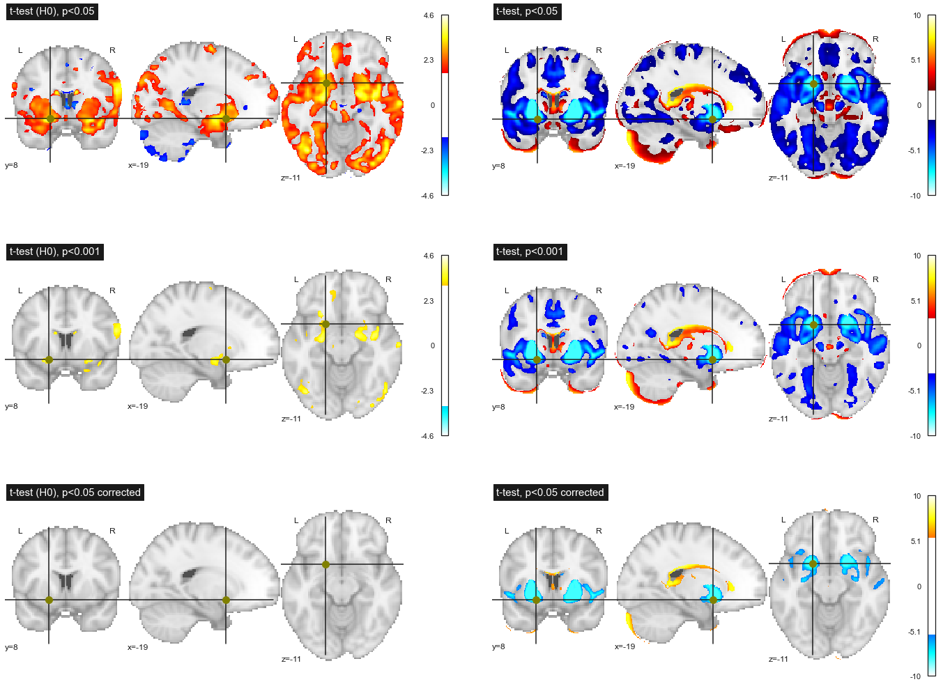
Fig. 82 Effect of different thresholding strategies on the association between age and gray matter density. Left: data under the null hypothesis (age values swapped across participants). Right: original data. Row 1: uncorrected threshold p<0.05 for multiple comparisons; row 2: uncorrected threshold p<0.001 for multiple comparisons; threshold p<0.05 corrected for multiple comparisons vis Bonferroni’s approach. This figure is adapted from a nilearn tutorial (click on + to see the code). This figure is distributed under license CC-BY 4.0.
Now that we have discussed the interpretation of the p value, we must now decide on a threshold to apply to the p values. If we use the usual threshold p<0.05, this means that for 20 permutations, we will detect an association once (on average) for a given voxel. But since we have thousands of voxels in the brain, this means that we will detect 5% of the brain (on average) for each permutation! This is what we observe (and even more) in the top left figure Fig. 82. This is the multiple comparison problem, and the more tests you do, the bigger this problem becomes.
If we lower the threshold to p<0.001, we only detect 0.1% of the brain (on average) under the null hypothesis, and we indeed observe a reduction in the number of voxels in the figure on the left, 2nd line Fig. 82.
The simplest method to correct for the problem of multiple comparisons is to use a corrected threshold p<0.05/N, where N is the number of comparisons (ie tests). In our case, we have approximately 100,000 voxels, so we’ll use p<0.0000001! With this strategy, no voxel passes the threshold in our experiment under the null hypothesis, see bottom left figure Fig. 82. In general this is what will happen (on average) for 19/20 permutations.
If we now observe the effect of these different strategies on the original data, we observe that the smaller the threshold p, the less significant effects are detected. Nevertheless, even with p<0.05 corrected by Bonferroni's approach, we still detect the main effects of age.
Conclusion
The simple
regression modelmakes it possible topredicttheobservationsof adependent variablefrom anexplanatory variable.This
modelis appliedindependentlyto eachvoxel(massively multivariate approach).It is possible to use the
general linear modelto simultaneously test theeffectof severalexplanatory variableson thedependent variable.When performing a large number of
statistical testsat eachvoxel, thesignificance thresholdof the test must be modified (problem ofmultiple comparisons).
Exercises
In the following we created a few exercises that aim to recap core aspects of this part of the course and thus should allow you to assess if you understood the main points.
Exercise 9.1
We want to compare the connectivity between two groups of participants, young vs old.
Describe the predictor variables to include in a regression model.
What other variables do you think are important to include in the model?
Exercise 9.2
True/false (explain why)
The regression model can be used to perform group statistics for the following types of measurements… (true/false)
fMRIMRI T1(VBM)T1 MRI(volumetry)MRI T1(cortical thickness)Behavioral dataPositron Emission TomographyOptical ImagingDiffusion Imaging
Exercise 9.3
Right wrong. We observe a difference in the mean between two groups, and we perform a statistical test that gives us a p value.
The
p-valueis theprobabilitythat there is notrue difference.A low
p-valueindicates a highprobabilitythat there is atrue difference.The
p-valueindicates theprobabilityof observing thisdifference, at least, if there really was nodifferencebetween the twogroups.
Exercise 9.4
Right wrong. A problem of multiple comparisons means:
That we repeatedly perform
statistical teststhat generate ap-value.That we repeat a
statistical testat eachvoxelin animageof thebrain.That many
hypothesesare tested in an article.That we have four
subgroups, and we compare each of the three possiblepairsofsubgroups.
Exercise 9.5
Rank the following analyzes from smallest to largest, based on the number of multiple comparisons involved. Indicate the approximate number of comparisons.
Gray matterdensityis compared between twogroupsofparticipantsat eachbrain voxel.Glucose metabolismwas compared between twogroupsofparticipantsat eachvoxelof thebrain, usingFDG-PET.We compare the
volumeofcerebral regionsbetween twogroupsofparticipants, from anatlasthat includes90 regions.The
volumeof thehippocampusis compared between twogroupsofparticipants.
Exercise 9.6
To answer the questions in this exercise, first read the article Tau pathology in cognitively normal older adults by Ziontz et al., available as preprint on Biorxiv under CC0 license and published in the journal Alzheimer’s & Dementia: Diagnosis, Assessment & Disease Monitoring doi. The following questions require short answers.
What is the
dependent variableof thelinear model?Which
explanatory variablesare included in thelinear model?Do we know how many
multiple comparisonsare made?How are
multiple comparisonscorrected for?