Graph Visualization
We’ve learned from the Workflow tutorial that every Nipype workflow is a directed acyclic graph. Some workflow structures are easy to understand directly from the script and some others are too complex for that. Luckily, there is the write_graph method!
write_graph
write_graph allows us to visualize any workflow in five different ways:
orig- creates a top-level graph without expanding internal workflow nodesflat- expands workflow nodes recursivelyhierarchical- expands workflow nodes recursively with a notion on the hierarchycolored- expands workflow nodes recursively with a notion on hierarchy in colorexec- expands workflows to depict iterables
Which graph visualization should be used is chosen by the graph2use parameter.
Additionally, we can also choose the format of the output file (png or svg) with the format parameter.
A third parameter, called simple_form can be used to specify if the node names used in the graph should be of the form nodename (package) or nodename.Class.package.
Preparation
Instead of creating a new workflow from scratch, let’s just import one from the Nipype workflow library.
# Import the function to create an spm fmri preprocessing workflow
from niflow.nipype1.workflows.fmri.spm import create_spm_preproc

# Create the workflow object
spmflow = create_spm_preproc()
For a reason that will become clearer under the exec visualization, let’s add an iternode at the beginning of the spmflow and connect them together under a new workflow, called metaflow. The iternode will cause the workflow to be executed three times, once with the fwhm value set to 4, once set to 6 and once set to 8. For more about this see the Iteration tutorial.
# Import relevant modules
from nipype import IdentityInterface, Node, Workflow

# Create an iternode that iterates over three different fwhm values
inputNode = Node(IdentityInterface(fields=['fwhm']), name='iternode')
inputNode.iterables = ('fwhm', [4, 6, 8])

# Connect inputNode and spmflow in a workflow
metaflow = Workflow(name='metaflow')
metaflow.connect(inputNode, "fwhm", spmflow, "inputspec.fwhm")
orig graph
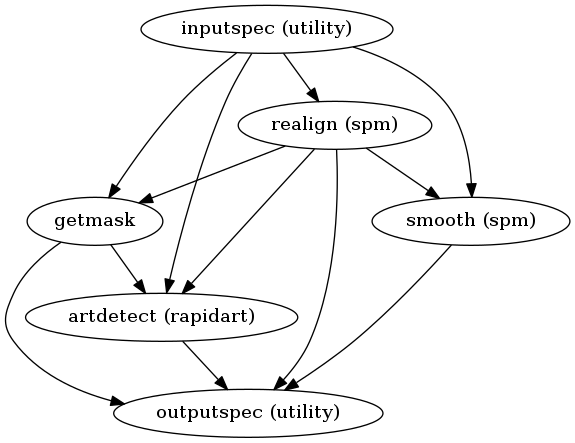
This visualization gives us a basic overview of all the nodes and internal workflows in a workflow and shows in a simple way the dependencies between them.
# Write graph of type orig
spmflow.write_graph(graph2use='orig', dotfilename='./graph_orig.dot')

# Visualize graph
from IPython.display import Image
Image(filename="graph_orig.png")
211017-17:15:45,985 nipype.workflow INFO:
	 Generated workflow graph: /home/neuro/workshop_weizmann/workshop/nipype/notebooks/graph_orig.png (graph2use=orig, simple_form=True).
flat graph
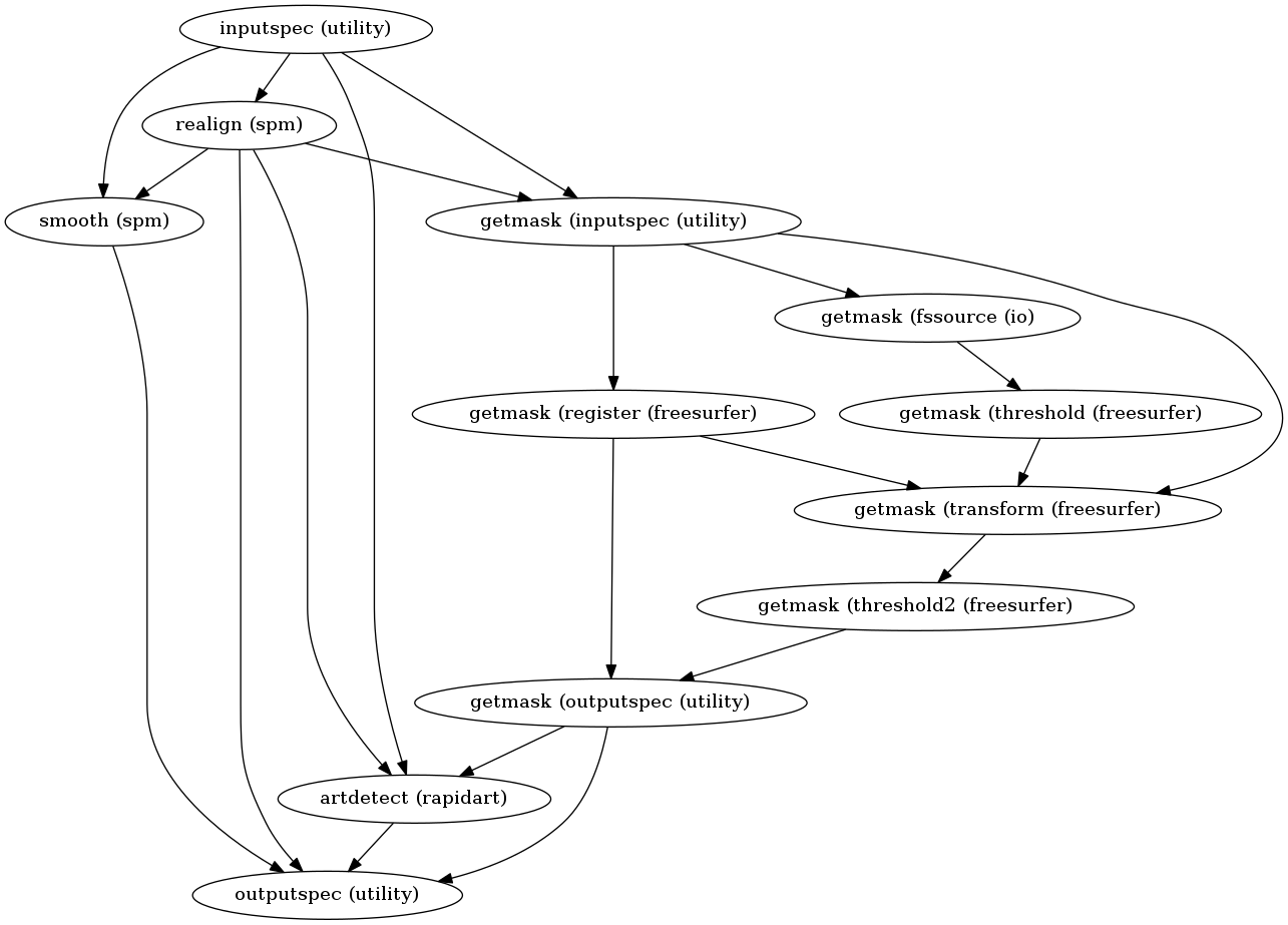
This visualization gives us already more information about the internal structure of the spmflow workflow. As we can, the internal workflow getmask from the orig visualization above was replaced by the individual nodes contained in this internal workflow.
# Write graph of type flat
spmflow.write_graph(graph2use='flat', dotfilename='./graph_flat.dot')

# Visualize graph
from IPython.display import Image
Image(filename="graph_flat.png")
211017-17:15:46,554 nipype.workflow INFO:
	 Generated workflow graph: /home/neuro/workshop_weizmann/workshop/nipype/notebooks/graph_flat.png (graph2use=flat, simple_form=True).
hierarchical graph
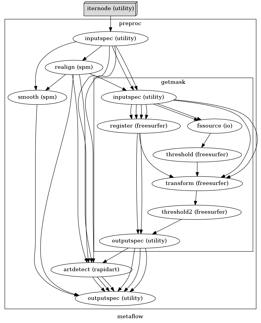
To better appreciate this visualization, let’s look at the metaflow workflow that has one hierarchical level more than the spmflow.
As you can see, this visualization makes it much clearer which elements of a workflow are nodes and which ones are internal workflows. Also, each connection is shown as an individual arrow, and not just represented by one single arrow between two nodes. Additionally, iternodes and mapnodes are visualized differently than normal nodes to make them pop out more.
# Write graph of type hierarchical
metaflow.write_graph(graph2use='hierarchical', dotfilename='./graph_hierarchical.dot')

# Visualize graph
from IPython.display import Image
Image(filename="graph_hierarchical.png")
211017-17:15:46,781 nipype.workflow INFO:
	 Generated workflow graph: ./graph_hierarchical.png (graph2use=hierarchical, simple_form=True).
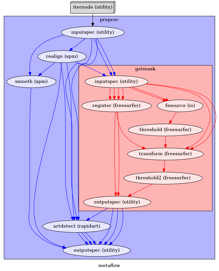
colored graph
This visualization is almost the same as the hierarchical above. The only difference is that individual nodes and different hierarchy levels are colored coded differently.
# Write graph of type colored
metaflow.write_graph(graph2use='colored', dotfilename='./graph_colored.dot')

# Visualize graph
from IPython.display import Image
Image(filename="graph_colored.png")
211017-17:15:46,985 nipype.workflow INFO:
	 Generated workflow graph: ./graph_colored.png (graph2use=colored, simple_form=True).
exec graph
This visualization is the most different from the rest. Like the flat visualization, it depicts all individual nodes. But additionally, it drops the utility nodes from the workflow and expands workflows to depict iterables (can be seen in the detailed_graph visualization further down below).
# Write graph of type exec
metaflow.write_graph(graph2use='exec', dotfilename='./graph_exec.dot')

# Visualize graph
from IPython.display import Image
Image(filename="graph_exec.png")
211017-17:15:47,425 nipype.workflow INFO:
	 Generated workflow graph: /home/neuro/workshop_weizmann/workshop/nipype/notebooks/graph_exec.png (graph2use=exec, simple_form=True).

Detailed graphs
The orig, flat and exec visualization also create a detailed graph whenever write_graph is executed. A detailed graph shows a node with not just the node name, but also with all its input and output parameters.
detailed flat graph
For example, the detailed graph of the flat graph looks as follows:
from IPython.display import Image
Image(filename="graph_flat_detailed.png")
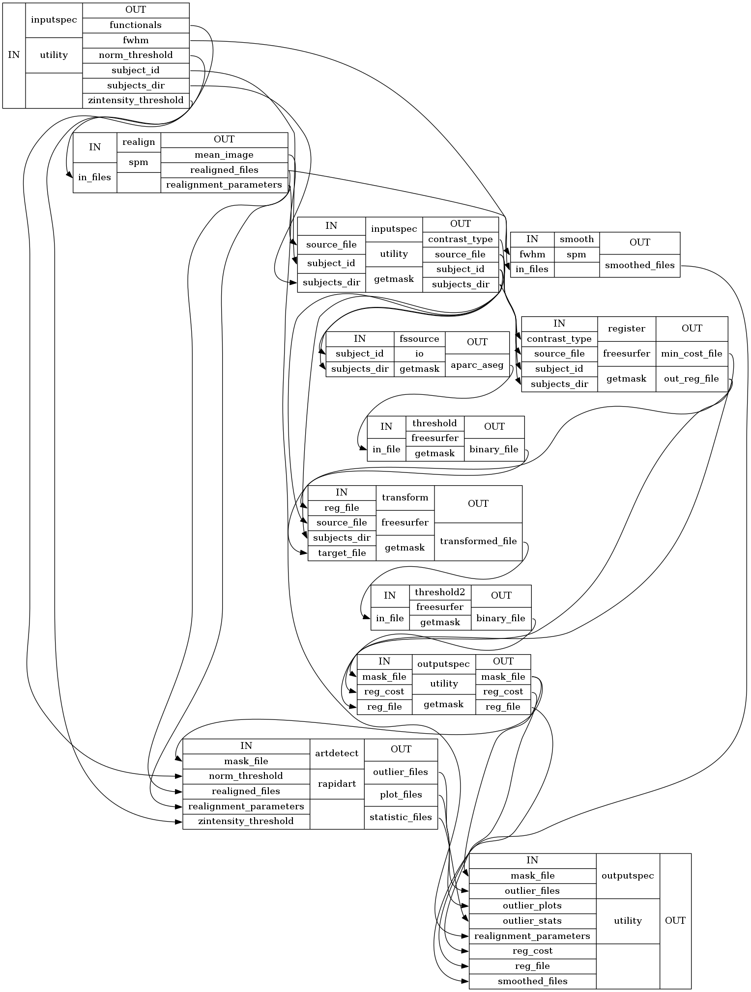
Such a visualization might be more complicated to read, but it gives you a complete overview of a workflow and all its components.
detailed exec graph
Now, if we look at the detailed graph of the exec visualization, we can see where the iteration takes place:
from IPython.display import Image
Image(filename="graph_exec_detailed.png")

In the middle left of the figure, we have three preproc.smooth nodes of the spm interface with the names “a0”, “a1” and “a2”. Those represent the three smoothing nodes with the fwhm parameter set to 4, 6 and 8. Now if those nodes would be connected to another workflow, this would mean that the workflow that follows would be depicted three times, each time for another input coming from the preproc.smooth node.
Therefore, the detailed exec visualization makes all individual execution elements very clear and allows it to see which elements can be executed in parallel.
simple_form
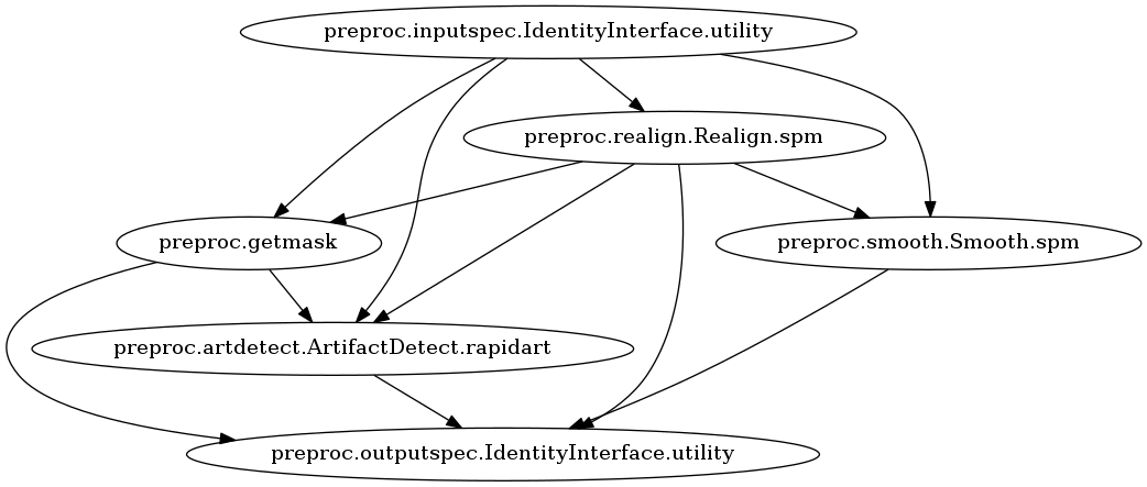
Last but not least is the third write_graph argument, simple_form. If this parameter is set to False, this means that the node names in the visualization will be written in the form of nodename.Class.package, instead of nodename (package). For example, let’s look at the origvisualization with simple_form set to False.
# Write graph of type orig
spmflow.write_graph(graph2use='orig', dotfilename='./graph_orig_notSimple.dot', simple_form=False)

# Visualize graph
from IPython.display import Image
Image(filename="graph_orig_notSimple.png")
211017-17:15:47,940 nipype.workflow INFO:
	 Generated workflow graph: /home/neuro/workshop_weizmann/workshop/nipype/notebooks/graph_orig_notSimple_detailed.png (graph2use=orig, simple_form=False).
