Introduction to Visualization in python
Python provides a wide array of options
Low-level and high-level plotting APIs
Static images vs. HTML output vs. interactive plots
Domain-general and domain-specific packages
PS: Many pieces of this notebook have been scavenged from other visualization notebooks and galleries. But the main things are from Tal Yarkoni’s visualization-in-python notebook.
General Overview
In this notebook, we will cover the following python packages. Some of them are exclusively for visualization while others like Pandas have many other purposes:
The visualization of the first three is all based on matplotlib and use static images. While the last three create HTML outputs and allow much more interactive plots. We will talk about each one as we go along.
Python-graph-gallery
Check out the very helpful and cool new homepage https://python-graph-gallery.com/ to see how you can create different kinds of graphs.
Preparation
As with most things in Python, we first load the relevant packages. Here we load three important packages:
%matplotlib inline
import matplotlib.pyplot as plt
import numpy as np
import pandas as pd
import seaborn as sns
The first line in the cell above is specific to Jupyter notebooks. It tells the interpreter to capture figures and embed them in the browser. Otherwise, they would end up almost in digital ether.
The Datasets
For example purposes, we will make use of phenotypic information within a dataset from OpenNeuro, provided as part of the following publication:
It contains age, age group, groups, gender and handedness for 150 participants, including children and adults.
We will use curl to gather the respective file:
%%bash
curl --silent --output /dev/null -O participants.tsv https://openneuro.org/crn/datasets/ds000228/snapshots/1.0.0/files/participants.tsv
Now we can load the dataframe using pandas:
sub_df = pd.read_table("participants.tsv")
and explore it:
sub_df
| participant_id | Age | AgeGroup | Child_Adult | Gender | Handedness | ToM Booklet-Matched | ToM Booklet-Matched-NOFB | FB_Composite | FB_Group | WPPSI BD raw | WPPSI BD scaled | KBIT_raw | KBIT_standard | DCCS Summary | Scanlog: Scanner | Scanlog: Coil | Scanlog: Voxel slize | Scanlog: Slice Gap | |
|---|---|---|---|---|---|---|---|---|---|---|---|---|---|---|---|---|---|---|---|
| 0 | sub-pixar001 | 4.774812 | 4yo | child | M | R | 0.80 | 0.736842 | 6.0 | pass | 22.0 | 13.0 | NaN | NaN | 3.0 | 3T1 | 7-8yo 32ch | 3mm iso | 0.1 |
| 1 | sub-pixar002 | 4.856947 | 4yo | child | F | R | 0.72 | 0.736842 | 4.0 | inc | 18.0 | 9.0 | NaN | NaN | 2.0 | 3T1 | 7-8yo 32ch | 3mm iso | 0.1 |
| 2 | sub-pixar003 | 4.153320 | 4yo | child | F | R | 0.44 | 0.421053 | 3.0 | inc | 15.0 | 9.0 | NaN | NaN | 3.0 | 3T1 | 7-8yo 32ch | 3mm iso | 0.1 |
| 3 | sub-pixar004 | 4.473648 | 4yo | child | F | R | 0.64 | 0.736842 | 2.0 | fail | 17.0 | 10.0 | NaN | NaN | 3.0 | 3T1 | 7-8yo 32ch | 3mm iso | 0.2 |
| 4 | sub-pixar005 | 4.837782 | 4yo | child | F | R | 0.60 | 0.578947 | 4.0 | inc | 13.0 | 5.0 | NaN | NaN | 2.0 | 3T1 | 7-8yo 32ch | 3mm iso | 0.2 |
| ... | ... | ... | ... | ... | ... | ... | ... | ... | ... | ... | ... | ... | ... | ... | ... | ... | ... | ... | ... |
| 150 | sub-pixar151 | 23.000000 | Adult | adult | F | R | NaN | NaN | NaN | NaN | NaN | NaN | NaN | NaN | NaN | 3T1 | 32ch adult | 3.13 mm iso | 0.1 |
| 151 | sub-pixar152 | 21.000000 | Adult | adult | F | R | NaN | NaN | NaN | NaN | NaN | NaN | NaN | NaN | NaN | 3T1 | 32ch adult | 3.13 mm iso | 0.1 |
| 152 | sub-pixar153 | 30.000000 | Adult | adult | M | R | NaN | NaN | NaN | NaN | NaN | NaN | NaN | NaN | NaN | 3T1 | 32ch adult | 3.13 mm iso | 0.1 |
| 153 | sub-pixar154 | 29.000000 | Adult | adult | M | R | NaN | NaN | NaN | NaN | NaN | NaN | NaN | NaN | NaN | 3T1 | 32ch adult | 3.13 mm iso | 0.1 |
| 154 | sub-pixar155 | 26.000000 | Adult | adult | M | R | NaN | NaN | NaN | NaN | NaN | NaN | NaN | NaN | NaN | 3T1 | 32ch adult | 3.13 mm iso | 0.1 |
155 rows × 19 columns
In the following cell we remove all participants that have missing values.
sub_df = sub_df.dropna(axis=1, how='all')
sub_df.head()
| participant_id | Age | AgeGroup | Child_Adult | Gender | Handedness | ToM Booklet-Matched | ToM Booklet-Matched-NOFB | FB_Composite | FB_Group | WPPSI BD raw | WPPSI BD scaled | KBIT_raw | KBIT_standard | DCCS Summary | Scanlog: Scanner | Scanlog: Coil | Scanlog: Voxel slize | Scanlog: Slice Gap | |
|---|---|---|---|---|---|---|---|---|---|---|---|---|---|---|---|---|---|---|---|
| 0 | sub-pixar001 | 4.774812 | 4yo | child | M | R | 0.80 | 0.736842 | 6.0 | pass | 22.0 | 13.0 | NaN | NaN | 3.0 | 3T1 | 7-8yo 32ch | 3mm iso | 0.1 |
| 1 | sub-pixar002 | 4.856947 | 4yo | child | F | R | 0.72 | 0.736842 | 4.0 | inc | 18.0 | 9.0 | NaN | NaN | 2.0 | 3T1 | 7-8yo 32ch | 3mm iso | 0.1 |
| 2 | sub-pixar003 | 4.153320 | 4yo | child | F | R | 0.44 | 0.421053 | 3.0 | inc | 15.0 | 9.0 | NaN | NaN | 3.0 | 3T1 | 7-8yo 32ch | 3mm iso | 0.1 |
| 3 | sub-pixar004 | 4.473648 | 4yo | child | F | R | 0.64 | 0.736842 | 2.0 | fail | 17.0 | 10.0 | NaN | NaN | 3.0 | 3T1 | 7-8yo 32ch | 3mm iso | 0.2 |
| 4 | sub-pixar005 | 4.837782 | 4yo | child | F | R | 0.60 | 0.578947 | 4.0 | inc | 13.0 | 5.0 | NaN | NaN | 2.0 | 3T1 | 7-8yo 32ch | 3mm iso | 0.2 |
Using the keys method we can look at all the column headings that are left.
list(sub_df.keys())
['participant_id',
'Age',
'AgeGroup',
'Child_Adult',
'Gender',
'Handedness',
'ToM Booklet-Matched',
'ToM Booklet-Matched-NOFB',
'FB_Composite',
'FB_Group',
'WPPSI BD raw',
'WPPSI BD scaled',
'KBIT_raw',
'KBIT_standard',
'DCCS Summary',
'Scanlog: Scanner',
'Scanlog: Coil',
'Scanlog: Voxel slize',
'Scanlog: Slice Gap']
Lets now see how we can visualize the information in this dataset (sub_df). Python has quite a lot of visualization packages. Undeniably, the most famous and at the same time versatile, that additionally is the basis of most others, is matplotlib.
matplotlib
The most widely-used Python plotting library
Initially modeled on MATLAB’s plotting system
Designed to provide complete control over a plot
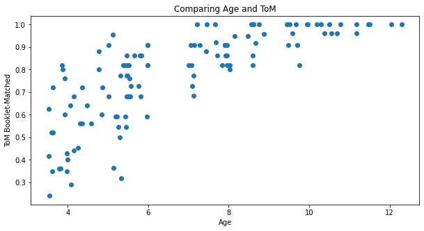
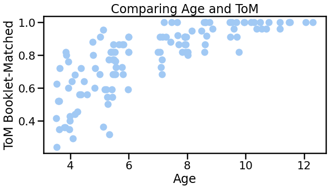
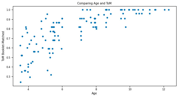
plt.figure(figsize=(10, 5))
plt.scatter(sub_df['Age'], sub_df['ToM Booklet-Matched'])
plt.xlabel('Age')
plt.ylabel('ToM Booklet-Matched')
plt.title('Comparing Age and ToM');
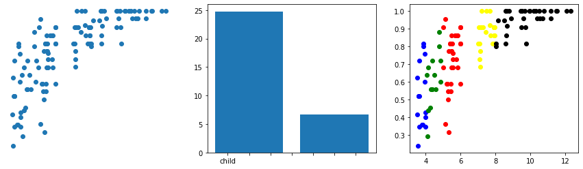
Thinking about how plotting works with matplotlib, we can explore a different approach to plotting, where we at first generate our figure and access certain parts of it, in order to modify them:
# Set up a figure with 3 columns
fig, axes = plt.subplots(1, 3, figsize=(15, 4))
# Scatter plot in top left
axes[0].scatter(sub_df['Age'], sub_df['ToM Booklet-Matched'])
axes[0].axis('off')
means = sub_df.groupby('Child_Adult')['Age'].mean()
axes[1].bar(np.arange(len(means))+1, means)
# Note how **broken** this is without additional code
axes[1].set_xticklabels(means.index)
colors = ['blue', 'green', 'red', 'yellow', 'black', 'violet']
for i, (s, grp) in enumerate(sub_df.groupby('AgeGroup')):
axes[2].scatter(grp['Age'], grp['ToM Booklet-Matched'], c=colors[i])
/opt/miniconda-latest/envs/neuro/lib/python3.7/site-packages/ipykernel_launcher.py:12: UserWarning: FixedFormatter should only be used together with FixedLocator
if sys.path[0] == '':
Exercise 1
Create a figure with a single axes and plot Handedness as function of Child_Adult.
Set the figure size to a ratio of 8 (wide) x 5 (height)
Use the colors
redandgraySet the opacity of the points to 0.5
Label the axes
Add a legend
Click the button to show the solution!
plt.figure(figsize=(10, 5))
colors = ['black', 'red']
for i, (s, grp) in enumerate(sub_df.groupby('Child_Adult')):
plt.scatter(grp['Age'], grp['Handedness'], c=colors[i], alpha=0.5)
plt.xlabel('Age')
plt.xlabel('Handedness')
plt.legend(['Child', 'Adult']);
# Create solution here
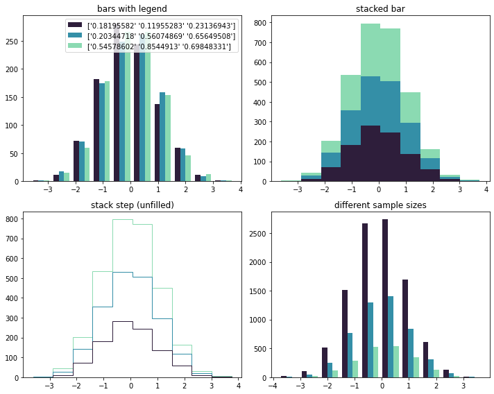
From the Gallery
You can reuse code directly from the matplotlib gallery.
# Adapted from https://matplotlib.org/gallery/statistics/histogram_multihist.html
import numpy as np
import matplotlib.pyplot as plt
n_bins = 10
x = np.random.randn(1000, 3)
fig, axes = plt.subplots(nrows=2, ncols=2, figsize=(10, 8))
ax0, ax1, ax2, ax3 = axes.flatten()
colors = [sns.color_palette("mako")[0], sns.color_palette("mako")[3], sns.color_palette("mako")[5]]
ax0.hist(x, n_bins, histtype='bar', color=colors, label=colors)
ax0.legend(prop={'size': 10})
ax0.set_title('bars with legend')
ax1.hist(x, n_bins, histtype='bar', stacked=True, color=colors)
ax1.set_title('stacked bar')
ax2.hist(x, n_bins, histtype='step', stacked=True, fill=False, color=colors)
ax2.set_title('stack step (unfilled)')
# Make a multiple-histogram of data-sets with different length.
x_multi = [np.random.randn(n) for n in [10000, 5000, 2000]]
ax3.hist(x_multi, n_bins, histtype='bar', color=colors)
ax3.set_title('different sample sizes')
fig.tight_layout()
plt.show()
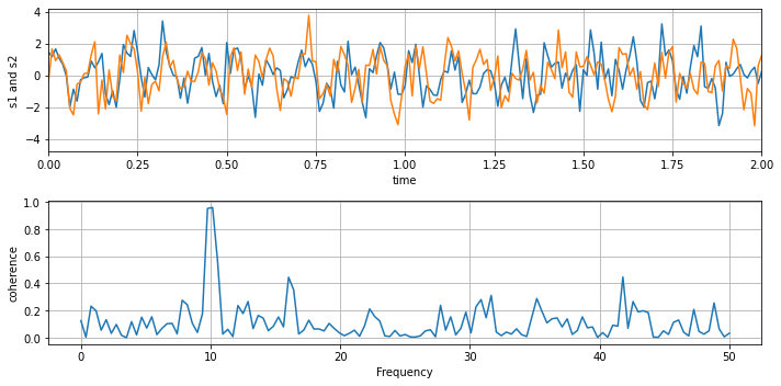
# Adapted from https://matplotlib.org/gallery/lines_bars_and_markers/cohere.html
import numpy as np
import matplotlib.pyplot as plt
dt = 0.01
t = np.arange(0, 30, dt)
nse1 = np.random.randn(len(t)) # white noise 1
nse2 = np.random.randn(len(t)) # white noise 2
# Two signals with a coherent part at 10Hz and a random part
s1 = np.sin(2 * np.pi * 10 * t) + nse1
s2 = np.sin(2 * np.pi * 10 * t) + nse2
fig, axs = plt.subplots(2, 1, figsize=(10, 5))
axs[0].plot(t, s1, t, s2)
axs[0].set_xlim(0, 2)
axs[0].set_xlabel('time')
axs[0].set_ylabel('s1 and s2')
axs[0].grid(True)
cxy, f = axs[1].cohere(s1, s2, 256, 1. / dt)
axs[1].set_ylabel('coherence')
fig.tight_layout()
plt.show()
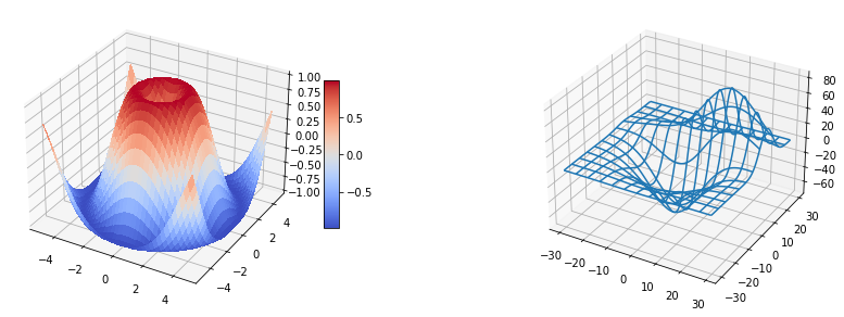
# Adapted from http://matplotlib.org/examples/mplot3d/subplot3d_demo.html
from mpl_toolkits.mplot3d.axes3d import Axes3D
import matplotlib.pyplot as plt
# imports specific to the plots in this example
import numpy as np
from matplotlib import cm
from mpl_toolkits.mplot3d.axes3d import get_test_data
# Twice as wide as it is tall.
fig = plt.figure(figsize=(15, 5))
#---- First subplot
ax = fig.add_subplot(1, 2, 1, projection='3d')
X = np.arange(-5, 5, 0.25)
Y = np.arange(-5, 5, 0.25)
X, Y = np.meshgrid(X, Y)
R = np.sqrt(X**2 + Y**2)
Z = np.sin(R)
surf = ax.plot_surface(X, Y, Z, rstride=1, cstride=1, cmap=cm.coolwarm,
linewidth=0, antialiased=False)
ax.set_zlim3d(-1.01, 1.01)
fig.colorbar(surf, shrink=0.5, aspect=10)
#---- Second subplot
ax = fig.add_subplot(1, 2, 2, projection='3d')
X, Y, Z = get_test_data(0.05)
ax.plot_wireframe(X, Y, Z, rstride=10, cstride=10);
Customization in matplotlib
matplotlib is infinitely customizable
As in most modern plotting environments, you can do virtually anything
You just have to be willing to spend enough time on it
matplotlib
Pros
Provides low-level control over virtually every element of a plot
Completely object-oriented API; plot components can be easily modified
Close integration with numpy
Extremely active community
Tons of functionality (figure compositing, layering, annotation, coordinate transformations, color mapping, etc.)
Cons
Steep learning curve
API is extremely unpredictable–redundancy and inconsistency are common
Some simple things are hard; some complex things are easy
Lacks systematicity/organizing syntax–every plot is its own little world
Simple plots often require a lot of code
Default styles are kind of ugly
The documentation… why?
High-level interfaces to matplotlib
Matplotlib is very powerful and very robust, but the API is hit-and-miss
Many high-level interfaces to matplotlib have been written
Abstract away many of the annoying details
The best of both worlds: easy generation of plots, but retain
matplotlib’s power
Many domain-specific visualization tools are built on
matplotlib(e.g., nilearn in neuroimaging)
Pandas
Provides simple but powerful plotting tools
DataFrame integration supports, e.g., groupby() calls for faceting
Often the easiest approach for simple data exploration
Arguably not as powerful, elegant, or intuitive as seaborn
Let’s load an example dataset and have a brief look at it:
import pandas as pd
iris = sns.load_dataset("iris")
iris[::8]
| sepal_length | sepal_width | petal_length | petal_width | species | |
|---|---|---|---|---|---|
| 0 | 5.1 | 3.5 | 1.4 | 0.2 | setosa |
| 8 | 4.4 | 2.9 | 1.4 | 0.2 | setosa |
| 16 | 5.4 | 3.9 | 1.3 | 0.4 | setosa |
| 24 | 4.8 | 3.4 | 1.9 | 0.2 | setosa |
| 32 | 5.2 | 4.1 | 1.5 | 0.1 | setosa |
| 40 | 5.0 | 3.5 | 1.3 | 0.3 | setosa |
| 48 | 5.3 | 3.7 | 1.5 | 0.2 | setosa |
| 56 | 6.3 | 3.3 | 4.7 | 1.6 | versicolor |
| 64 | 5.6 | 2.9 | 3.6 | 1.3 | versicolor |
| 72 | 6.3 | 2.5 | 4.9 | 1.5 | versicolor |
| 80 | 5.5 | 2.4 | 3.8 | 1.1 | versicolor |
| 88 | 5.6 | 3.0 | 4.1 | 1.3 | versicolor |
| 96 | 5.7 | 2.9 | 4.2 | 1.3 | versicolor |
| 104 | 6.5 | 3.0 | 5.8 | 2.2 | virginica |
| 112 | 6.8 | 3.0 | 5.5 | 2.1 | virginica |
| 120 | 6.9 | 3.2 | 5.7 | 2.3 | virginica |
| 128 | 6.4 | 2.8 | 5.6 | 2.1 | virginica |
| 136 | 6.3 | 3.4 | 5.6 | 2.4 | virginica |
| 144 | 6.7 | 3.3 | 5.7 | 2.5 | virginica |
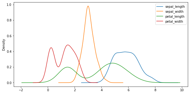
As we can see, there are 4 different variables containing ordinal data. One thing, we can for example easily do is to plot their distribution using a KDE. For now, we will collapse over the species variable.
iris.plot(kind='kde', figsize=(10, 5));
If we now want to have a closer, more specific look at the different species, we can for example employ boxplots:
iris.groupby('species').boxplot(rot=45, figsize=(10,6));
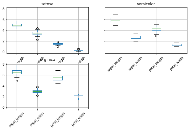
However, always think about the potential problems with boxplots:

Source: Autodesk Research via https://thestatsninja.com/tag/boxplot/
Seaborn
Seaborn abstracts away many of the complexities to deal with such minutiae and provides a high-level API for creating aesthetic plots.
Arguably the premier matplotlib interface for high-level plots
Generates beautiful plots in very little code
Beautiful styles and color palettes
Wide range of supported plots
Modest support for structured plotting (via grids)
Exceptional documentation
Generally, the best place to start when exploring data
Can be quite slow (e.g., with permutation)
For example, the following command auto adjusts the setting for the figure to reflect what you are using the figure for.
import seaborn as sns
# Adjust the context of the plot
sns.set_context('poster') # http://seaborn.pydata.org/tutorial/aesthetics.html#scaling-plot-elements
sns.set_palette('pastel') # http://seaborn.pydata.org/tutorial/color_palettes.html
# But still use matplotlib to do the plotting
plt.figure(figsize=(10, 5))
plt.scatter(sub_df['Age'], sub_df['ToM Booklet-Matched'])
plt.xlabel('Age')
plt.ylabel('ToM Booklet-Matched')
plt.title('Comparing Age and ToM');
# Adjust the context of the plot
sns.set_context('paper')
sns.set_palette('colorblind')
# But still use matplotlib to do the plotting
plt.figure(figsize=(10, 5))
plt.scatter(sub_df['Age'], sub_df['ToM Booklet-Matched'])
plt.xlabel('Age')
plt.ylabel('ToM Booklet-Matched')
plt.title('Comparing Age and ToM');
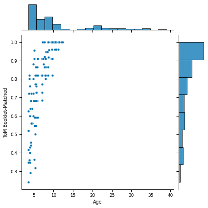
Now let’s redo the scatter plot in seaborn style.
sns.jointplot(x='Age', y='ToM Booklet-Matched', data=sub_df);
Seaborn example
Given the dataset we are using, what would you change to provide a better understanding of the data.
One way to do this with seaborn is to use a more general interface called the FacetGrid.
Let’s replot the figure while learning about a few new commands. Try to understand what the function does and try to change some parameters.
sns.set(style="whitegrid", palette="magma", color_codes=True)
sns.set_context('poster')
kws = dict(s=100, alpha=0.75, linewidth=0.15, edgecolor="k")
g = sns.FacetGrid(sub_df, col="AgeGroup", palette="magma",
hue_order=[1, 2], size=5.5)
g = (g.map(plt.scatter, "Age", "ToM Booklet-Matched", **kws).add_legend())
/opt/miniconda-latest/envs/neuro/lib/python3.7/site-packages/seaborn/axisgrid.py:316: UserWarning: The `size` parameter has been renamed to `height`; please update your code.
warnings.warn(msg, UserWarning)
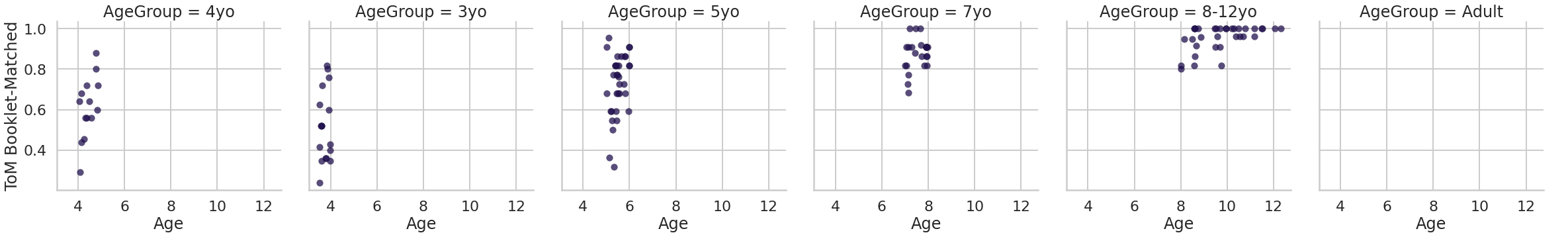
With just a few lines of code, note how much control you have over the figure.
Exercise 2
Using a pairwise plot, compare the distributions of Age, ToM Booklet-Matched, and WPPSI BD raw with respect to Child_Adult (and ask yourself if it makes sense).
Set a palette
Set style to
ticksSet context to
paperSuppress the
dx_groupvariable from being on the plot
Click the button to show the solution!
sns.set_palette(palette='hls')
sns.set_context('paper')
sns.set_style('ticks')
sns.pairplot(sub_df, vars=['Age', 'ToM Booklet-Matched', 'WPPSI BD raw'],
hue="Child_Adult", size=3);
# Create solution here
From the Gallery
You can reuse code directly from the seaborn gallery.
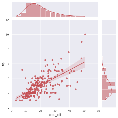
# Adapted from http://seaborn.pydata.org/examples/regression_marginals.html
import seaborn as sns
sns.set(style="darkgrid", color_codes=True)
tips = sns.load_dataset("tips")
g = sns.jointplot("total_bill", "tip", data=tips, kind="reg",
xlim=(0, 60), ylim=(0, 12), color="r", size=7)
/opt/miniconda-latest/envs/neuro/lib/python3.7/site-packages/seaborn/_decorators.py:43: FutureWarning: Pass the following variables as keyword args: x, y. From version 0.12, the only valid positional argument will be `data`, and passing other arguments without an explicit keyword will result in an error or misinterpretation.
FutureWarning
/opt/miniconda-latest/envs/neuro/lib/python3.7/site-packages/seaborn/axisgrid.py:2015: UserWarning: The `size` parameter has been renamed to `height`; please update your code.
warnings.warn(msg, UserWarning)
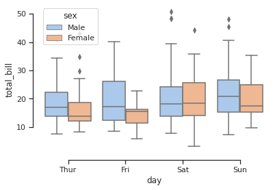
# Adapted from http://seaborn.pydata.org/examples/grouped_boxplot.html
import seaborn as sns
sns.set(style="ticks")
print(tips.head())
# Draw a nested boxplot to show bills by day and sex
sns.boxplot(x="day", y="total_bill", hue="sex", data=tips, palette="pastel")
sns.despine(offset=10, trim=True, )
total_bill tip sex smoker day time size
0 16.99 1.01 Female No Sun Dinner 2
1 10.34 1.66 Male No Sun Dinner 3
2 21.01 3.50 Male No Sun Dinner 3
3 23.68 3.31 Male No Sun Dinner 2
4 24.59 3.61 Female No Sun Dinner 4
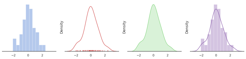
# Adapted from http://seaborn.pydata.org/examples/distplot_options.html
import numpy as np
import seaborn as sns
import matplotlib.pyplot as plt
sns.set(style="white", palette="muted", color_codes=True)
rs = np.random.RandomState(10)
# Set up the matplotlib figure
f, axes = plt.subplots(1, 4, figsize=(12, 3), sharex=True)
sns.despine(left=True)
# Generate a random univariate dataset
d = rs.normal(size=100)
# Plot a simple histogram with binsize determined automatically
sns.distplot(d, kde=False, color="b", ax=axes[0])
# Plot a kernel density estimate and rug plot
sns.distplot(d, hist=False, rug=True, color="r", ax=axes[1])
# Plot a filled kernel density estimate
sns.distplot(d, hist=False, color="g", kde_kws={"shade": True}, ax=axes[2])
# Plot a historgram and kernel density estimate
sns.distplot(d, color="m", ax=axes[3])
plt.setp(axes, yticks=[])
plt.tight_layout()
/opt/miniconda-latest/envs/neuro/lib/python3.7/site-packages/seaborn/distributions.py:2551: FutureWarning: `distplot` is a deprecated function and will be removed in a future version. Please adapt your code to use either `displot` (a figure-level function with similar flexibility) or `histplot` (an axes-level function for histograms).
warnings.warn(msg, FutureWarning)
/opt/miniconda-latest/envs/neuro/lib/python3.7/site-packages/seaborn/distributions.py:2551: FutureWarning: `distplot` is a deprecated function and will be removed in a future version. Please adapt your code to use either `displot` (a figure-level function with similar flexibility) or `kdeplot` (an axes-level function for kernel density plots).
warnings.warn(msg, FutureWarning)
/opt/miniconda-latest/envs/neuro/lib/python3.7/site-packages/seaborn/distributions.py:2055: FutureWarning: The `axis` variable is no longer used and will be removed. Instead, assign variables directly to `x` or `y`.
warnings.warn(msg, FutureWarning)
/opt/miniconda-latest/envs/neuro/lib/python3.7/site-packages/seaborn/distributions.py:2551: FutureWarning: `distplot` is a deprecated function and will be removed in a future version. Please adapt your code to use either `displot` (a figure-level function with similar flexibility) or `kdeplot` (an axes-level function for kernel density plots).
warnings.warn(msg, FutureWarning)
/opt/miniconda-latest/envs/neuro/lib/python3.7/site-packages/seaborn/distributions.py:2551: FutureWarning: `distplot` is a deprecated function and will be removed in a future version. Please adapt your code to use either `displot` (a figure-level function with similar flexibility) or `histplot` (an axes-level function for histograms).
warnings.warn(msg, FutureWarning)
iris.head()
| sepal_length | sepal_width | petal_length | petal_width | species | |
|---|---|---|---|---|---|
| 0 | 5.1 | 3.5 | 1.4 | 0.2 | setosa |
| 1 | 4.9 | 3.0 | 1.4 | 0.2 | setosa |
| 2 | 4.7 | 3.2 | 1.3 | 0.2 | setosa |
| 3 | 4.6 | 3.1 | 1.5 | 0.2 | setosa |
| 4 | 5.0 | 3.6 | 1.4 | 0.2 | setosa |
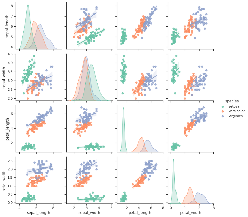
# Adapted from https://seaborn.pydata.org/tutorial/axis_grids.html
import seaborn as sns
sns.set(style="ticks")
g = sns.pairplot(iris, hue="species", palette="Set2", kind='reg',
diag_kind="kde", height=2.5)
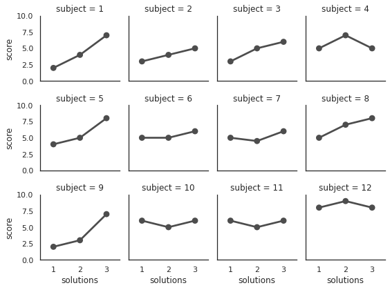
# Adapted from https://seaborn.pydata.org/tutorial/axis_grids.html
attend = sns.load_dataset('attention').query("subject <= 12")
g = sns.FacetGrid(attend, col="subject", col_wrap=4, height=2, ylim=(0, 10))
g.map(sns.pointplot, "solutions", "score", color=".3", ci=None);
/opt/miniconda-latest/envs/neuro/lib/python3.7/site-packages/seaborn/axisgrid.py:645: UserWarning: Using the pointplot function without specifying `order` is likely to produce an incorrect plot.
warnings.warn(warning)
Alternatives to matplotlib
You don’t have to use
matplotlibSome good reasons to use alternatives:
You want to output to HTML, SVG, etc.
You want something that plays well with other specs or isn’t tied to Python
You hate matplotlib
Good news! You have many options…
bokeh,plotly,HoloViews…
Bokeh
A Python visualization engine that outputs directly to the web
Can render
matplotlibplots to Bokeh, but not vice versaLets you generate interactive web-based visualizations in pure Python (!)
You get interactivity for free, and can easily customize them
Works seamlessly in Jupyter notebooks
Package development is incredibly fast
Biggest drawback may be the inability to output static images
# Adapted from http://bokeh.pydata.org/en/latest/docs/gallery/iris.html
from bokeh.plotting import figure, show, output_notebook
from bokeh.sampledata.iris import flowers
output_notebook()
colormap = {'setosa': 'red', 'versicolor': 'green', 'virginica': 'blue'}
colors = [colormap[x] for x in flowers['species']]
p = figure(title = "Iris Morphology")
p.xaxis.axis_label = 'Petal Length'
p.yaxis.axis_label = 'Petal Width'
p.circle(flowers["petal_length"], flowers["petal_width"],
color=colors, fill_alpha=0.2, size=10)
show(p)
import numpy as np
from bokeh.plotting import figure, show, output_notebook
from bokeh.models import HoverTool, ColumnDataSource
from bokeh.sampledata.les_mis import data
output_notebook()
nodes = data['nodes']
names = [node['name'] for node in sorted(data['nodes'], key=lambda x: x['group'])]
N = len(nodes)
counts = np.zeros((N, N))
for link in data['links']:
counts[link['source'], link['target']] = link['value']
counts[link['target'], link['source']] = link['value']
colormap = ["#444444", "#a6cee3", "#1f78b4", "#b2df8a", "#33a02c", "#fb9a99",
"#e31a1c", "#fdbf6f", "#ff7f00", "#cab2d6", "#6a3d9a"]
xname = []
yname = []
color = []
alpha = []
for i, node1 in enumerate(nodes):
for j, node2 in enumerate(nodes):
xname.append(node1['name'])
yname.append(node2['name'])
alpha.append(min(counts[i,j]/4.0, 0.9) + 0.1)
if node1['group'] == node2['group']:
color.append(colormap[node1['group']])
else:
color.append('lightgrey')
source = ColumnDataSource(data=dict(xname=xname, yname=yname, colors=color,
alphas=alpha, count=counts.flatten()))
p = figure(title="Les Mis Occurrences",
x_axis_location="above", tools="hover,save",
x_range=list(reversed(names)), y_range=names)
p.plot_width = 800
p.plot_height = 800
p.grid.grid_line_color = None
p.axis.axis_line_color = None
p.axis.major_tick_line_color = None
p.axis.major_label_text_font_size = "5pt"
p.axis.major_label_standoff = 0
p.xaxis.major_label_orientation = np.pi/3
p.rect('xname', 'yname', 0.9, 0.9, source=source,
color='colors', alpha='alphas', line_color=None,
hover_line_color='black', hover_color='colors')
p.select_one(HoverTool).tooltips = [('names', '@yname, @xname'),
('count', '@count')]
show(p) # show the plot
Plot.ly
Plot.ly fills the same niche as Bokeh - web-based visualization via other languages
Lets you build visualizations either in native code or online
# Adapted from https://plot.ly/python/ipython-notebook-tutorial/
import plotly
from plotly.offline import init_notebook_mode, plot
from IPython.core.display import display, HTML
import plotly.figure_factory as ff
from plotly.graph_objs import *
import pandas as pd
df = pd.read_csv("https://raw.githubusercontent.com/plotly/datasets/master/school_earnings.csv")
table = ff.create_table(df)
trace_women = Bar(x=df.School, y=df.Women, name='Women', marker=dict(color='#ffcdd2'))
trace_men = Bar(x=df.School, y=df.Men, name='Men', marker=dict(color='#A2D5F2'))
trace_gap = Bar(x=df.School, y=df.Gap, name='Gap', marker=dict(color='#59606D'))
data = [trace_women, trace_men, trace_gap]
layout = Layout(title="Average Earnings for Graduates",
xaxis=dict(title='School'),
yaxis=dict(title='Salary (in thousands)'))
fig = Figure(data=data, layout=layout)
init_notebook_mode(connected=True)
plot(fig, filename = 'average_earnings.html')
display(HTML('average_earnings.html'))
# Adapted from https://plot.ly/python/line-and-scatter/
import plotly
from plotly.offline import init_notebook_mode, plot
from IPython.core.display import display, HTML
import plotly.graph_objs as go
# Create random data with numpy
import numpy as np
N = 100
random_x = np.linspace(0, 1, N)
random_y0 = np.random.randn(N) + 5
random_y1 = np.random.randn(N)
random_y2 = np.random.randn(N) - 5
# Create traces
trace0 = go.Scatter(x=random_x, y=random_y0, mode='lines', name='lines')
trace1 = go.Scatter(x=random_x, y=random_y1, mode='lines+markers', name='lines+markers')
trace2 = go.Scatter(x=random_x, y=random_y2, mode='markers', name='markers')
data = [trace0, trace1, trace2]
init_notebook_mode(connected=True)
plot(data, filename = 'plotly_test.html')
display(HTML('plotly_test.html'))
# Adapted from https://plot.ly/python/continuous-error-bars/
import plotly
from plotly.offline import init_notebook_mode, plot
from IPython.core.display import display, HTML
import plotly.graph_objs as go
import pandas as pd
df = pd.read_csv('https://raw.githubusercontent.com/plotly/datasets/master/wind_speed_laurel_nebraska.csv')
upper_bound = go.Scatter(
name='Upper Bound', x=df['Time'], y=df['10 Min Sampled Avg'] + df['10 Min Std Dev'], mode='lines',
marker=dict(color="#444444"), line=dict(width=0), fillcolor='rgba(68, 68, 68, 0.3)', fill='tonexty')
trace = go.Scatter(
name='Measurement', x=df['Time'], y=df['10 Min Sampled Avg'], mode='lines',
line=dict(color='rgb(31, 119, 180)'), fillcolor='rgba(68, 68, 68, 0.3)', fill='tonexty')
lower_bound = go.Scatter(
name='Lower Bound', x=df['Time'], y=df['10 Min Sampled Avg']-df['10 Min Std Dev'],
marker=dict(color="#444444"), line=dict(width=0), mode='lines')
# Trace order can be important with continuous error bars
data = [lower_bound, trace, upper_bound]
layout = go.Layout(yaxis=dict(title='Wind speed (m/s)'),
title='Continuous, variable value error bars.', showlegend = False)
init_notebook_mode(connected=True)
fig = go.Figure(data=data, layout=layout)
plot(fig, filename = 'plotly_test_2.html')
display(HTML('plotly_test_2.html'))
# Adapted from https://plot.ly/python/3d-surface-plots/
import plotly
from plotly.offline import init_notebook_mode, plot
from IPython.core.display import display, HTML
import plotly.graph_objs as go
import pandas as pd
# Read data from a csv
z_data = pd.read_csv('https://raw.githubusercontent.com/plotly/datasets/master/api_docs/mt_bruno_elevation.csv')
data = [go.Surface(z=z_data.to_numpy())]
layout = go.Layout(autosize=True, width=500, height=500, margin=dict(l=65, r=50, b=65, t=90))
fig = go.Figure(data=data, layout=layout)
init_notebook_mode(connected=True)
plot(fig, filename = 'plotly_test_3.html')
display(HTML('plotly_test_3.html'))
So… what should you use?
I have no idea - there are too many options!
Okay, some tentative recommendations:
Use seaborn for exploration (runners-up: pandas and ggplot)
Bokeh or plot.ly if you want to output interactive visualizations to the web
For everything else… matplotlib (still)
Keep an eye on others like HoloViews and Altair